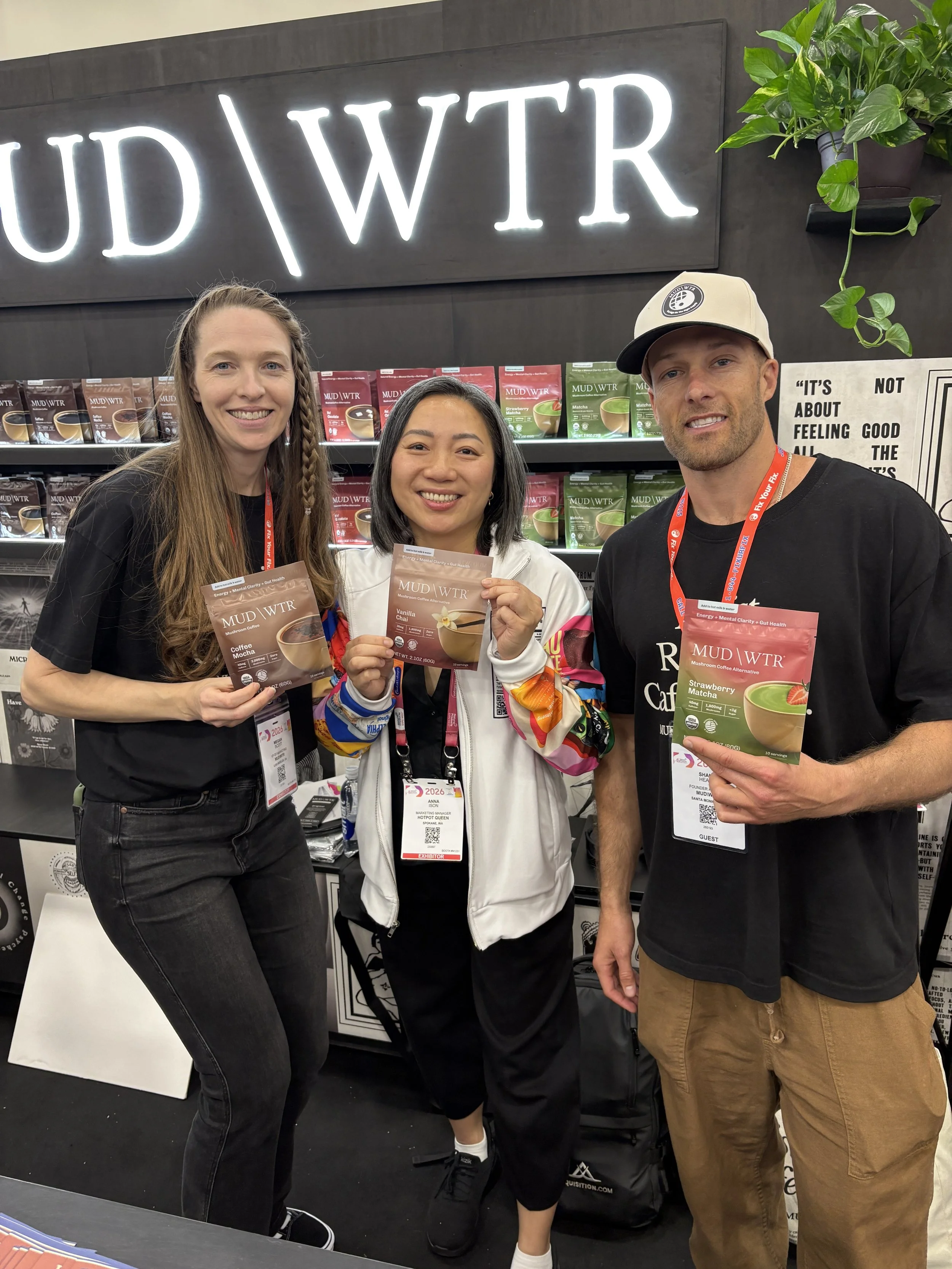
MUD\WTR debuts new packaging design at Expo West
So proud of how this work has come to life:
- a cohesive architecture to help navigation
- imagery that shows exactly what the product is
- appetite appeal that supports the flavor story
- optimized messaging to help consumers shop with clarity
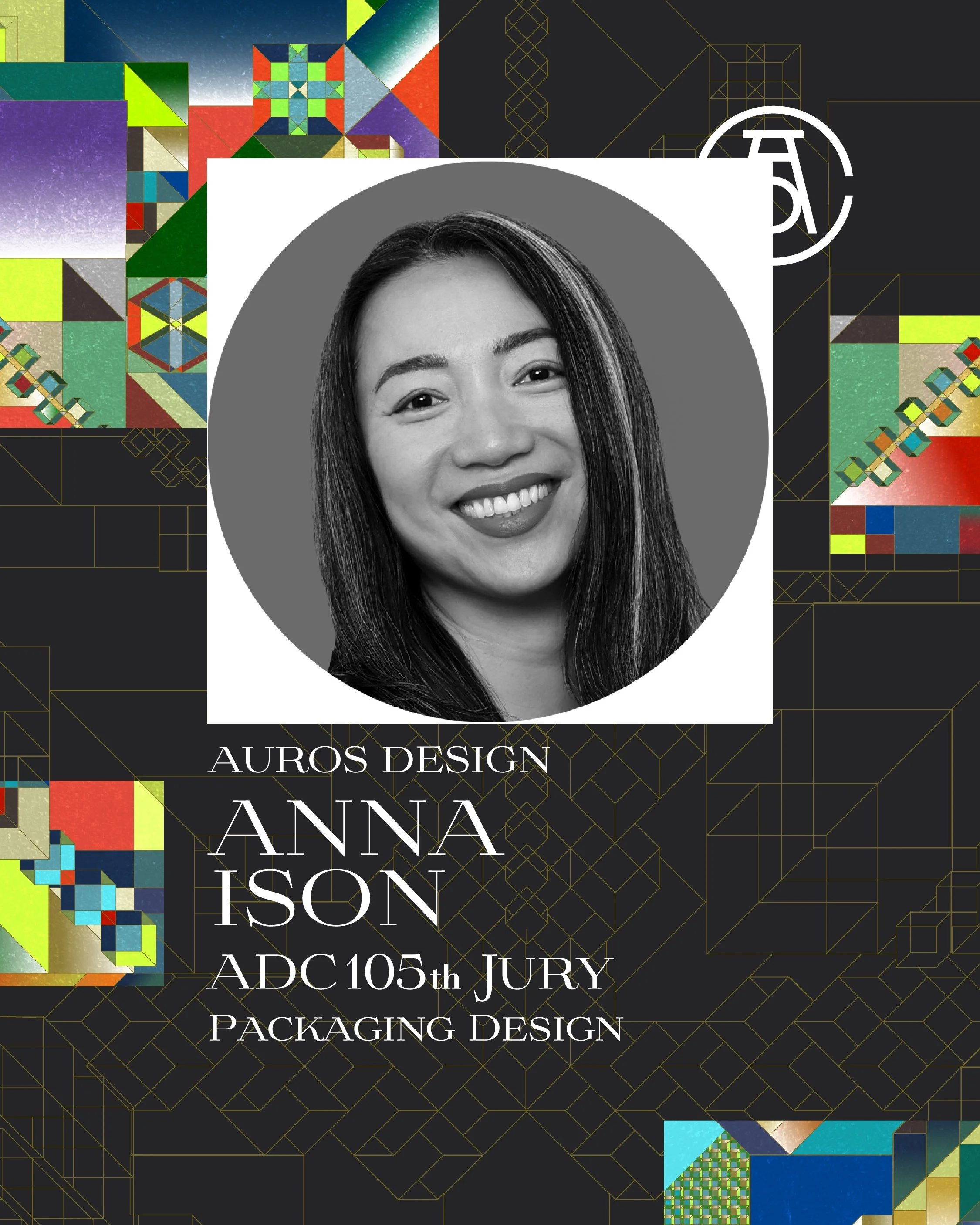
Thoughts heading into the ADC jury for The One Club for Creativity
Honored to announce my selection as a juror for the 105th ADC Annual Awards. Joining a global panel of industry leaders at The One Club for Creativity, I’ll be helping define the 'gold standard' for art direction and design craft in 2026.

How do you modernize a logo without losing the heart of it?
When redesigning logos- especially those of legacy brands, it’s important to look at the heart of what made it distinct in the first place. Start by squinting…

With information overload, can an image build trust in a split second?
Smart design tells a story faster than words. When you're standing in the baking aisle, every bag of flour starts to look the same- but the moment your eyes land on this Arrowhead Mills package a narrative unfolds.

Our brains are built for shortcuts
In a crowded grocery, we scan for patterns to save mental energy. Most packaging in a category look similar. But what if you break the pattern?

Last week, we promised real life learning examples on packaging. Now, we're ready to deliver!
On a shelf full of competitors, we saw that their tall noodle box (blue and orange single serving box) had excellent initial noticeability- 98% which is a huge win! But a closer look at the eye-tracking revealed a surprising truth: that high engagement likely signaled confusion- not successful communication.

We promised real life learning examples on packaging
I teamed up with Rich Moniz who specializes in eye-tracking. So we can pair data with design insight! We got some great brands who were interested in a trade:
- They get a free audit
- And we get to share the results with the community here-
The result? We all learn and grow together!

Who else gets a buzz of delight when Halloween candy starts hitting the shelves?
Having a kid has completely changed Halloween for me. It's a magical time, not just for them but for the entire neighborhood. Suddenly, everyone is out and about. The brownstones go all out with fog machines- the picturesque tree lined streets by day- turn into the best spooky spectacles by night!

It's back to school this week for kids- and perfect timing for this S'well x Crayola collab!
Saw this limited-edition water bottle and loved it immediately. Perfect pairing of whimsy and function by transforming the Swell bottle into a literal crayon! Love it when simple design works so well.

Beauty meets groceries?!
Was in SEPHORA doing a design audit and stumbled on this beauty mashup- Benefit Cosmetics has a product line packaged like pantry staples. A surprising merging of two worlds! The design is a playful nod to everyday kitchen items, with each product resembling a familiar food container.

Anyone can pay for eye level. But being smart can make even the lowest shelf a WIN!
Anyone can pay for eye level. But being smart can make even the lowest shelf a WIN! The real challenge for packaging isn't just creating a great looking design. It’s also making sure it stands out from every angle- and the bottom shelf is the ultimate test!

Ever struggle to remember the brand of a product you see everyday?
I have a tube of Aquaphor that I see daily when I open up my vanity mirror. I ran out and went to buy a new tube but ended up second guessing at shelf- Was it Aquaphor or actually Eucerin? They looked pretty much the same…

Let's talk butts... packaging butts, that is!
It's a quirk of retail merchandising– when the "butt" of your packaging becomes the unexpected hero
Usually due to:
- shelf orientation
- limited space
- how retailers optimize product visibility

A neon approach to oral care?
Squinting at any oral care shelf, you'd quickly see that the oral care category is full of cool blues and clinical whites. It makes sense- as these colors signal clean and fresh. They're soothing yet connote efficacy…

Logos that change colors- a branding conundrum?
Color plays an important role in brand and packaging design. Color can create a strong brand identity and enhance memory recall.
Owning a color: A branding advantage
When a brand consistently uses a color, it becomes synonymous with the brand itself

Spreading festive cheer with every rear...
Who says toilet paper can't be fun?! Who Gives A Crap’s "Gnome on the Throne" is proof that even the most mundane of household items can be festive. Not sure what's more clever- the mix & match stackable gnomes or their copywriter.

Remember when the non-alcoholic bev section was just a few sad bottles of sparkling cider?
Those days are OVER. Walked into a Mr. Mango the other day and was pleasantly surprised by their selection! Very interesting to witness what I thought would be just a trend, turn into the birth of a completely new category.

Seeing lots of posts about Tropicana- here’s my 2 cents
The refresh looks the same at a glance. Yes, they threw away their carafe as a distinctive asset. But honestly- when you look at the competitive set…is it really even that distinct anymore?

We've all been there. "Can you pick up more (insert product) while you’re out"
It's (X color) and shaped like (X shape)
Why do we describe products this way? Because our brains process shapes and colors long before text. When scanning a shelf, it’s hard to look for a brand name. It’s a lot easier to search by shape and color.

Getting reeled in by tinned fish packaging lately?
Forget what you think you know about tinned fish. This category is experiencing a glow-up, moving beyond basic pantry item to gourmet delicacy. And a huge part of that transformation lies in
the power of thoughtful packaging and branding!