
Evolving an American icon without burning 77% market share
Market Opportunity
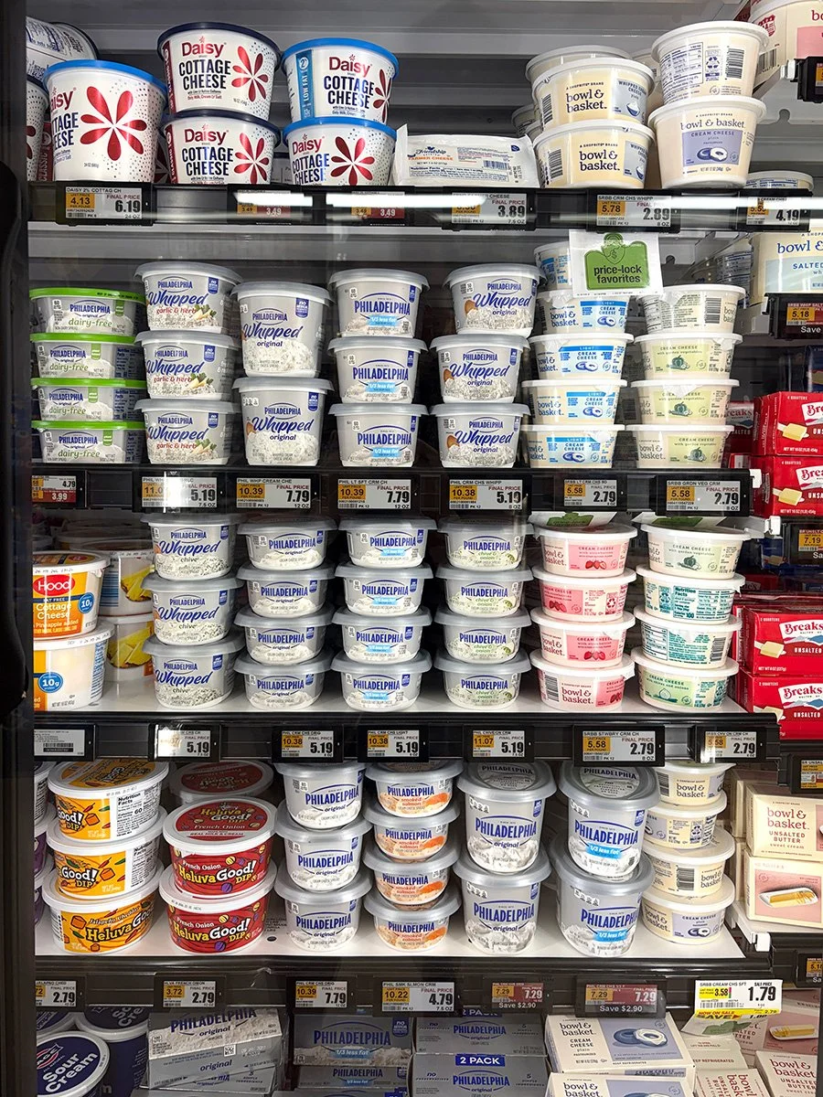
As an iconic market leader, Philadelphia faced two points of friction: legacy packaging created shelf clutter, while a expanding SKU range eroded portfolio cohesion.
The strategic solves required:
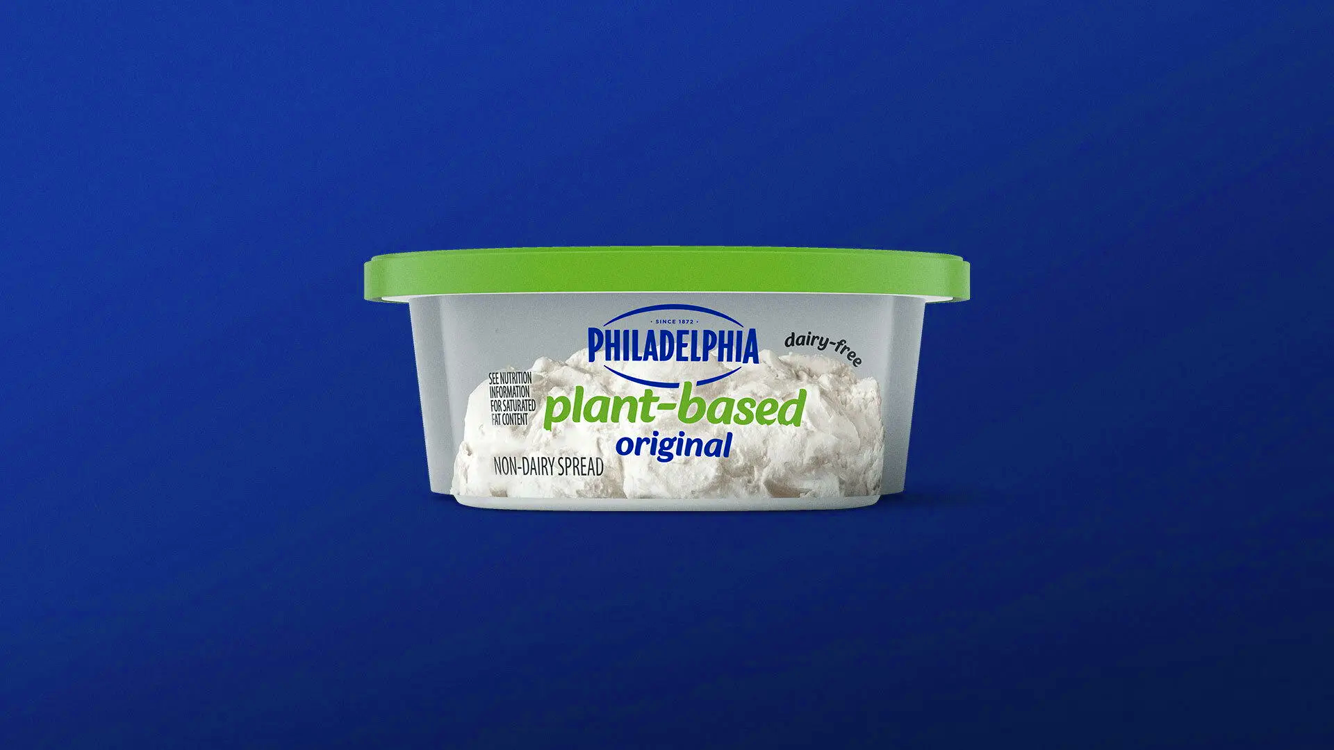
Portfolio Optimization: Unify a sprawling range of flavors, plant-based variants, and formats under a singular, recognizable packaging architecture without confusing loyal consumers
Commercial Appetite Appeal: Shift front-of-pack graphic hierarchy to drive immediate taste-profile recognition, elevating perception from a commodity ingredient to a premium lifestyle food experience
Outcome
Operating with 77% category market share and ~413,000 units sold daily, any visual evolution carries massive revenue risk. We modernized Philadelphia’s visual system to drive immediate shelf recognition, optimizing the brand block to safeguard category dominance while driving higher conversion across specialty SKU lines.
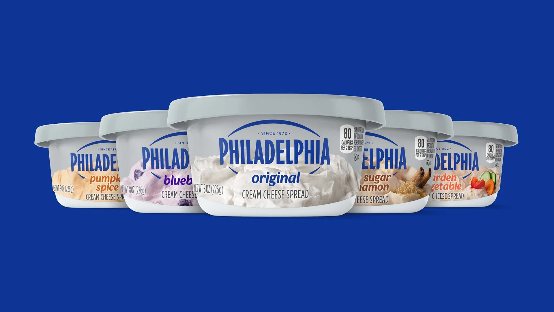
We focused on experience-first photography, capturing cream cheese as indulgent, pillowy, and irresistible. We brought to life the textures and richness that define the brand and created a modern, flexible system that works across formats, flavors, and SKUs, while maintaining the iconic Philadelphia identity.
The design doesn’t just show the product. It celebrates it, making each package feel like a promise of indulgence and quality.
Brand Identity
Brand World Development
Packaging Design
Visual Identity
Portfolio & SKU Optimization
Concept Development & Iteration
In collaboration with Jones Knowles Ritchie
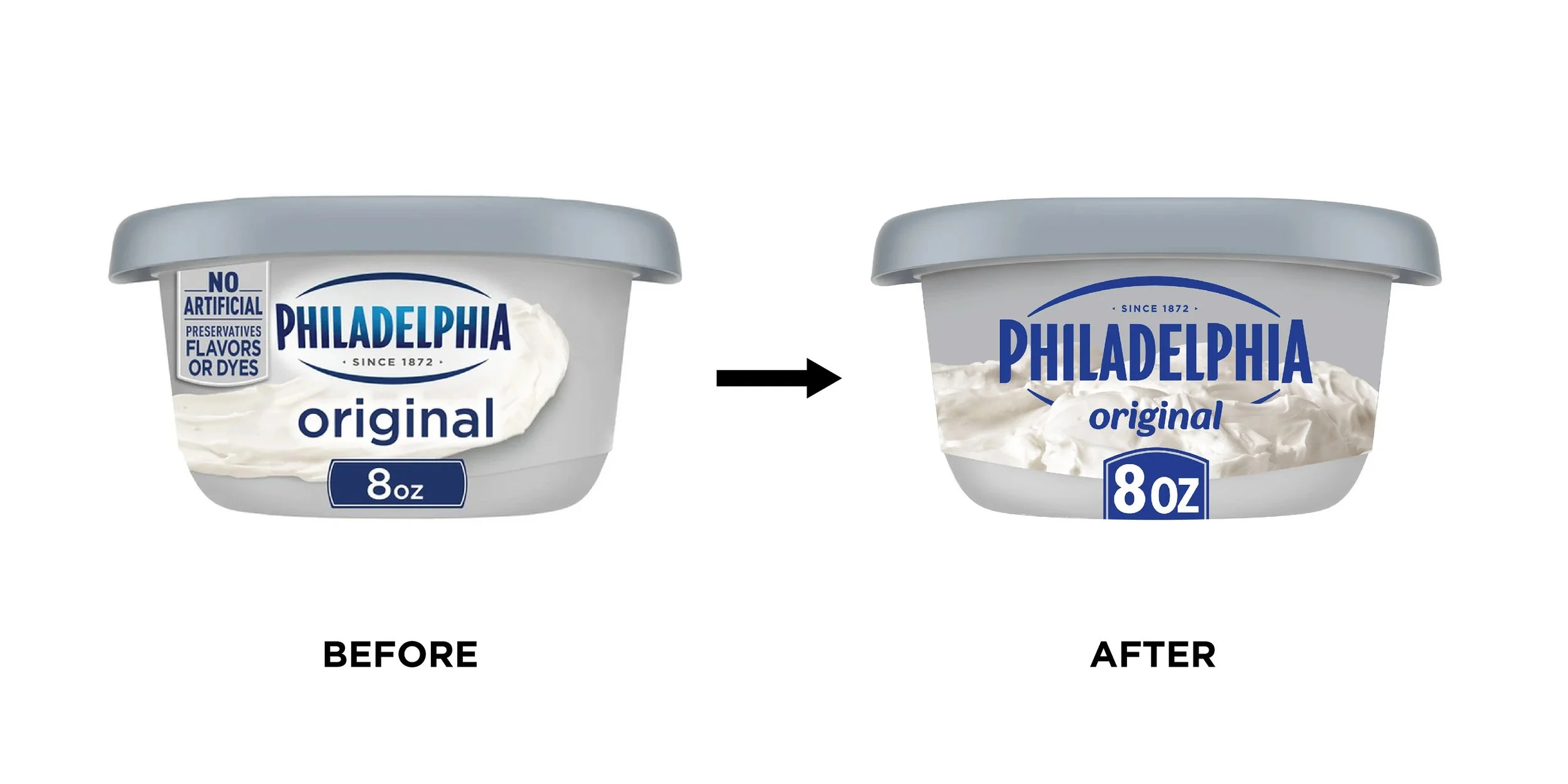
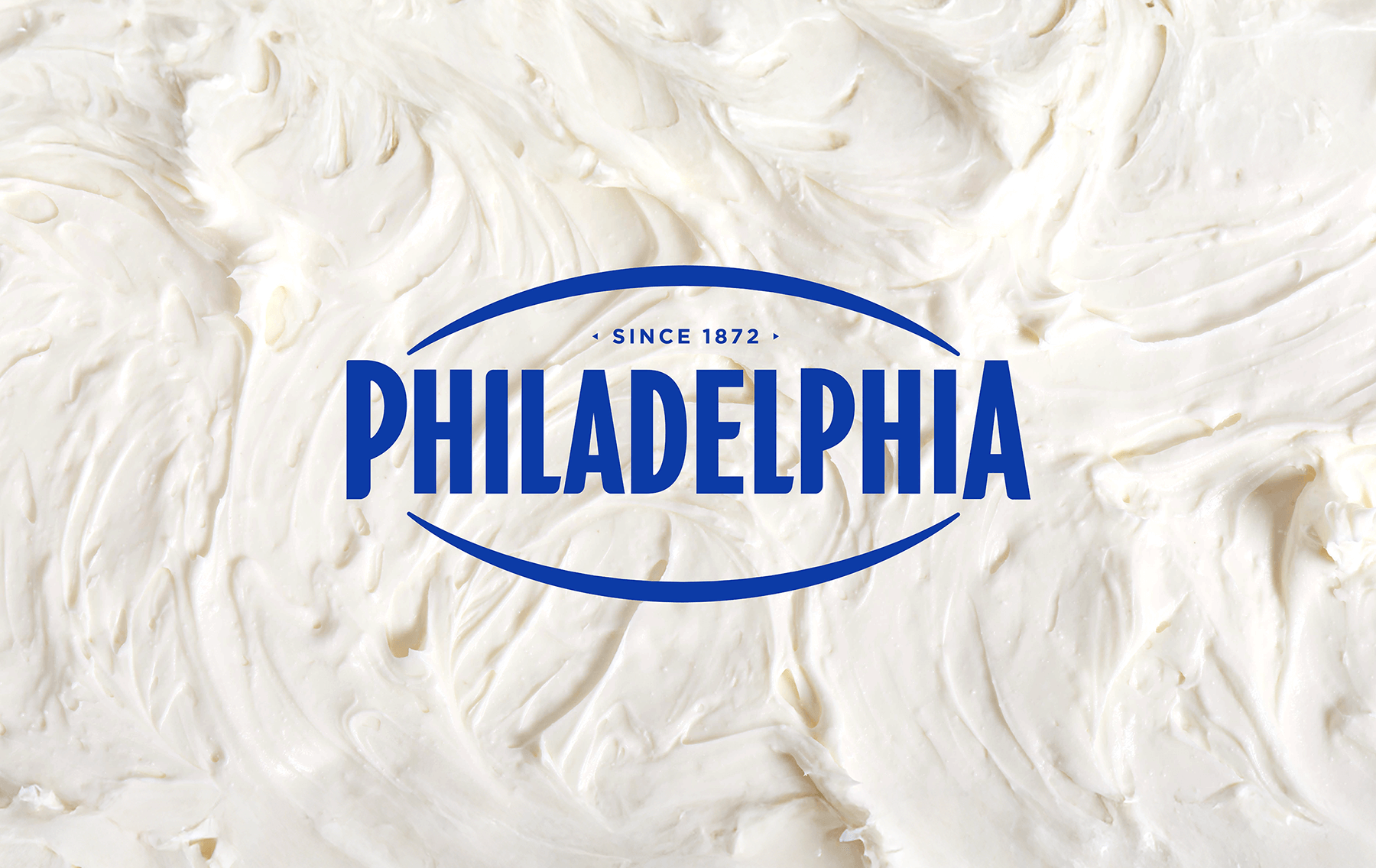
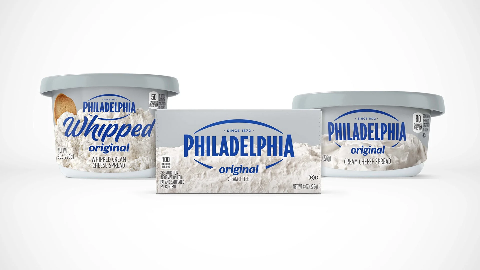
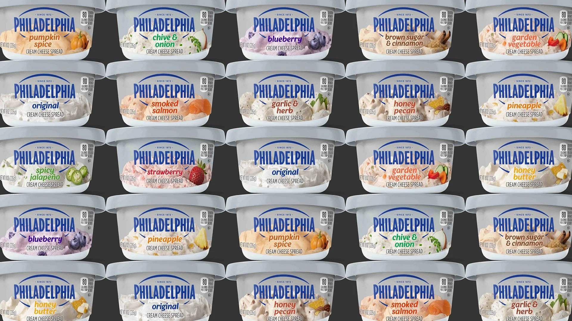
When you look at the new Philadelphia packaging architecture, the first thing that strikes you is the intentional harmony between heritage and appetite appeal. At the heart of the design, the iconic brandmark is nested directly within a generous, indulgent mound of cream cheese, creating a visual "nest" that reinforces the product's creamy texture as the foundation of every flavor.
This placement isn't just about branding; it’s a sensory cue that promises richness from the moment you glance at the shelf. Nesting the brandmark directly into the product imagery establishes an immediate, proprietary visual anchor at shelf.
Accelerated Shelf Navigation: By standardizing the structural "mound" position across all SKUs, we created a intuitive system that anchors the eye, allowing flavor variants and ingredients to communicate instantly without breaking brand block recognition
Equity Preservation: Modernizing the primary lockup while maintaining core color relationships protects instant consumer recognition at retail scale
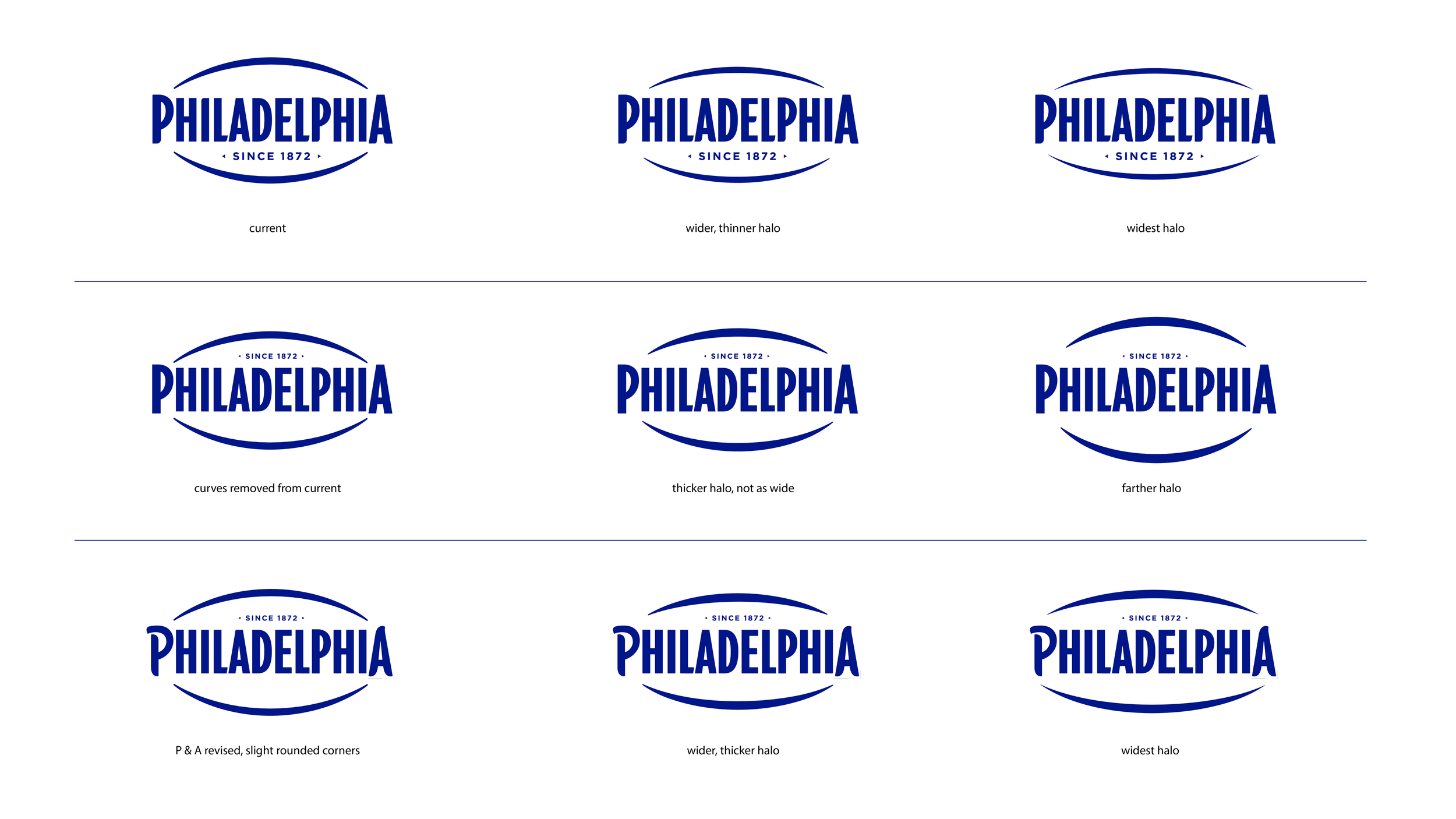
Wordmark Explore
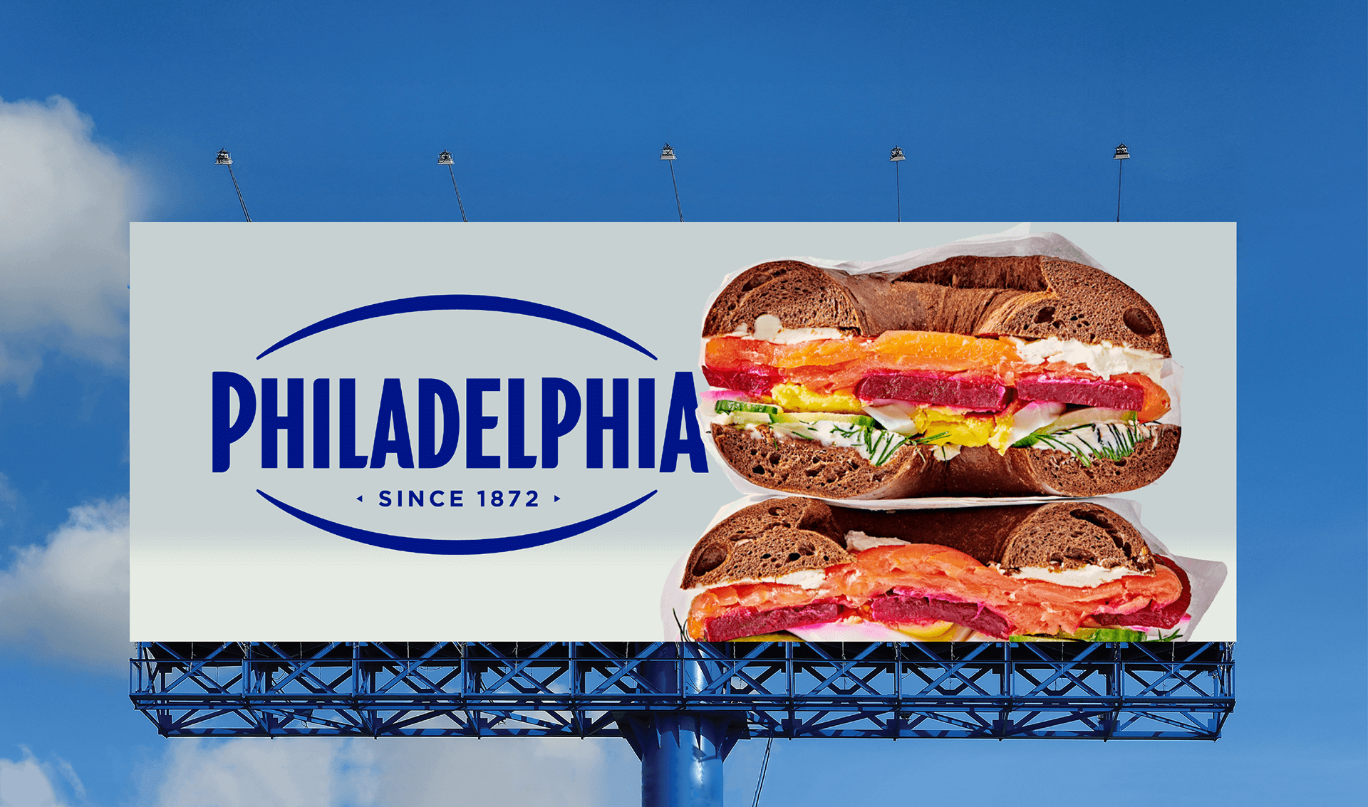
To de-risk rollout across global omnichannel touchpoints, we stress-tested wordmark proportions and graphic assets for elasticity:
Asset Ownership: Refined the core wordmark to maximize legibility across both micro-digital formats and large-scale secondary displays
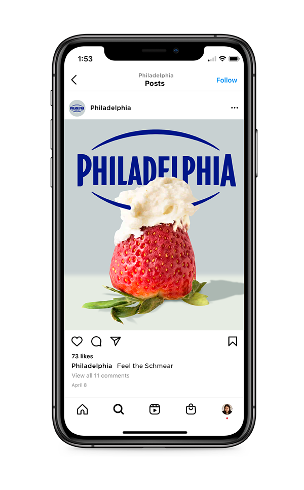
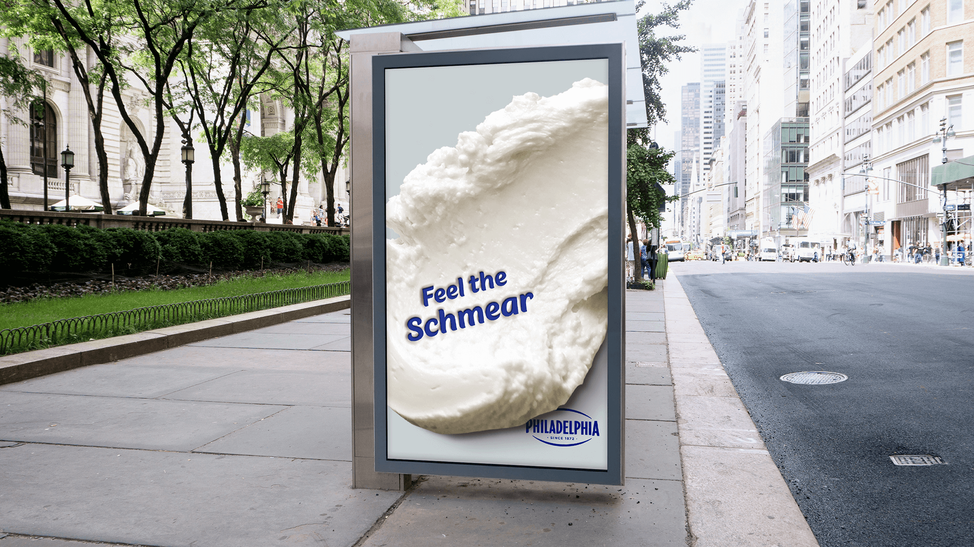
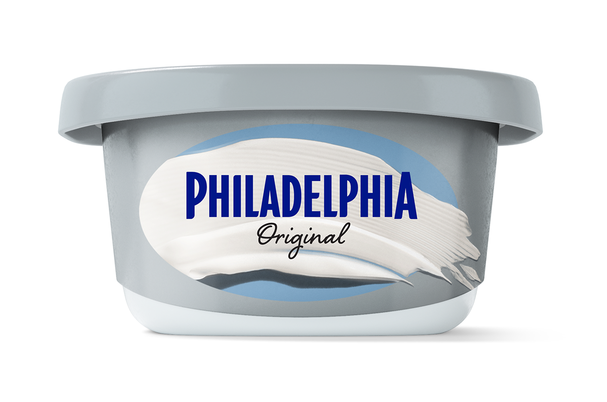
Dynamic Brand Assets: Engineered a tactile "schmear" asset lockup specifically designed for high-impact commercial campaigns and retail media integration
Packaging Explore
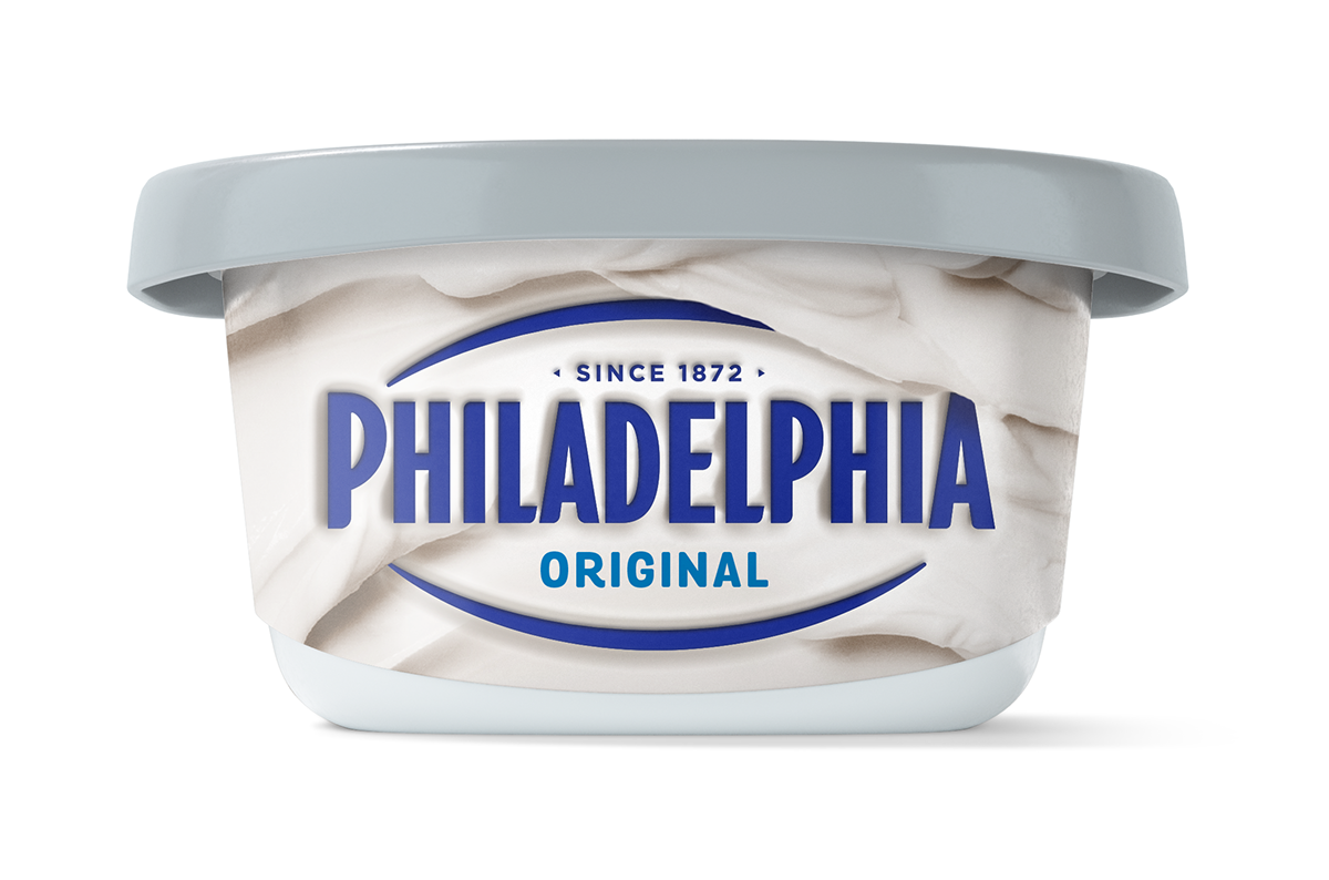
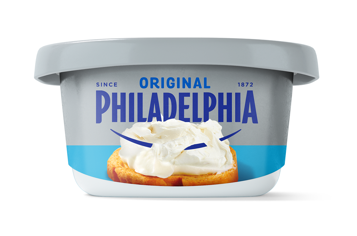
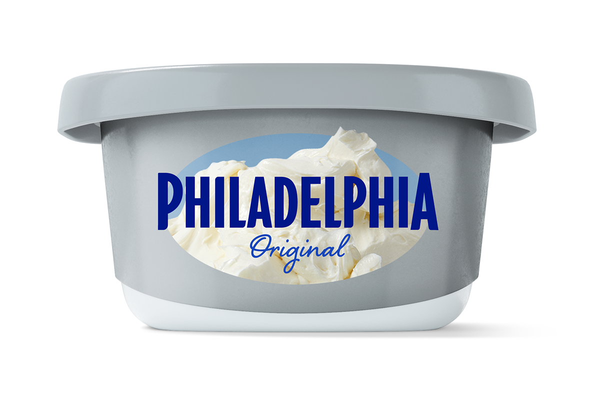
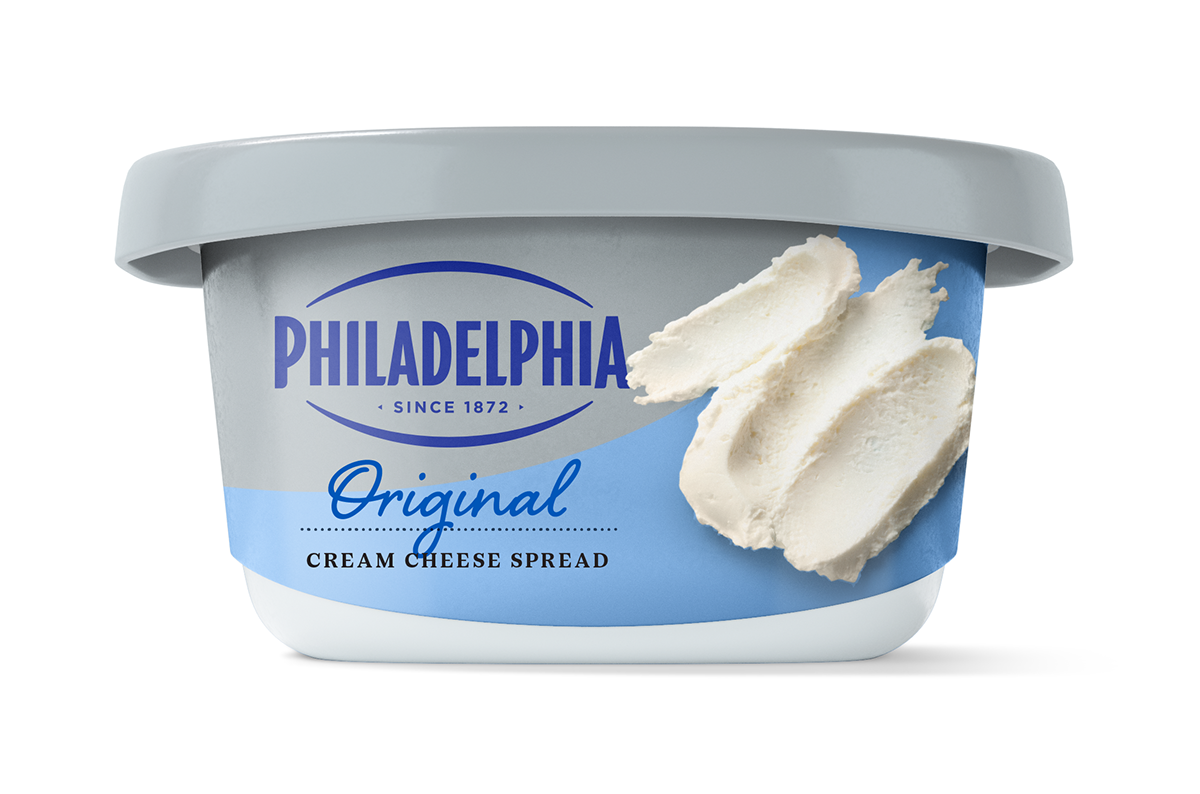
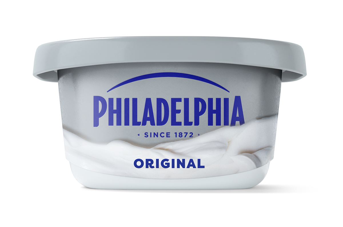
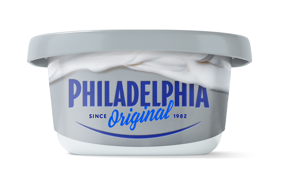
In this exploration for Philadelphia Cream Cheese, the focus was on evolving a storied heritage brand by balancing its iconic status with a more tactile, sensorial kitchen experience. We moved away from the standard clinical white backgrounds toward a system that celebrates the product’s creamy texture and versatile usage.
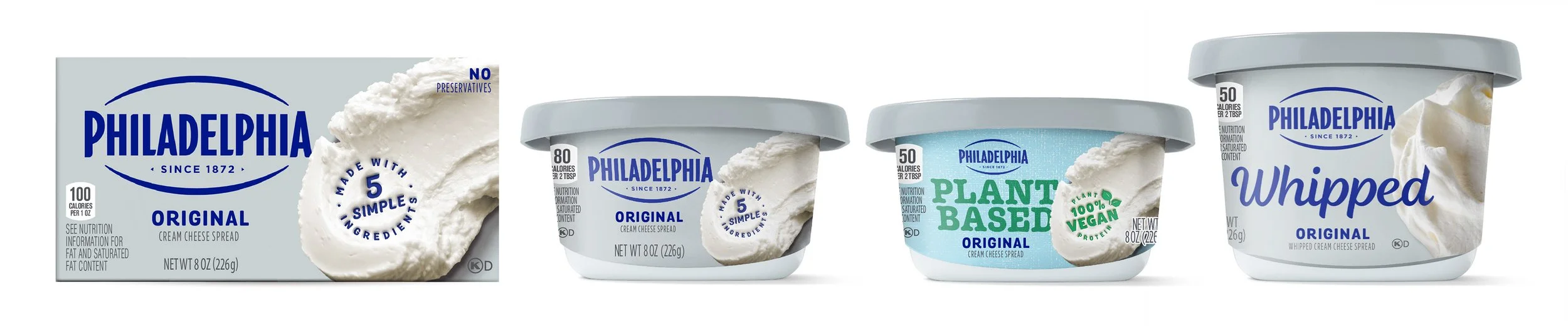

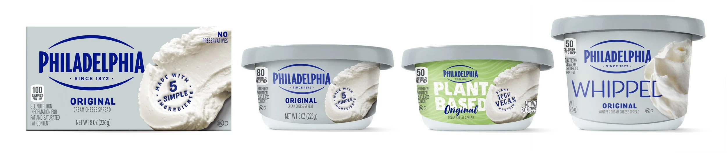
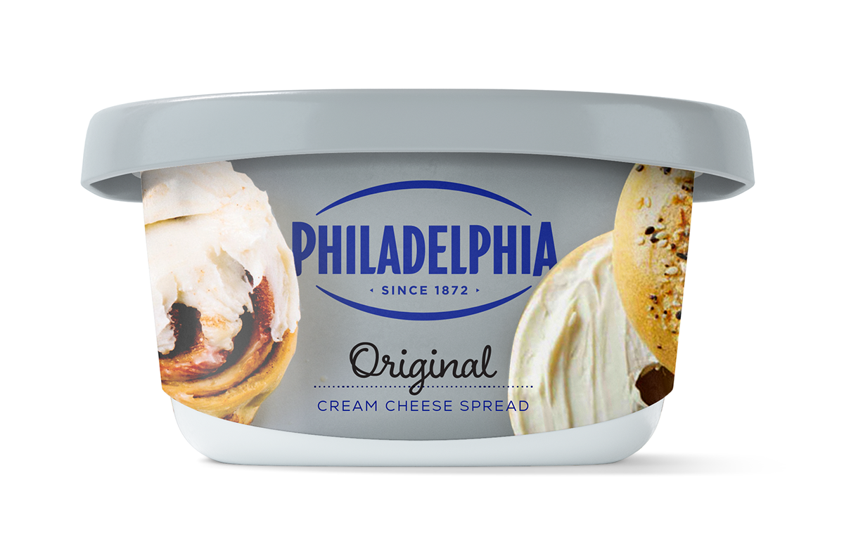
By experimenting with varying degrees of photographic "swirls" and more editorial typography, the concepts explore how the brand can feel both premium and approachable. This shift from a purely functional container to a more expressive canvas allows for better storytelling – highlighting the perfect schmear on a bagel or the decadent texture.
We modernized the visual system without losing the brand's equity, ensuring that every touchpoint feels as fresh and inviting as the product itself.
Modernizing Category Leaders