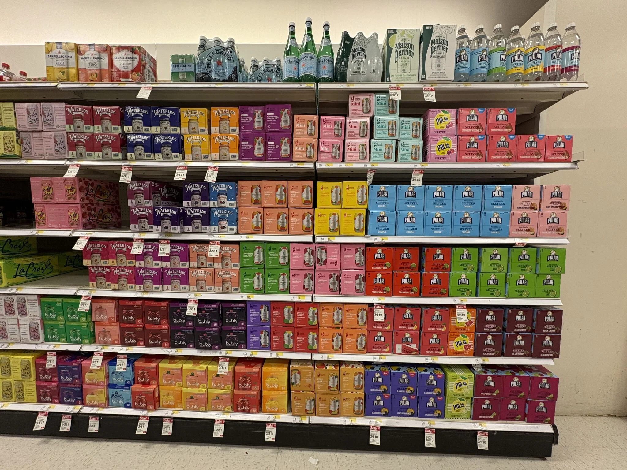
Let's talk butts... packaging butts, that is!
It's a quirk of retail merchandising–
When the "butt" of your packaging becomes the unexpected hero
Usually due to:
- shelf orientation
- limited space
- how retailers optimize product visibility
---
Examples that come to mind- and how to design for it
are categories like beverage and bread
✅ Keep shelf flexibility in mind
Think about how packaging looks from all angles
Is there a clear visual hierarchy, even from the sides?
✅ Strategic placement of key information
While the main selling points should be on the intended front,
make sure secondary panels still communicate key info
✅ Brand consistency is key
Regardless of which panel faces forward,
ensure branding is consistent on all sides for instant recognition
---
Understanding the different contexts of retail shelving
can be a strategic branding opportunity
to making sure packaging is impactful from every angle
What do you think...
Seen any great butts lately?


