Magic Spoon
Market Opportunity
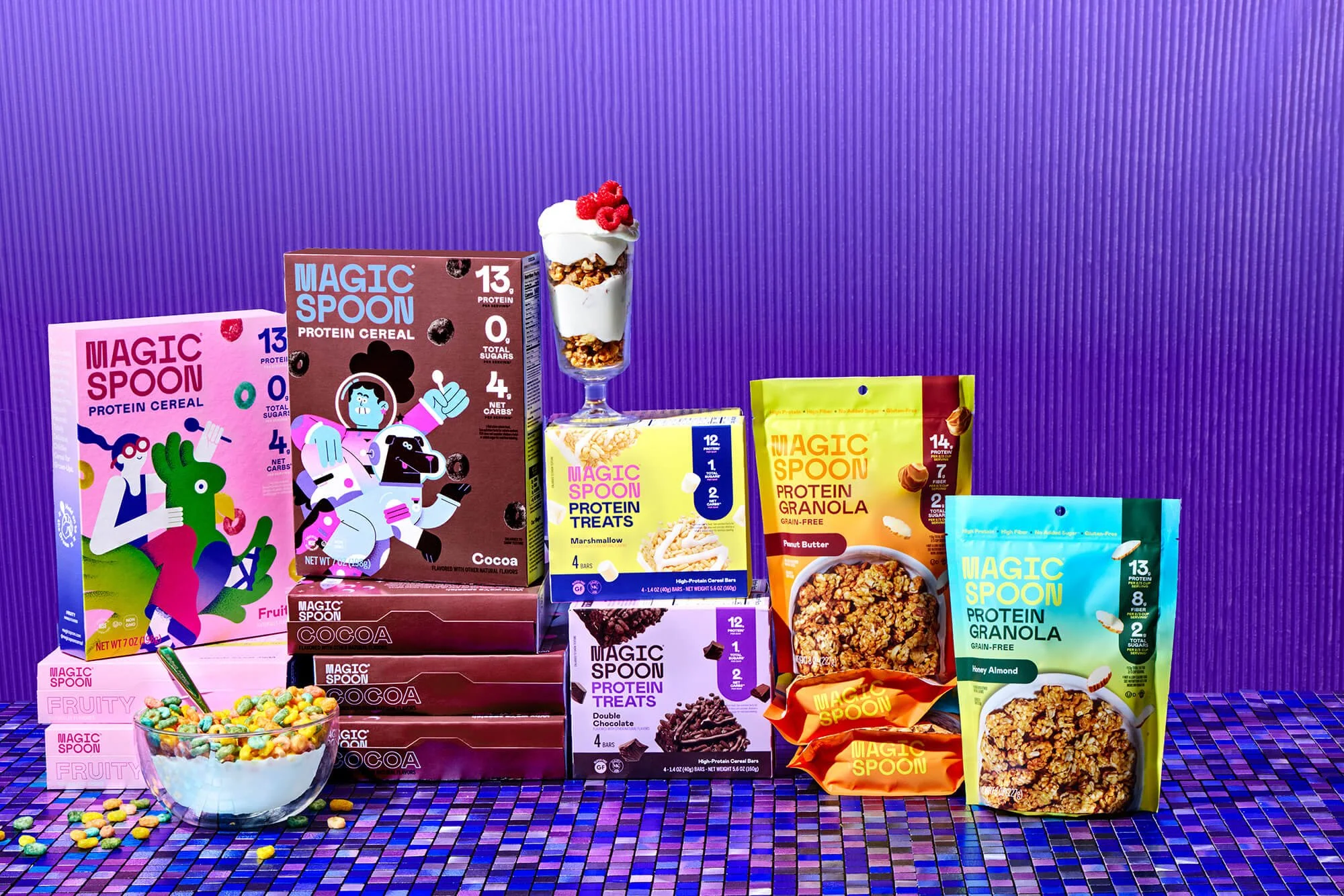
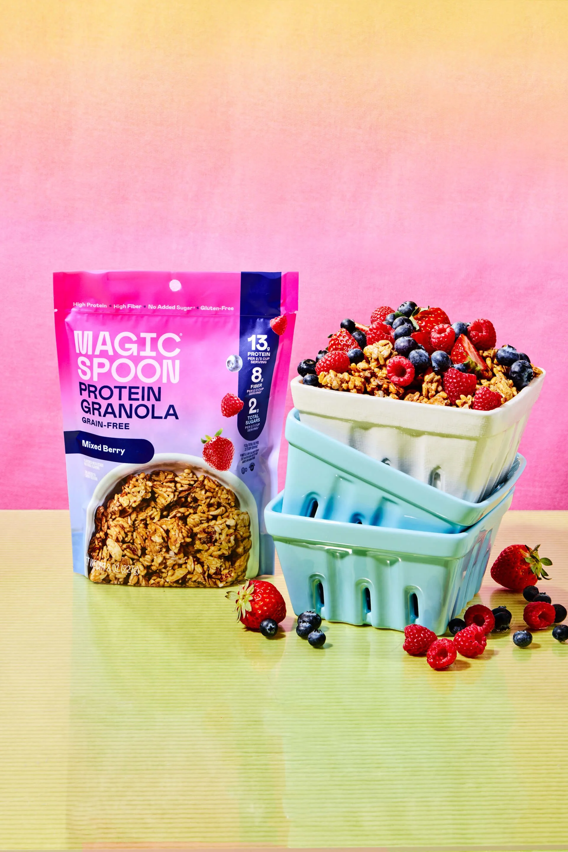
Magic Spoon set out to expand beyond cereal with the launch of a high-protein, grain free granola line – entering one of the most crowded, visually noisy aisles in grocery.
The challenge wasn’t just launching four new flavors. It was extending this uniquely playful brand into a new format without losing equity.
The new granola needed to:
Clearly ladder to Magic Spoon’s existing brand world
Communicate functional benefits instantly at shelf
Compete against both indulgent and “better-for-you” granolas
Establish a scalable visual system that could grow with the line
All while staying unmistakably Magic Spoon.
Outcome
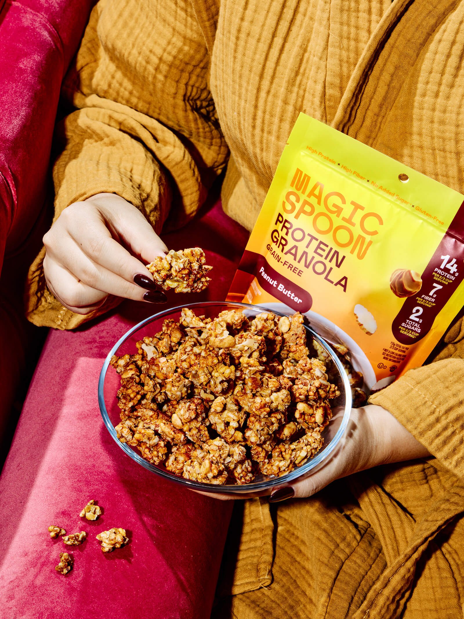
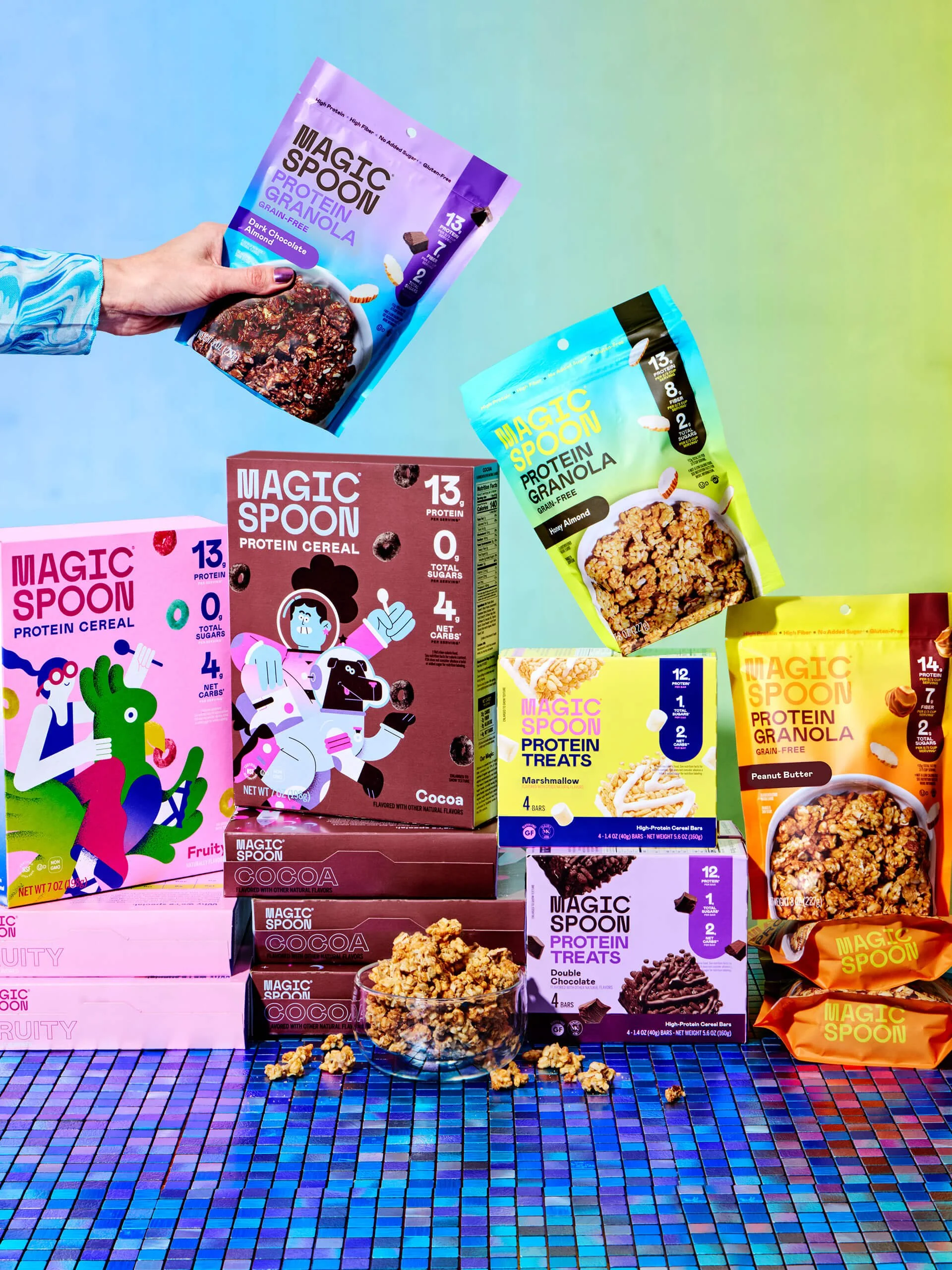
A packaging system built for retail launch– Magic Spoon closed an $85M Series B and entered 1,000+ retail locations including Target nationwide. The granola packaging was designed as a strategic portfolio extension, not a one off SKU. In a category driven by quick decisions, we prioritized immediate read and differentiation. Key nutritional macros (high protein, low sugar, low carb) are designed to be clear from distance, reinforcing the brand’s functional promise in seconds. We also elevated the product photography for appetite appeal.
Each flavor is distinct, yet part of a unified family. Abold gradient color strategy creates vibrancy and fun while ensuring strong flavor blocking at shelf and cohesion across the line. Dynamic flavor cues and expressive color bring energy to a category often dominated by muted, utilitarian codes. This reinforces Magic Spoon’s playful, optimistic personality – a key differentiator in a functional granola set that typically leans serious or rustic.
Packaging Strategy & Design
Portfolio Architecture
Range Navigation System
Extension Framework
Color Strategy
Shopability Optimization
In collaboration with Magic Spoon
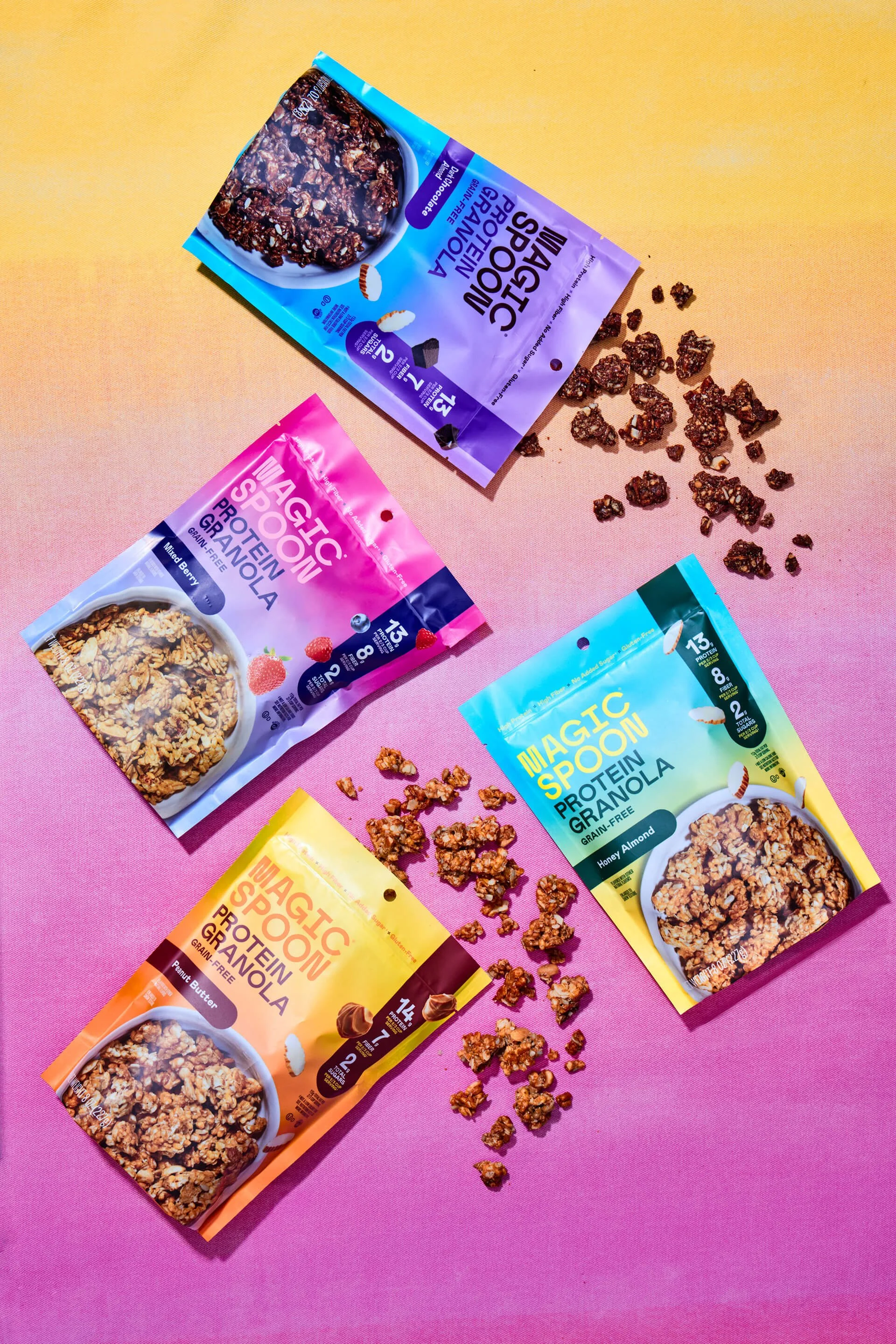
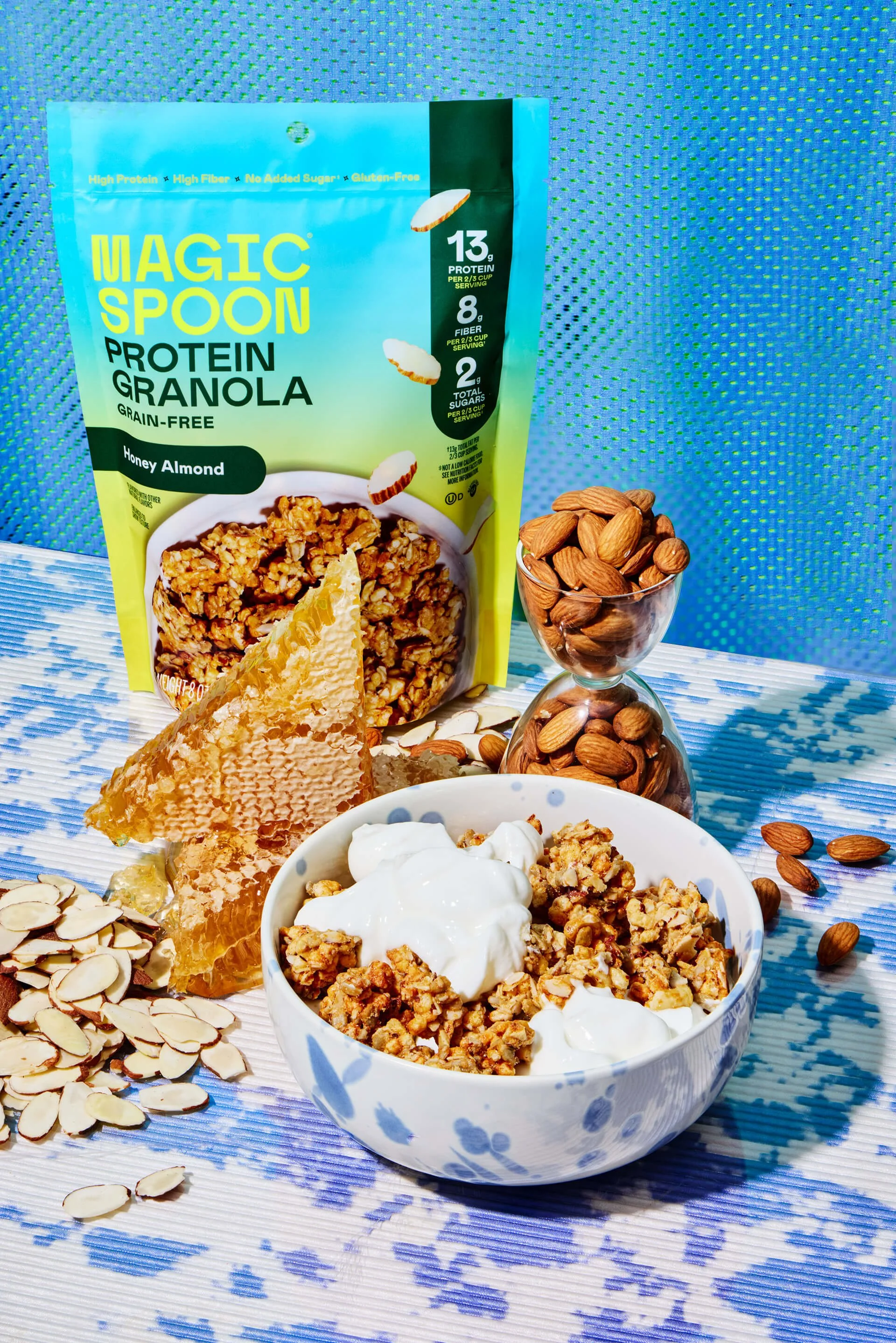
Expanding the Magic Spoon universe required a shift from the surrealist characters of the cereal boxes to a product-first hierarchy. We leaned into hyper-real photography, capturing the textures of grain-free clusters to drive appetite appeal. By placing the product in a dynamic, gravity-defying arrangement, we maintained the brand’s signature whimsy.
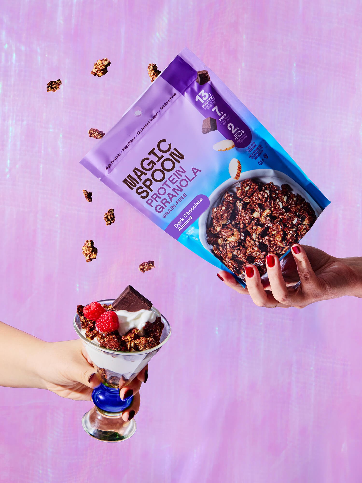

Rather than blending in with the muted tones of the granola category, we used a high-saturation gradient system designed to glow under retail lighting. This color strategy creates an unmistakable brand block that pulls the eye from a distance, using vibrant hues to signal flavor. These gradients do more than just attract attention. They also create a sense of movement and energy that mirrors the brand’s optimistic personality.

“I’ve had the pleasure of working with Anna on a few different packaging projects over the last couple months. She is a true expert in the CPG space, has a keen sense of understanding how to deliver on the information hierarchy while providing a range of impactful design concepts. Best of all, she is easy to work with, provide feedback to and help with quick turnarounds. Any brand would be lucky to work with her!”
Kristina MacIntosh
Head of Marketing, Magic Spoon
Scaling Challenger Brands