
Modernizing Kraft Heinz’s Delimex to recapture frozen aisle growth
Delimex is all about bold flavor, craveable comfort, and the joy of Mexican street food – yet its packaging wasn’t fully living up to that promise on shelf.
While Delimex held strong brand equity as a freezer staple, legacy packaging created visual fatigue at retail, leaving the brand vulnerable to modern challenger brands in the frozen Mexican space.
The strategic mandate focused on two key priorities:
Defending Market Share: Refreshing the visual hierarchy to stand out in door-glass freezer displays without alienating core, brand-loyal consumers
Category Repositioning: Transitioning perceptions from a commodity frozen staple to an authentic, street-food-inspired flavor experience through elevated design assets and high-impact packaging architecture
Market Opportunity
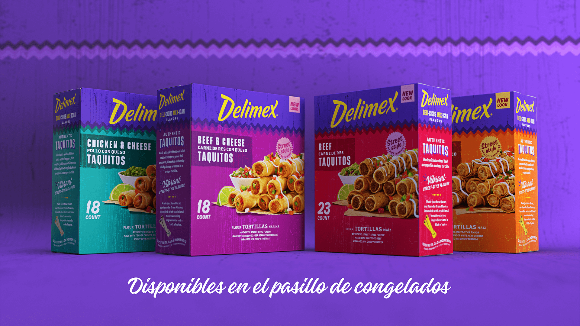
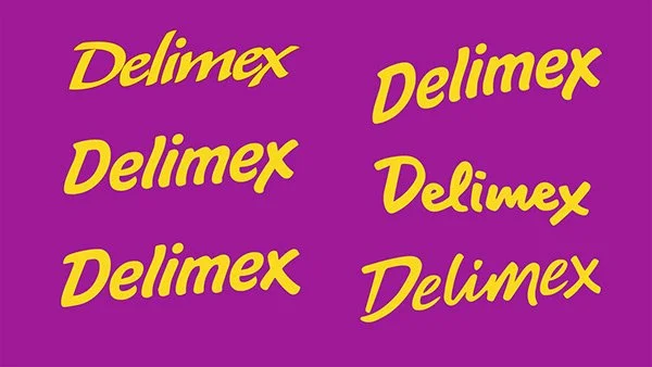
The redesign focused on turning up the flavor. We started by auditing Delimex’s existing visual equities to understand what mattered most to loyal shoppers. The logo was reimagined as an evolution rather than a replacement– keeping the spirit of the original mark, while introducing cleaner forms and a more confident expression that feels modern.
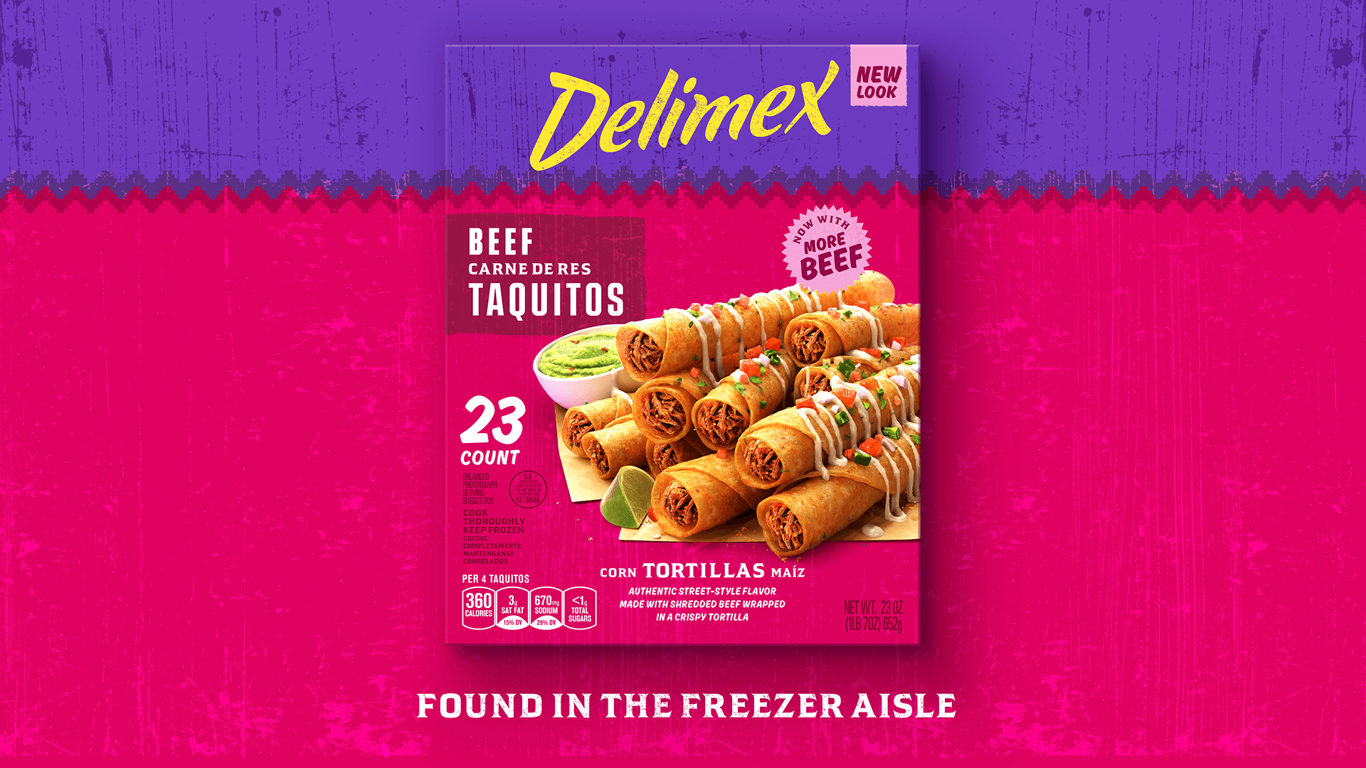
In a high-velocity, crowded category, we evolved Delimex’s visual identity to drive immediate shelf conversion without sacrificing legacy consumer trust. The strategic restage upgraded key equities – elevating product photography to hero taste appeal while modernizing the primary mark to signal premium quality to younger, flavor-focused shoppers.
Outcome
Brand Strategy & Positioning
Portfolio & SKU Optimization
Visual Identity
Logo Design
Brand World Design
Packaging Design
Concept Development & Iteration
In collaboration with Jones Knowles Ritchie


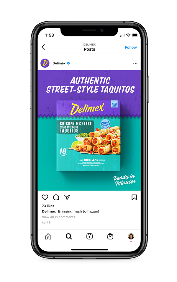


COLOR ARCHITECTURE AND NAVIGATION EFFICIENCY
We transformed the color system into a functional packaging framework designed to maximize brand block visibility and speed up shopper decision-making:
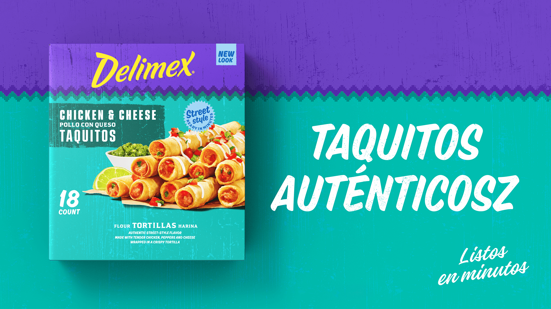
High-Impact Brand Blocking: Used hyper-vibrant brand colors to cut through cold-case glare and establish clear visual ownership of the door
Streamlined SKU Navigation: Standardized variant callouts and ingredient hierarchy across the portfolio to optimize shopper find-time and increase basket building across flavors


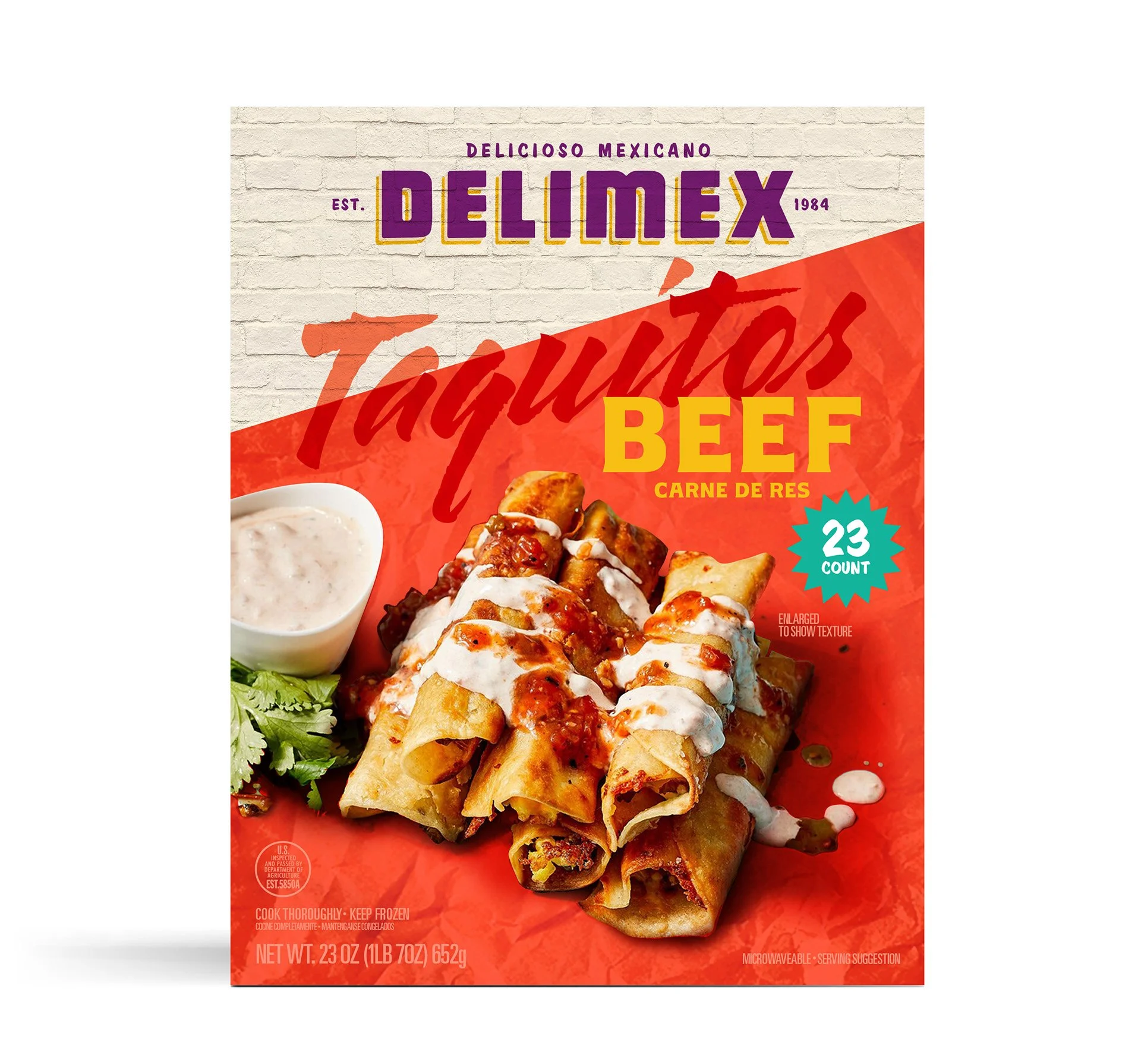

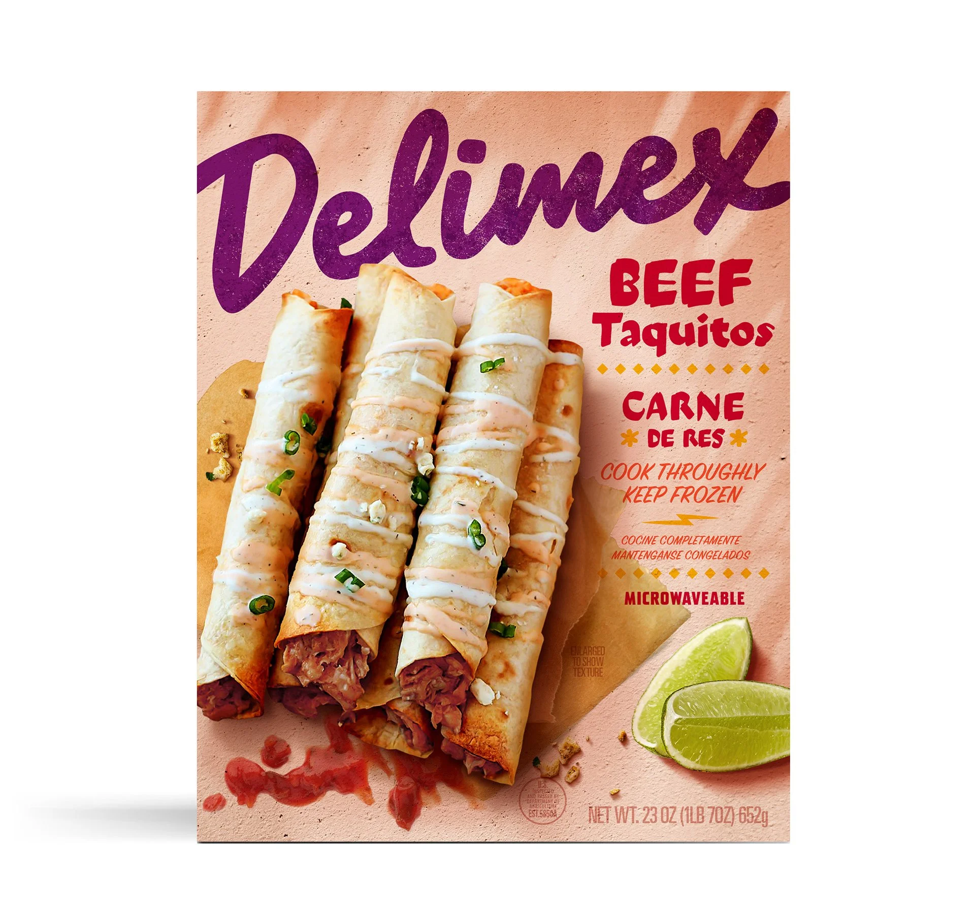


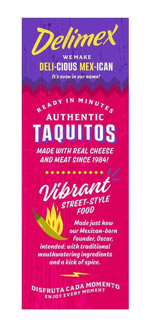
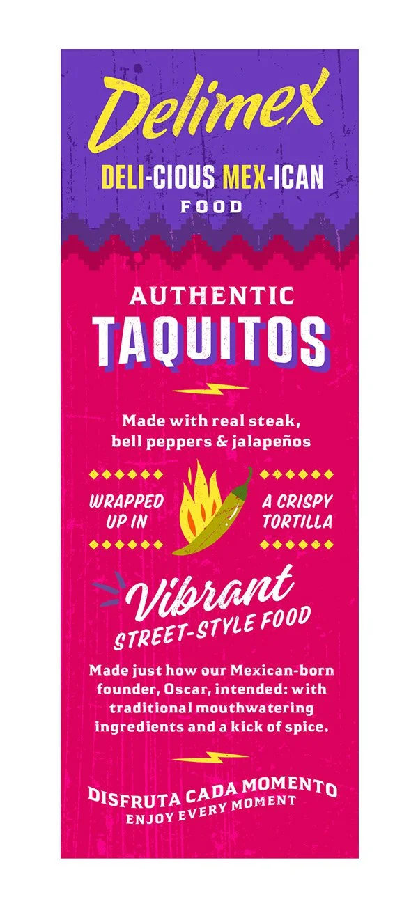
To drive value across every inch of retail packaging, we re-engineered secondary surfaces into strategic brand touchpoints. We turned side panels into active brand storytelling surfaces, driving post-purchase engagement and reinforcing premium value.

EVOLVING A LEGACY ICON
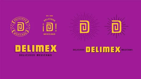
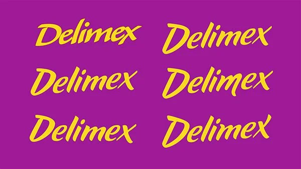
The Delimex identity explore was an exercise in strategic stretching. We moved through a range from close-in refinements of existing equity to farther-out concepts. The goal was to protect the heart of what shoppers already recognize while pushing the brand into a more modern space.
By experimenting with icons and fluid, hand-drawn scripts, we bridged the gap between heritage and movement. The close-in work sharpens the brand's familiar authority, while the farther-out explores (like the spiral "D" monogram and gestural brushwork) transition the narrative from a frozen staple to a vibrant, street-food-inspired experience. This range ensures the brand maintains its trust at shelf while gaining the fresh edge needed to capture new audiences.
This exploration shows how a legacy CPG brand can maintain its core identity while evolving for a modern consumer.

Modernizing Category Leaders