Beauty meets groceries?!
Beauty meets groceries?!
Was in Sephora doing a design audit
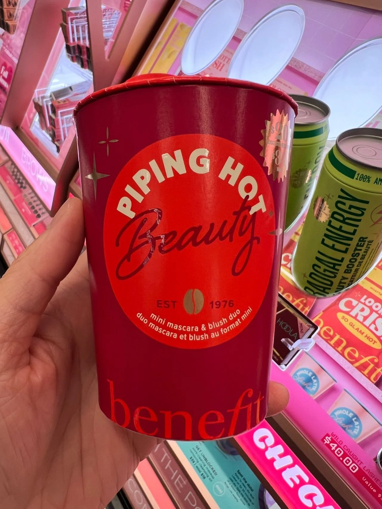
And stumbled on this beauty mashup-
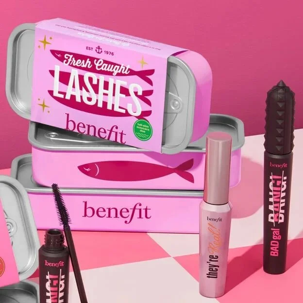
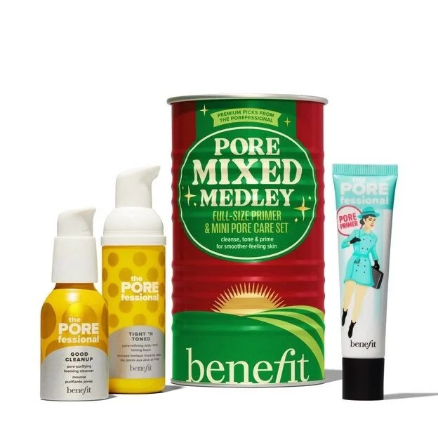
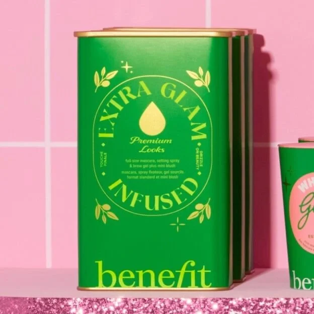
Benefit Cosmetics has a product line packaged like pantry staples
A surprising merging of two worlds!
The design is a playful nod to everyday kitchen items, with each product resembling a familiar food container
—-
It’s an unexpected approach that instantly grabs attention
In a sea of beauty bottles and tubes that all look the same
This somehow worked because of the element of surprise
And makes for great unboxings for social!
—-
Packaging design plays a crucial role in attracting consumers and driving purchase
Beauty and food move in different ways-
but there are fundamental overlaps when it comes to design levers
—-
Color:
Color psychology is imporant for evoking emotions and associations
Typography:
Font selection can convey brand personality and signal premiumness
Materials:
Can influence the perceived quality, luxury, and sustainability of a product
Structure & Shape:
Impacts functionality, shelf appeal, and brand recognition
Tactile Experience:
The feel and texture of packaging can enhance the brand experience
—-
I’m not a big makeup girlie but these would make great gifts!
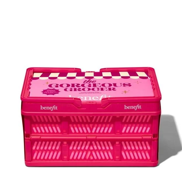
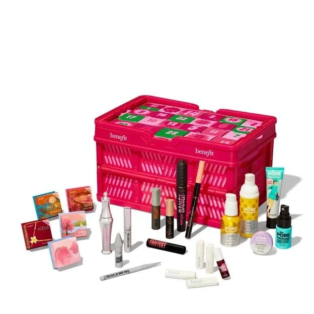
“The Gorgeous Grocer” comes in a grocery basket and opens up into a delightfully indulgent advent calendar of products
What’s your fave out of these?!
