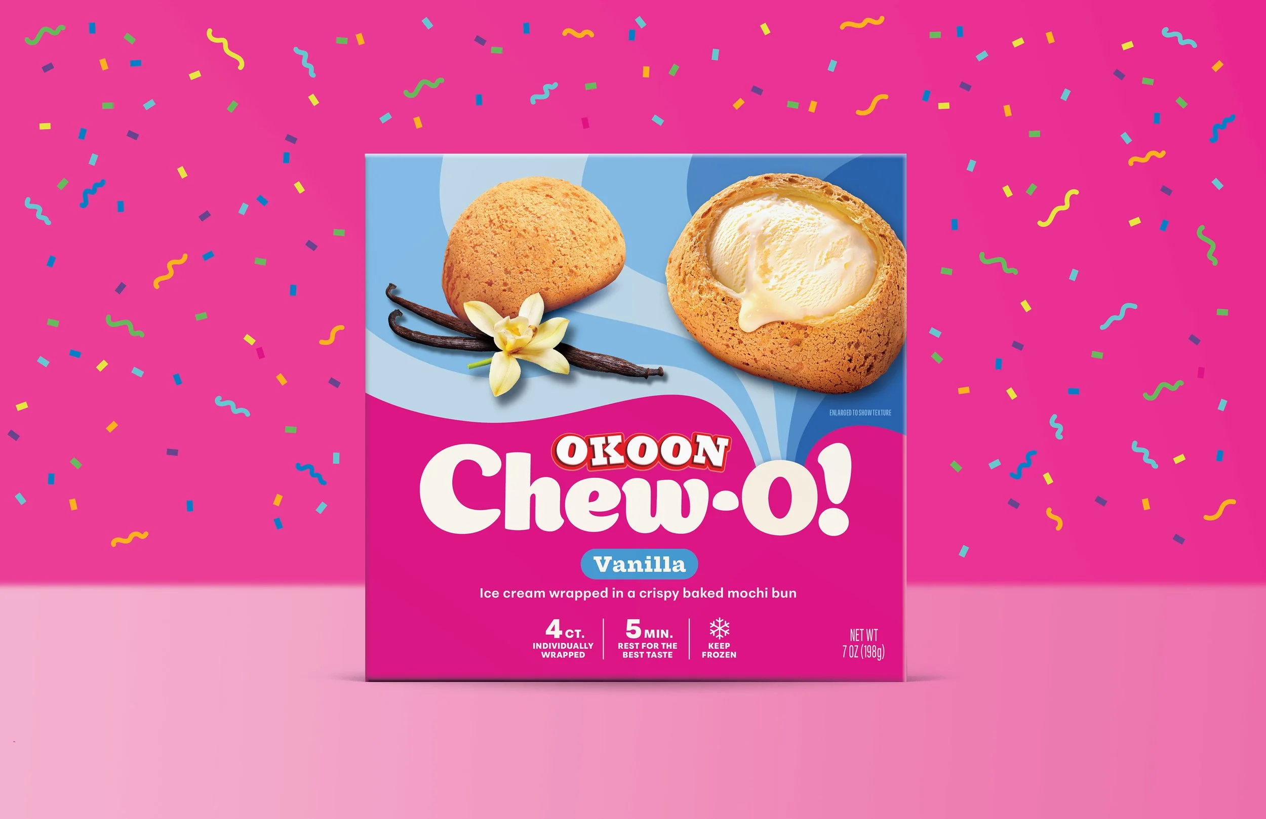
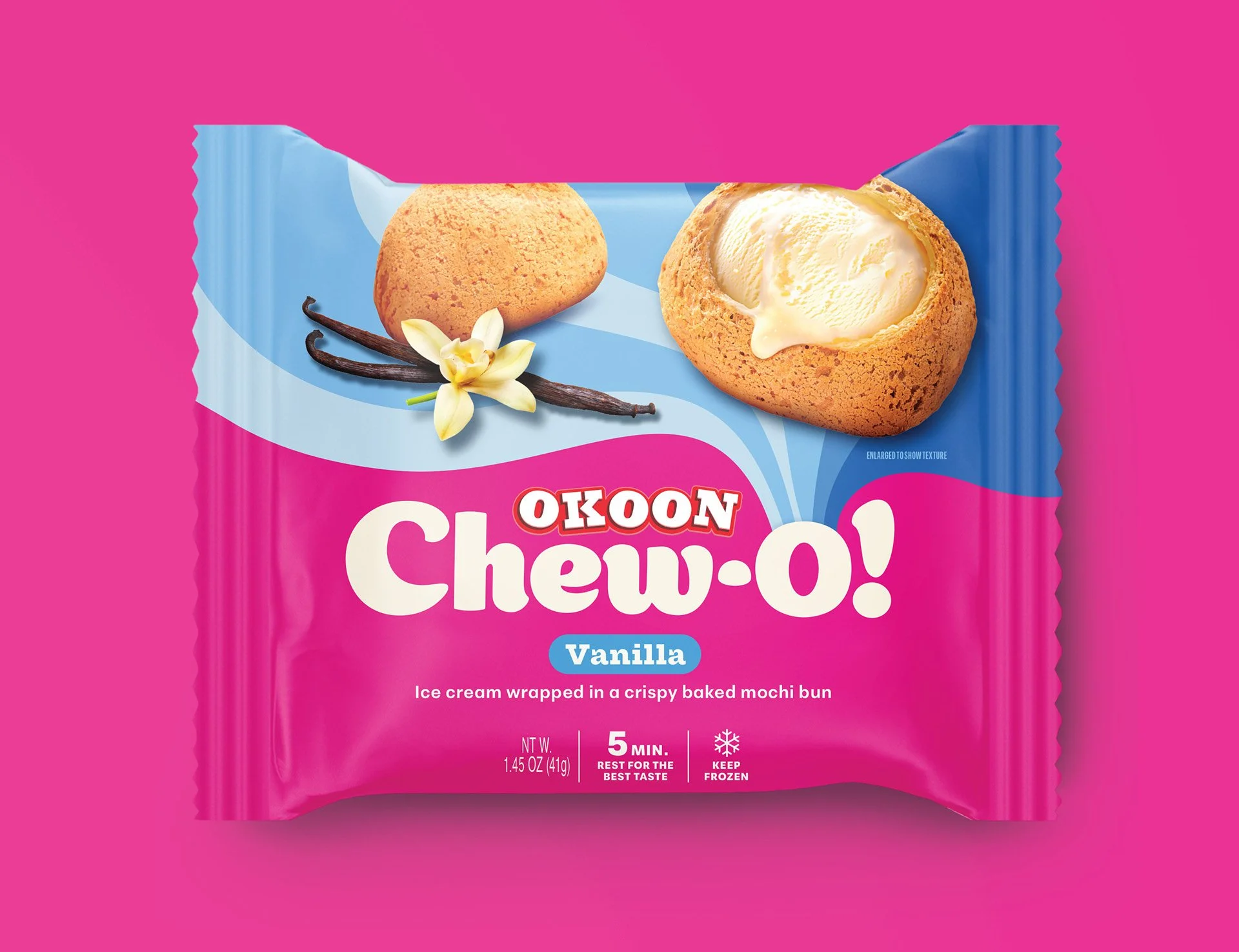
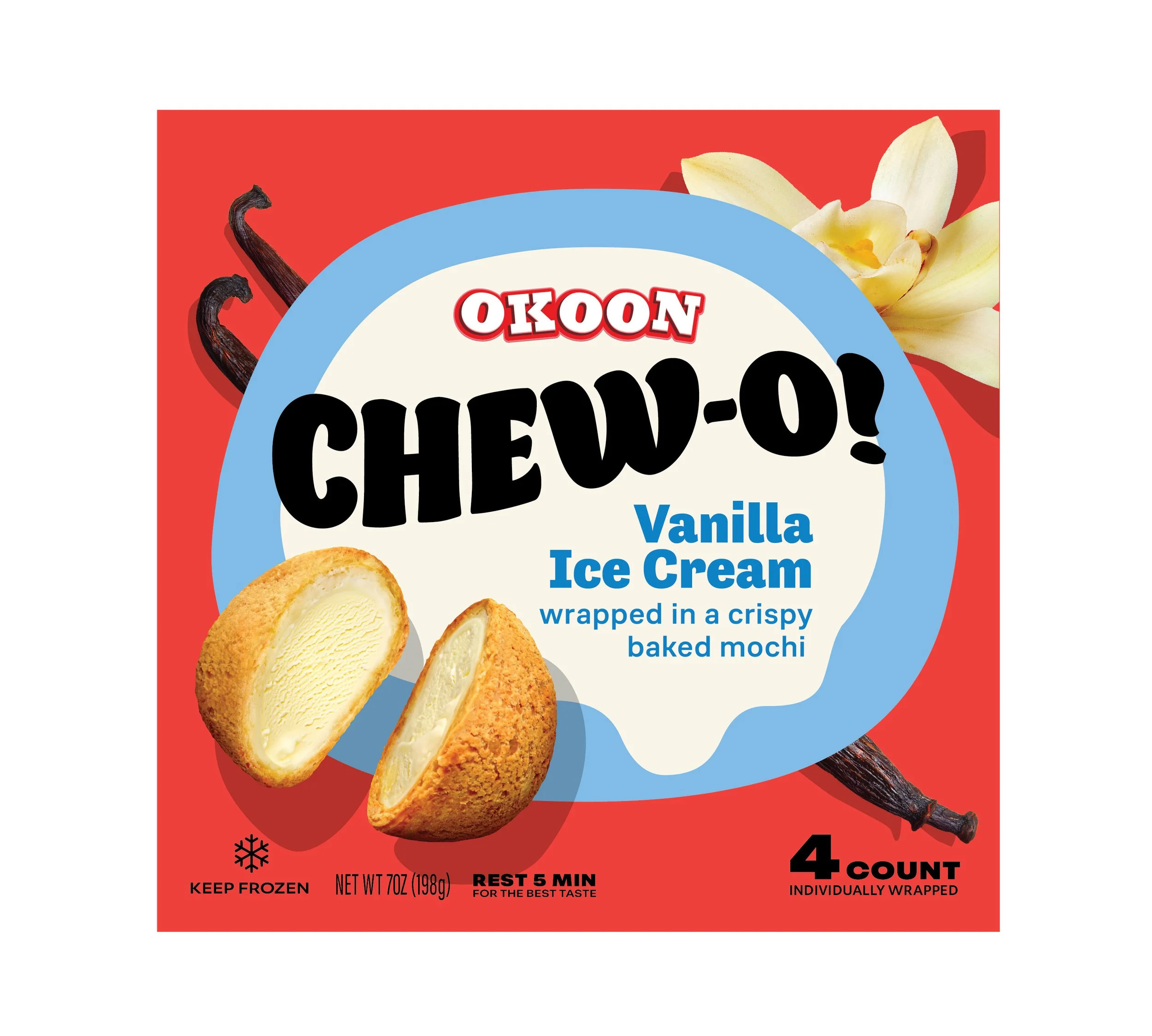
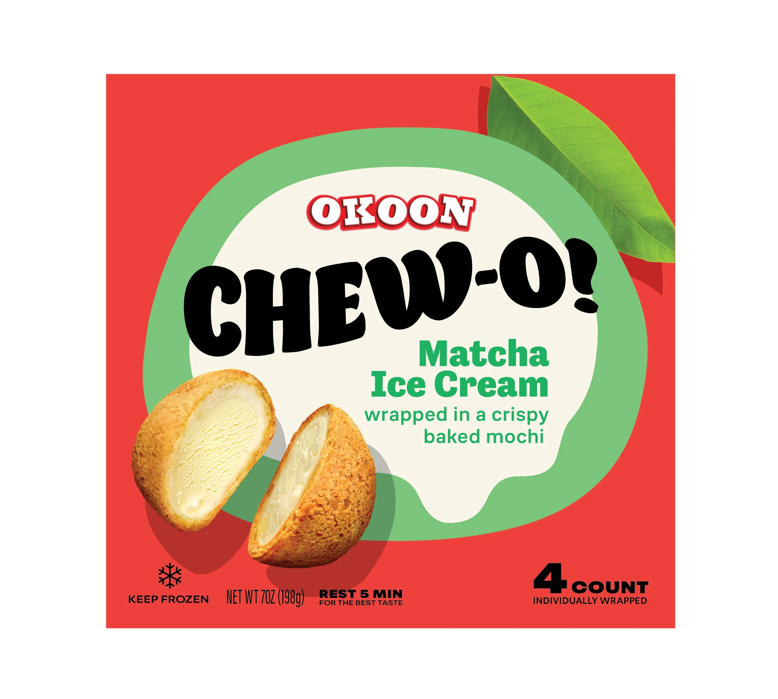
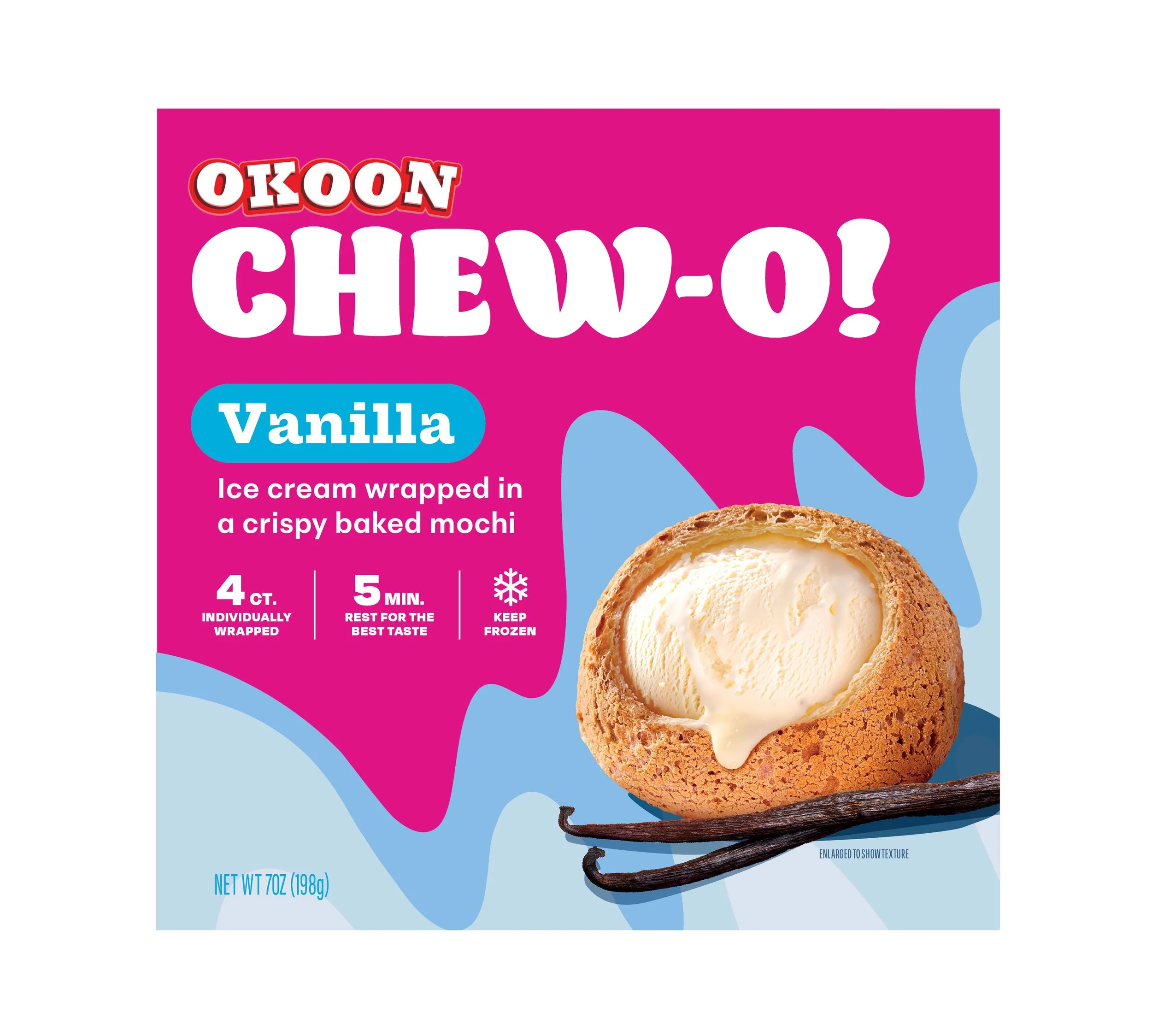
Chew-O!
Chew-O! was launching an innovative ice cream-filled mochi into a crowded frozen dessert aisle. The design needed to communicate indulgence, playfulness, and versatility while immediately standing out on shelf. Beyond that, the packaging had to be future-proof, creating a foundation for new flavors or formats without requiring a complete redesign.
Market Opportunity
Outcome
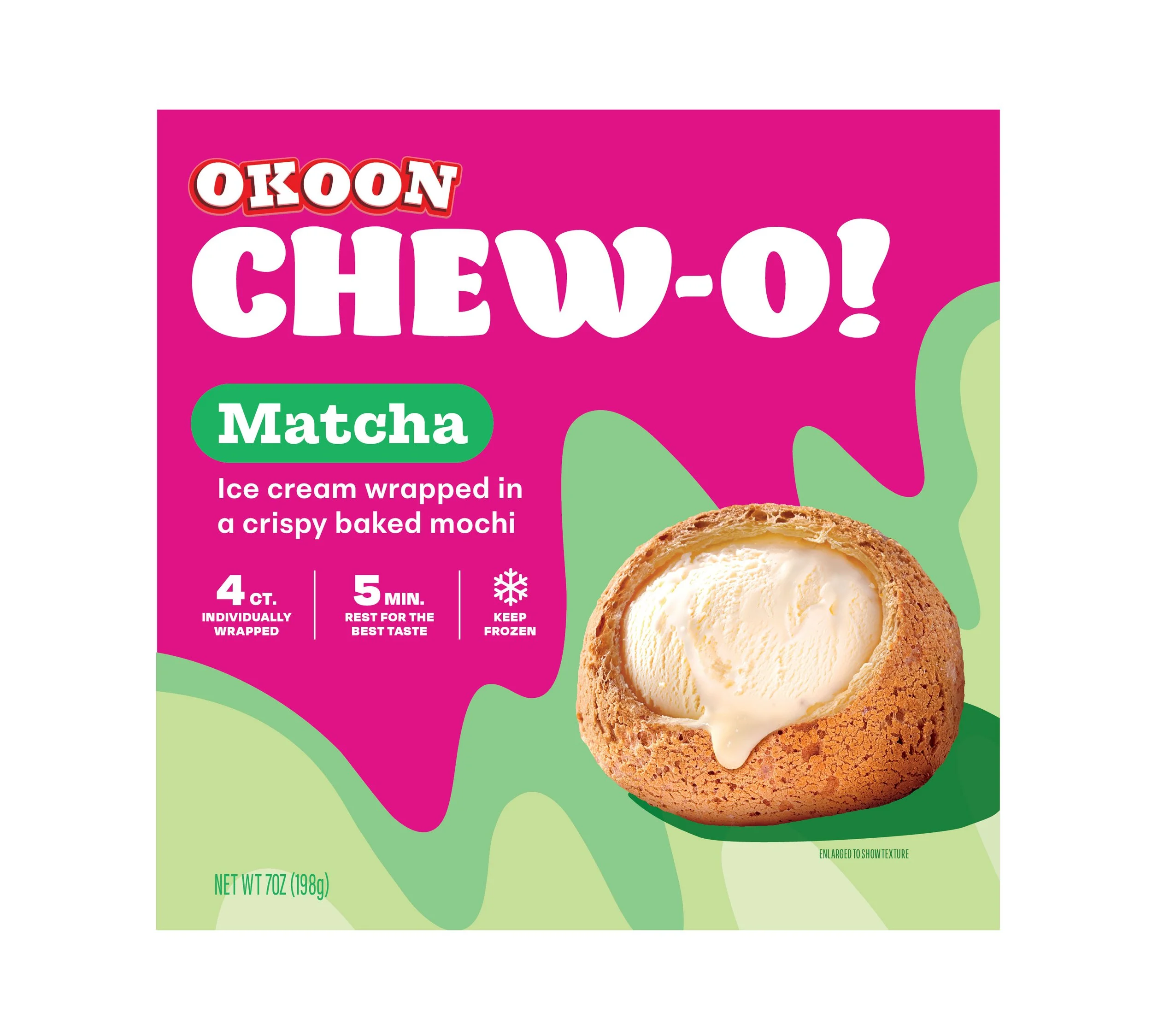
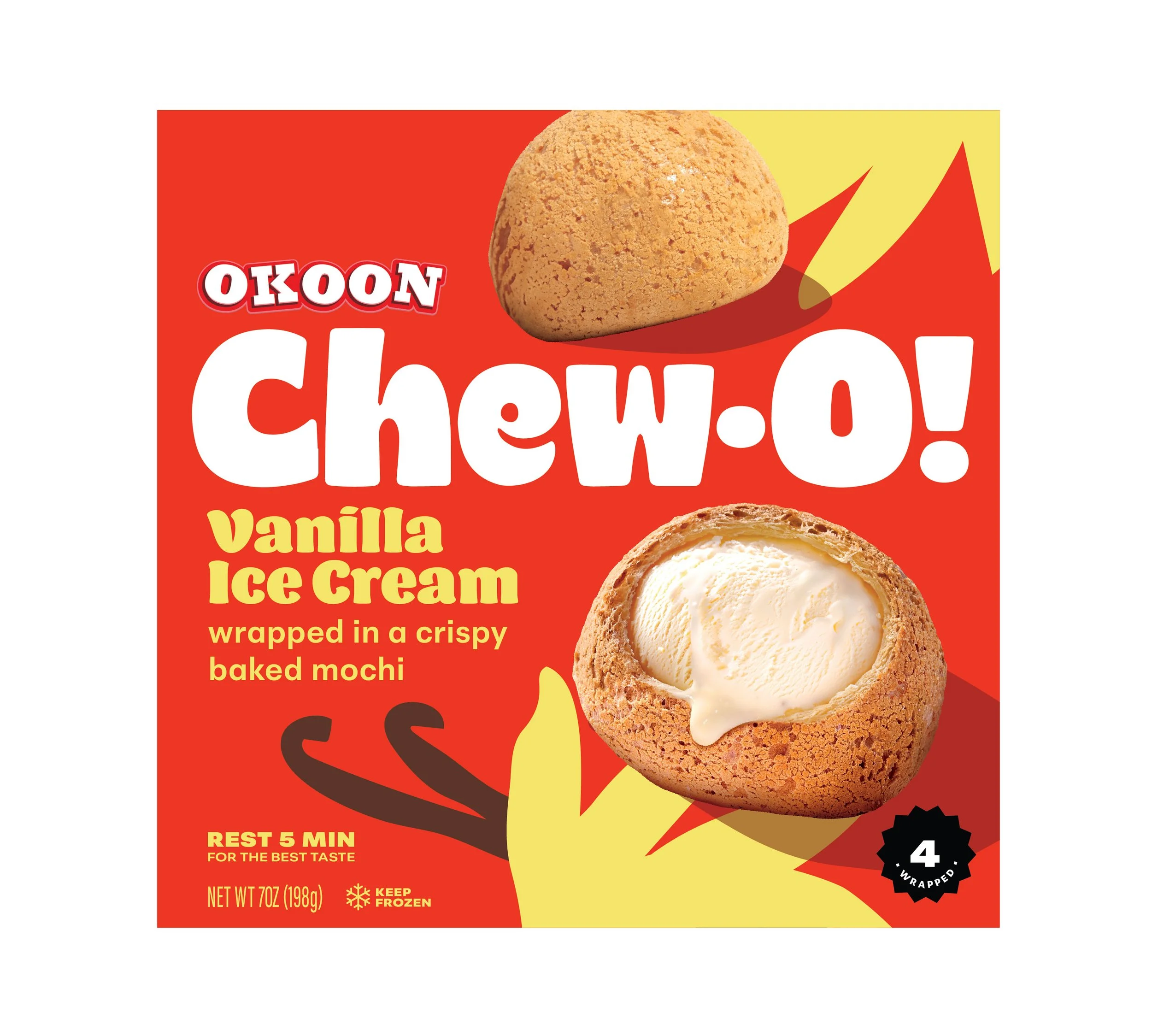
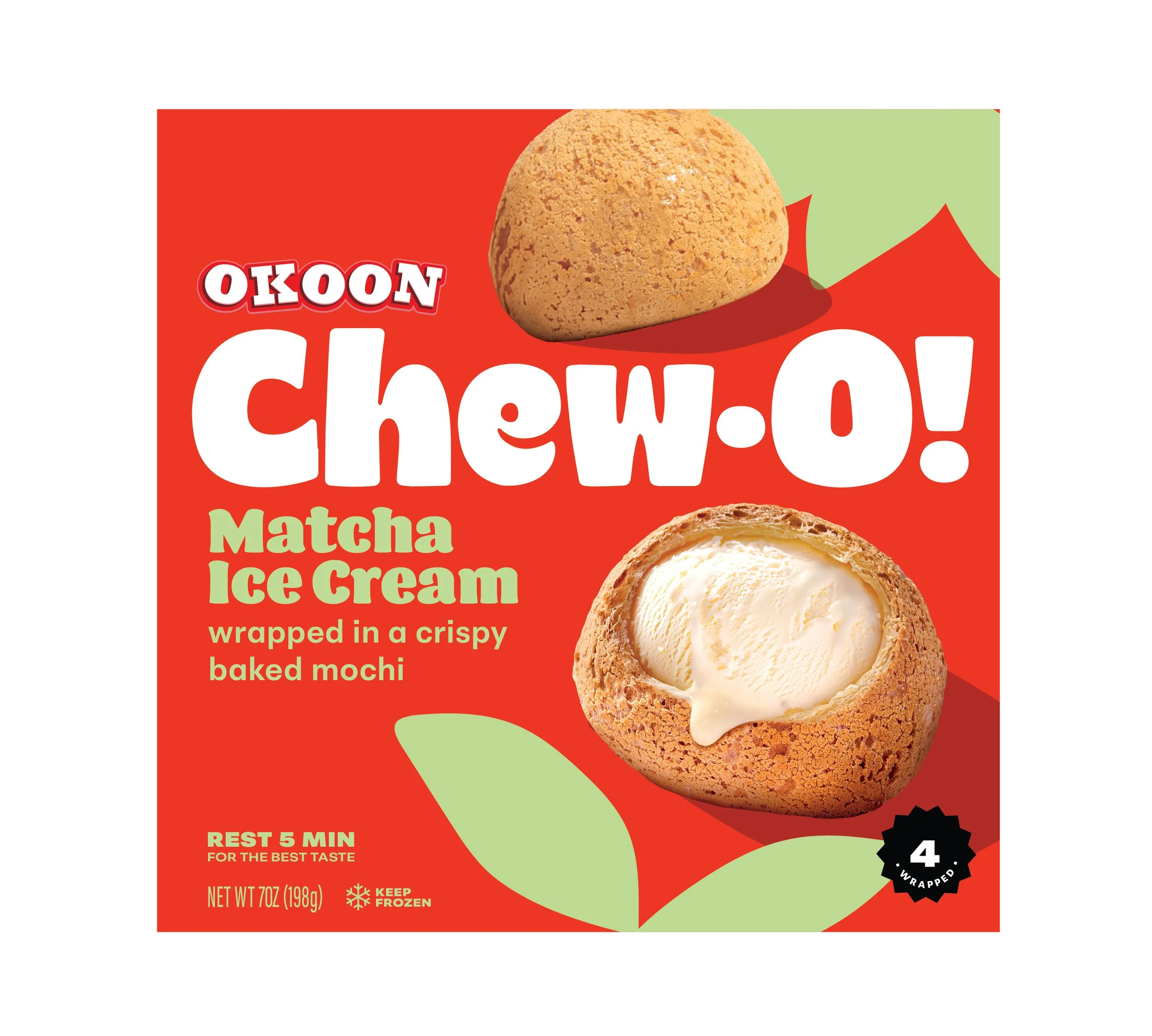
A vibrant brand identity was crafted around the idea of "a bite into happiness", using playful typography and a bright color palette. The bursting rays emanating from the logo symbolize the excitement of that first bite, a dynamic explosion of textures and flavors. Chew-O! is more than just dessert– it’s a sensorial taste experience! The crispy, golden mochi bun gives way to creamy, indulgent ice cream, creating a sensorial contrast that’s both surprising and satisfying.
Brand Strategy & Positioning
Visual Identity
Logo Design
Brand World Development
Packaging Design
Concept Development & Iteration
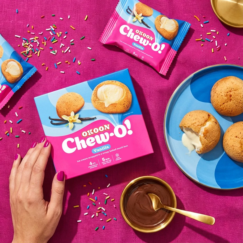
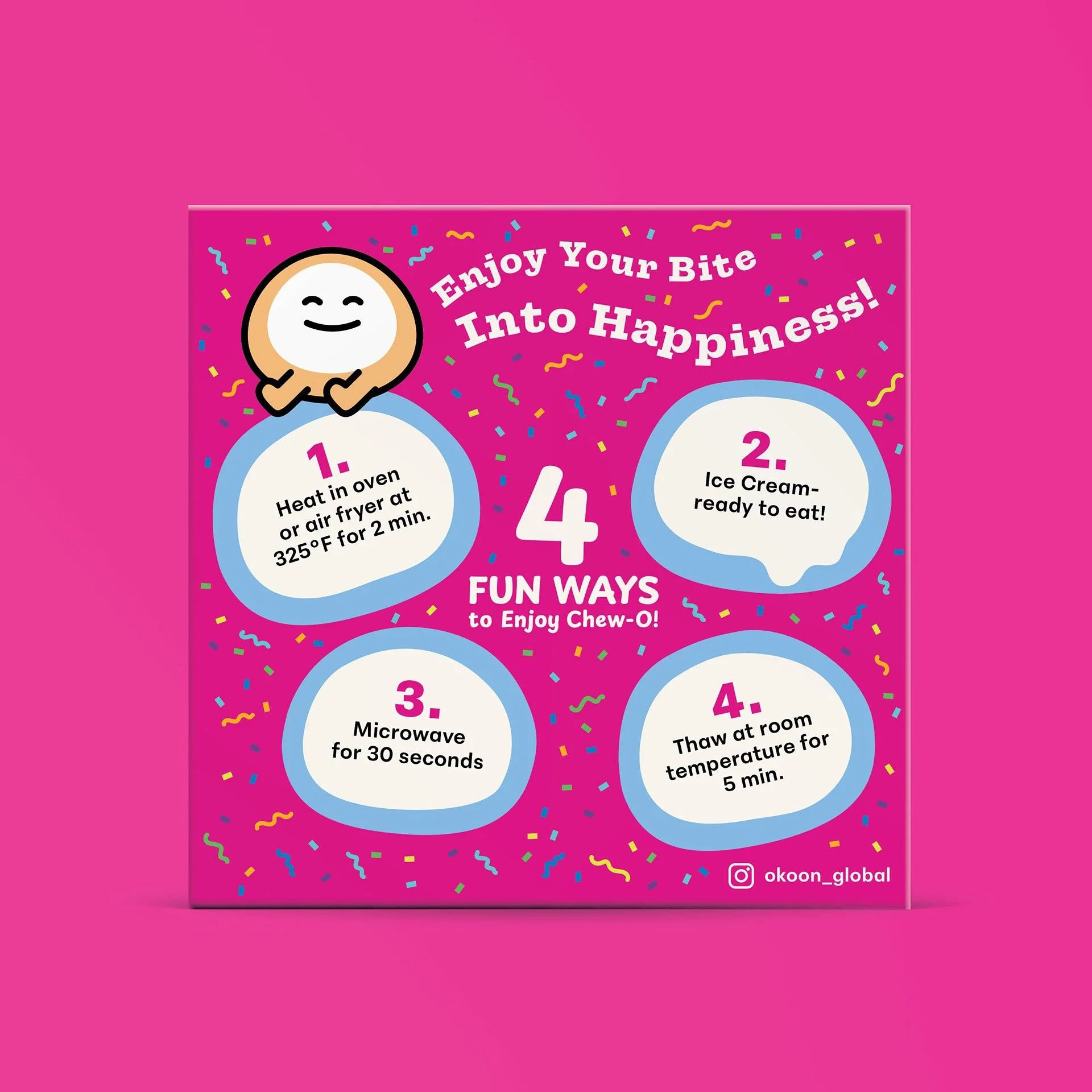
A friendly mascot, OMI, adds personality and guides consumers to explore multiple ways to enjoy Chew-O!, reinforcing the brand’s playful and experiential positioning. OMI helps consumers discover creative ways to enjoy – whether straight from the freezer or melted in an air fryer. Chew-O! invites us to tap into our inner child and take a moment for play and creativity.
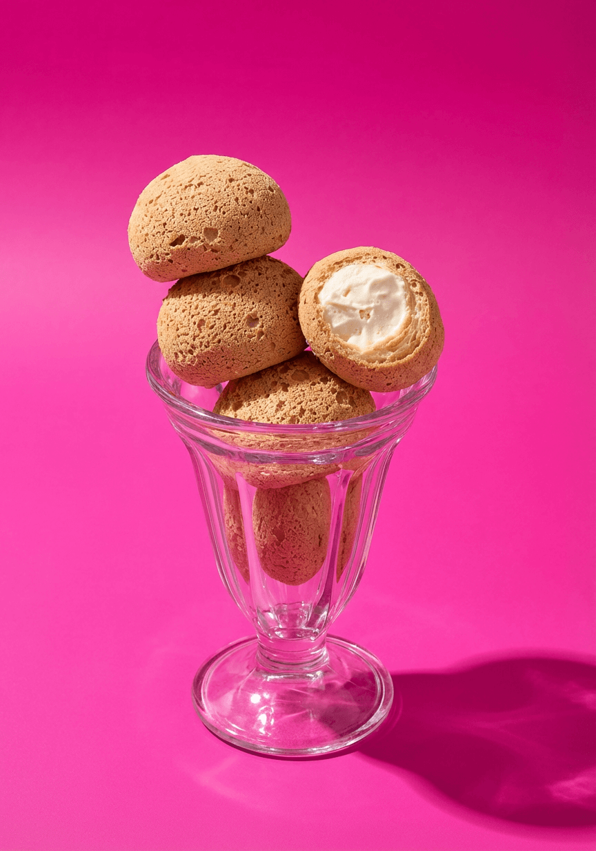
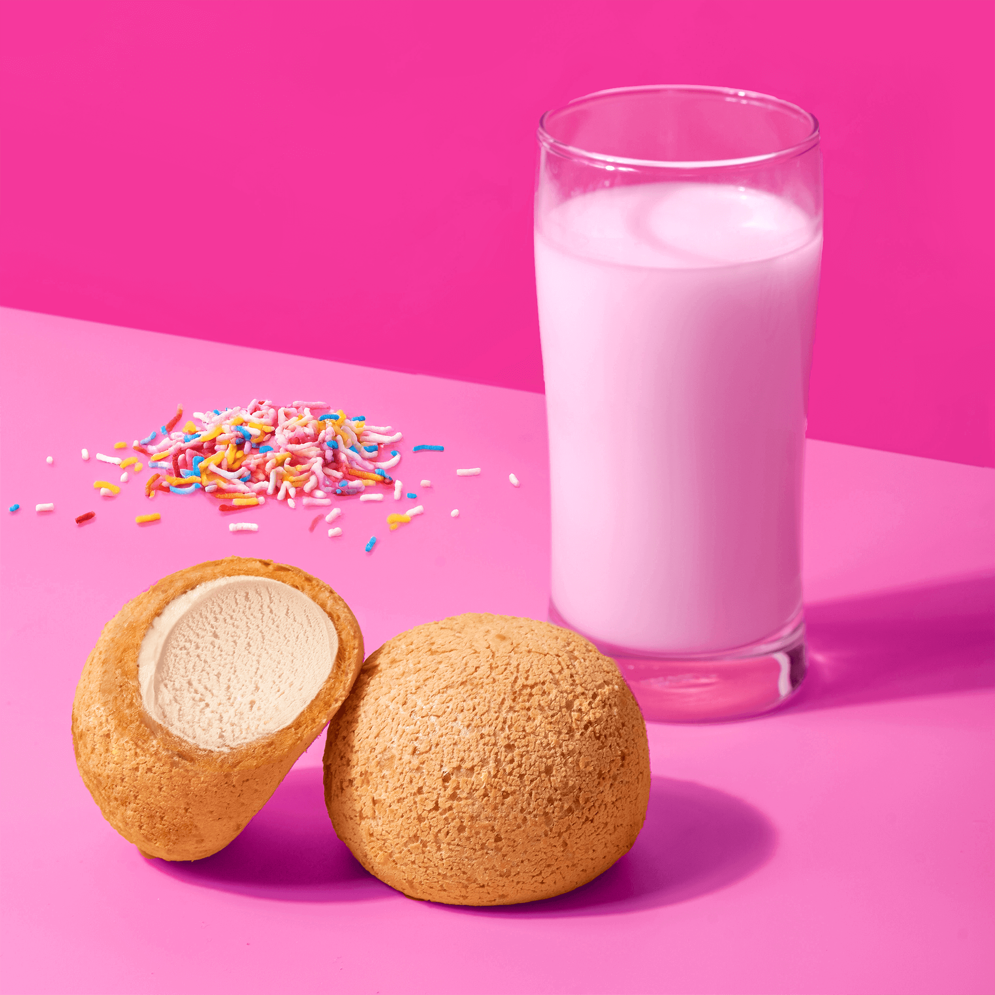
Chew-O! is all about redefining the sensory experience of a frozen treat by leaning into the beautiful tension between heat and ice. The design exploration below showcases a revolutionary baked mochi shell that brings a golden, toasted crunch to the traditional chewiness we love, creating a sophisticated structural contrast with the velvety ice cream core.
By moving away from the soft, powdered exterior of standard mochi, these vibrant packaging design options highlight a "crispy baked" innovation that feels artisanal yet approachable. It is a bold visual statement that promises a multi-textural journey – where the warmth of a bakery-style bun meets the immediate chill of premium vanilla or earthy matcha. It just goes to show that the best innovations happen when you dare to bake what’s usually kept cold!
Preparing Brands for National Retail