Wholesome Pantry
(Shoprite Private Label)
Market Opportunity
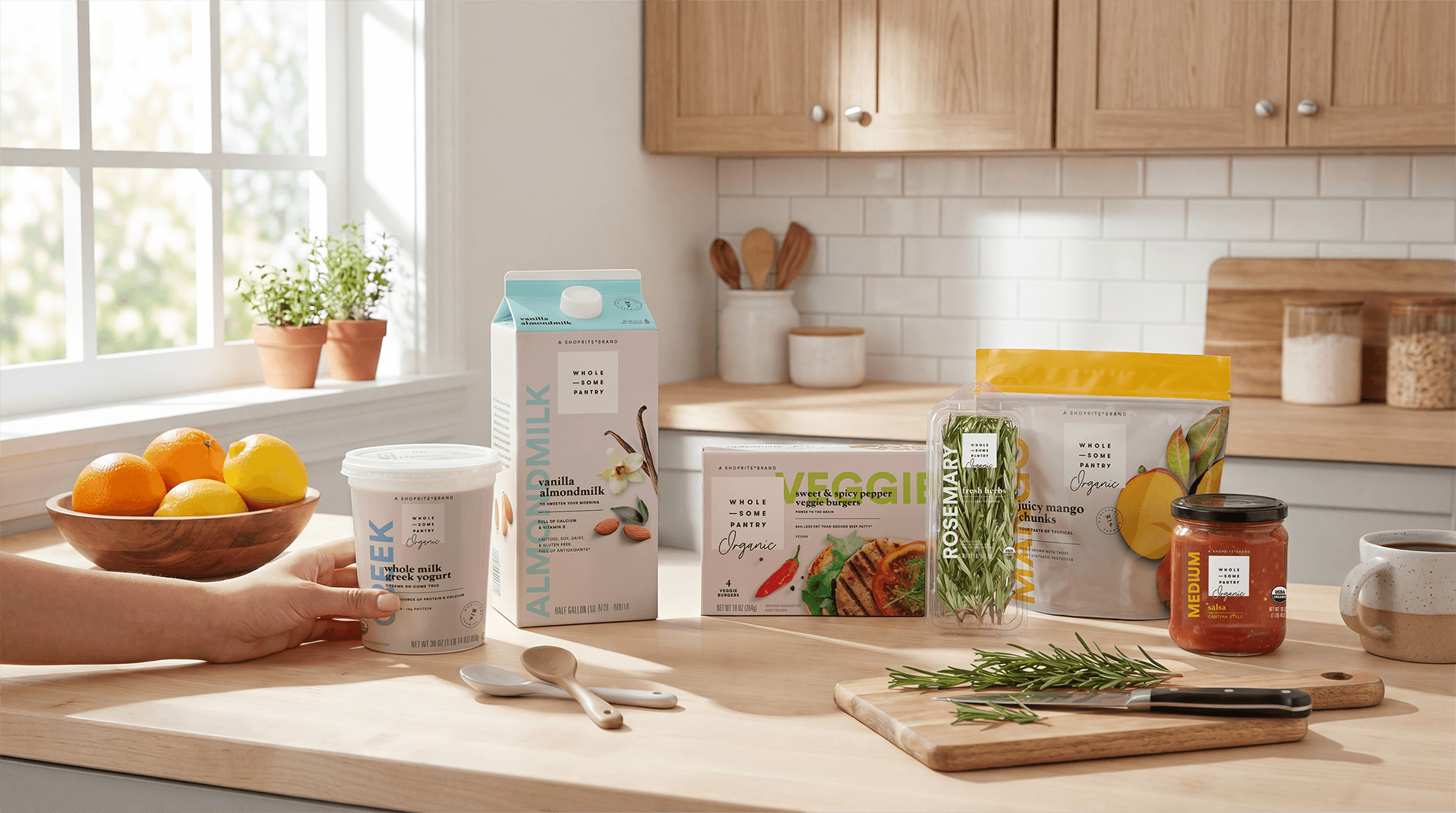
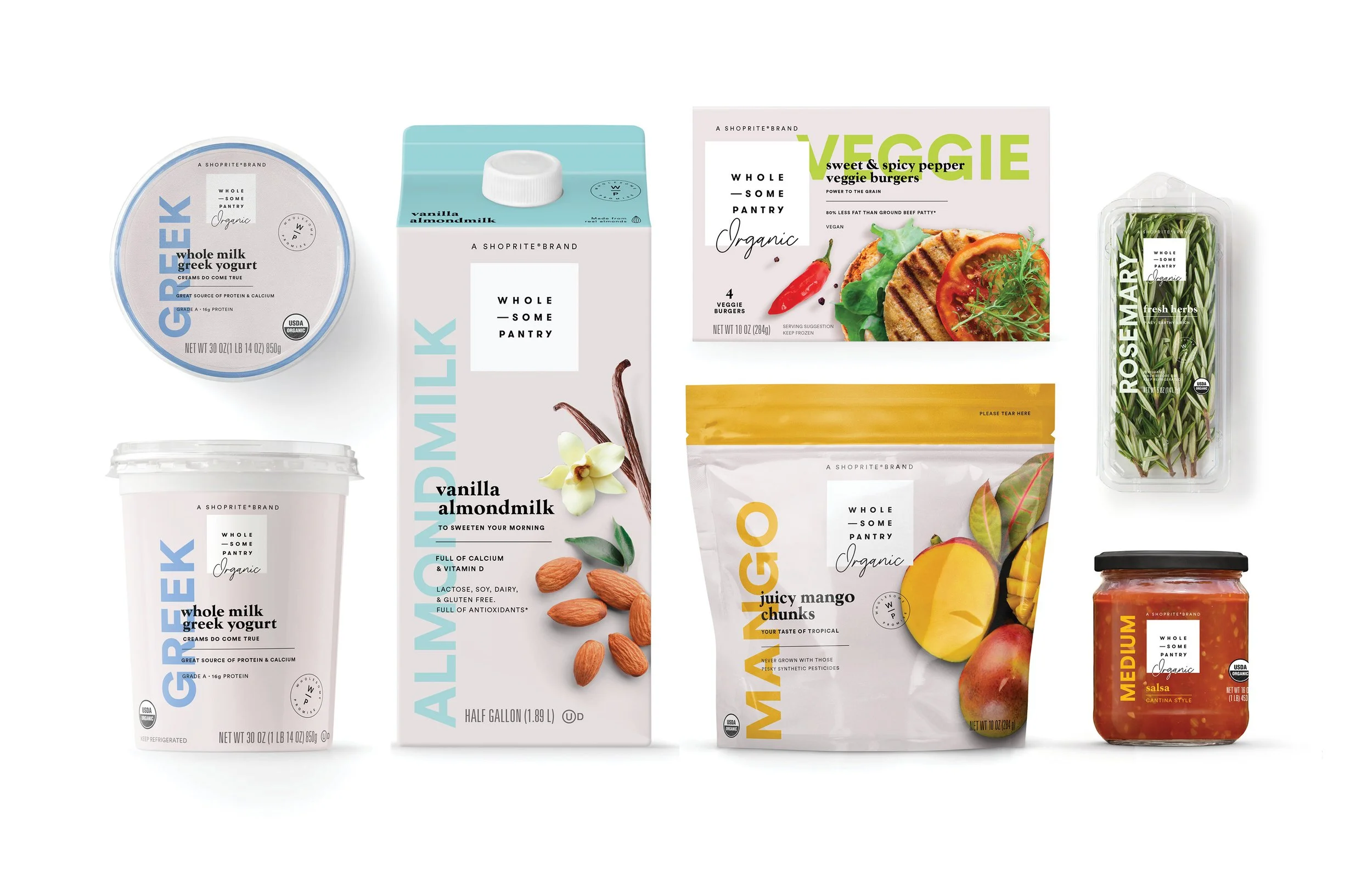
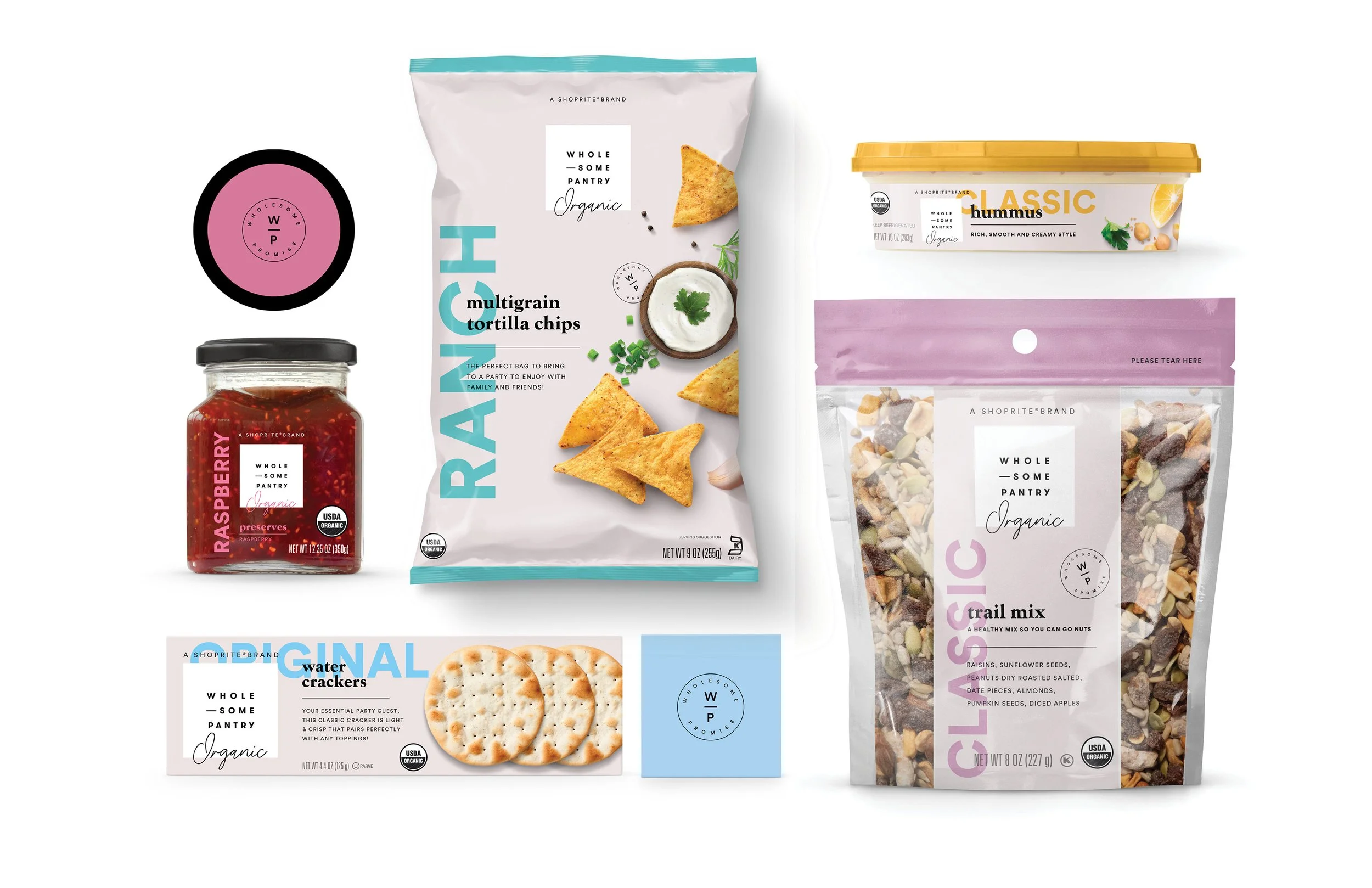
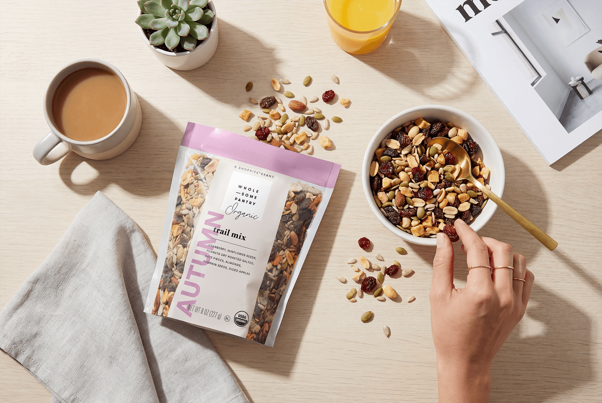
Wholesome Pantry set out to redefine what private label can feel like. Shoppers no longer want copycat, utilitarian packaging– they’re craving products that deliver an elevated brand experience at an affordable price.
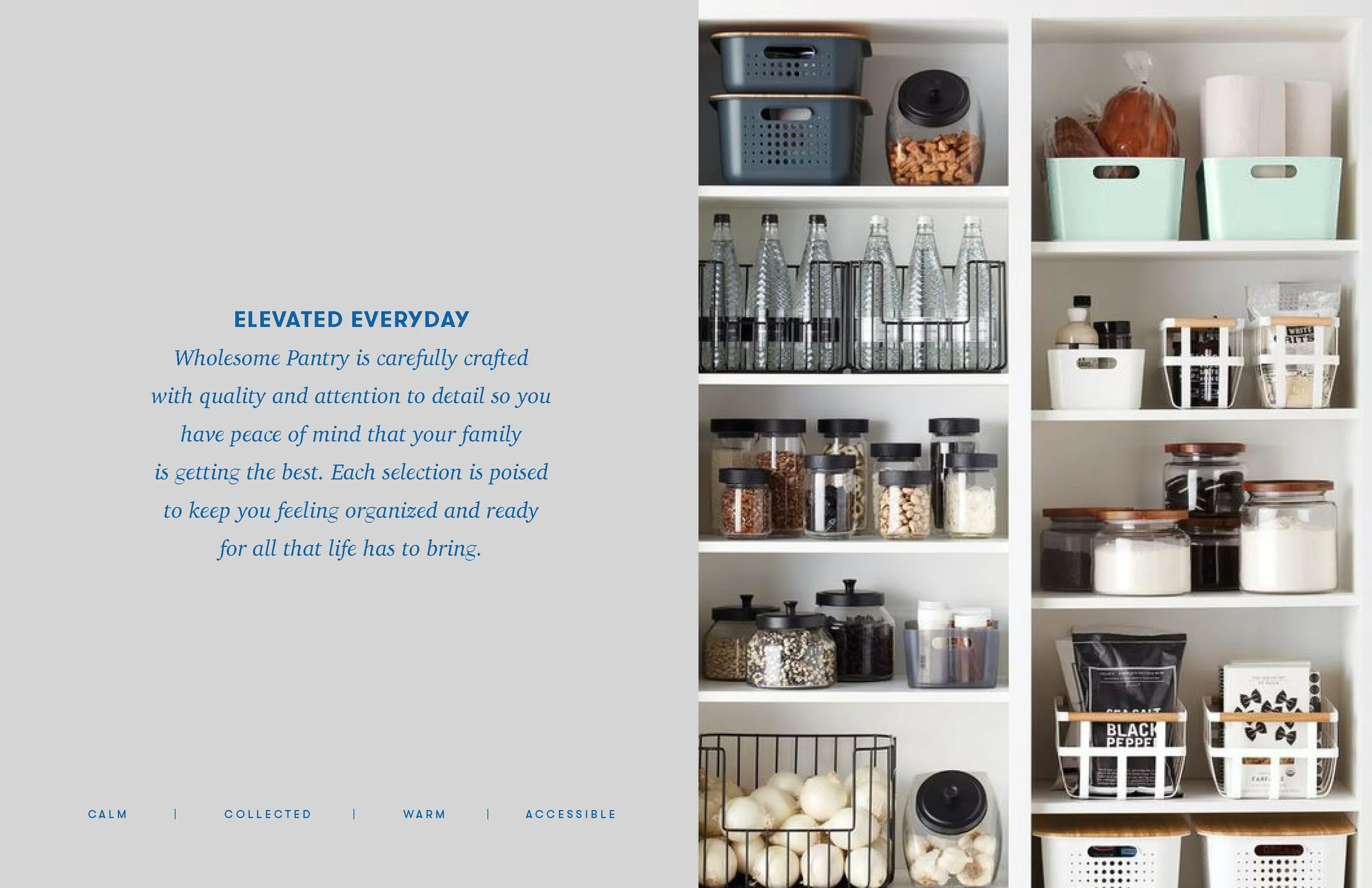
The challenge was to design a flexible system that could work across a large family of SKUs and product lines, providing clarity and navigation for consumers while standing out on crowded retail shelves. The goal was to make Wholesome Pantry feel premium, modern, and pantry-worthy, even in a private label context.
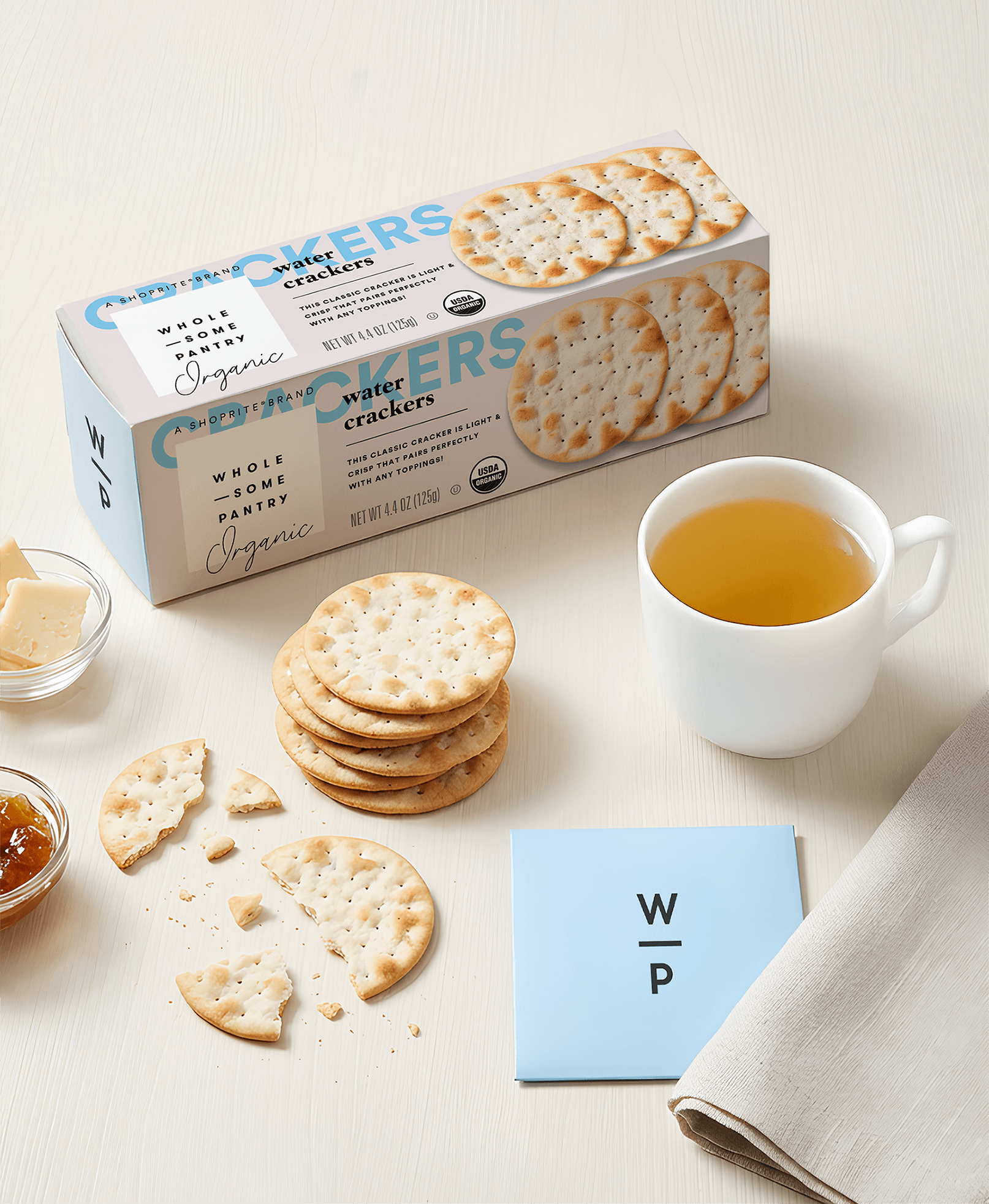
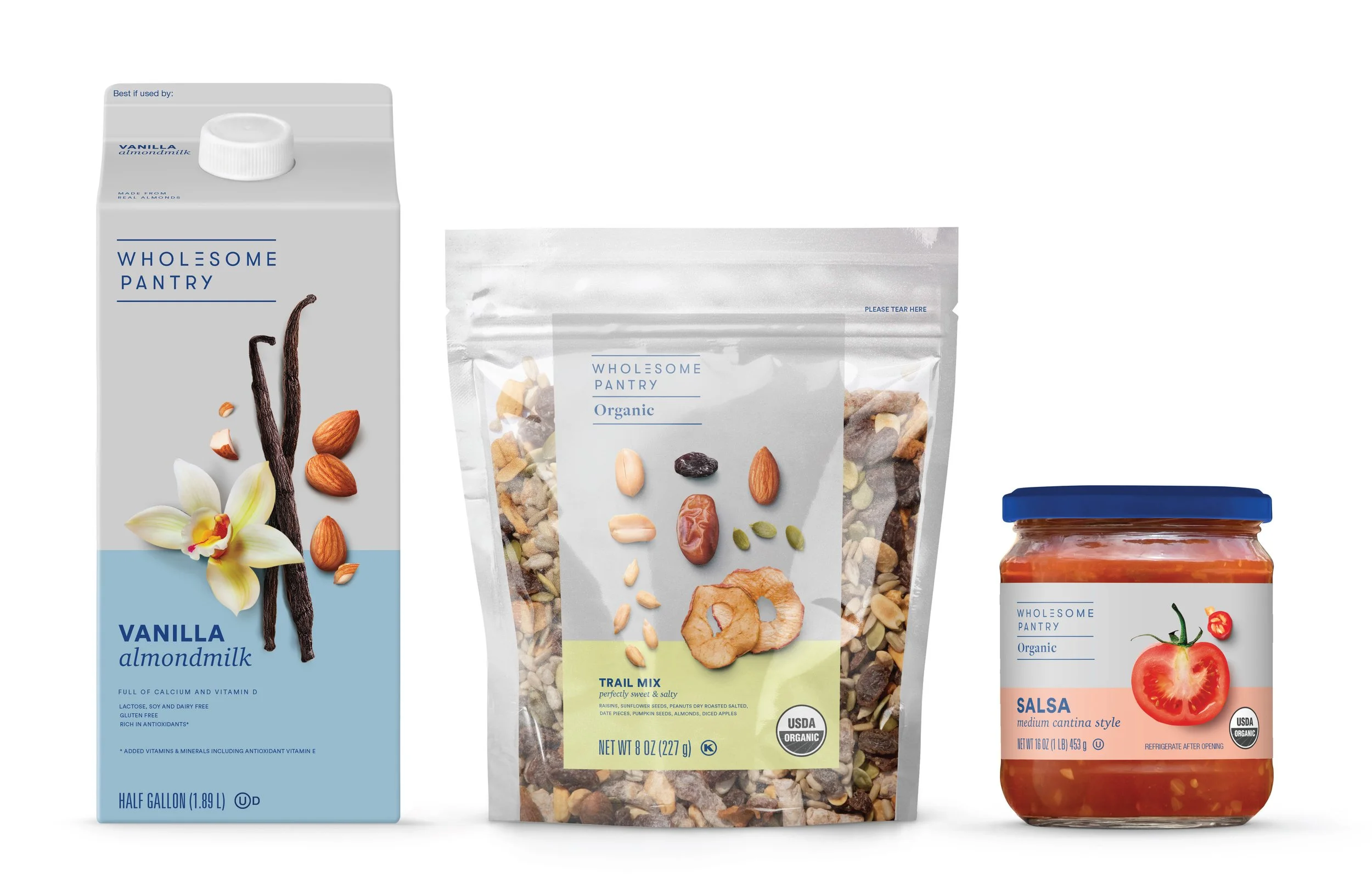
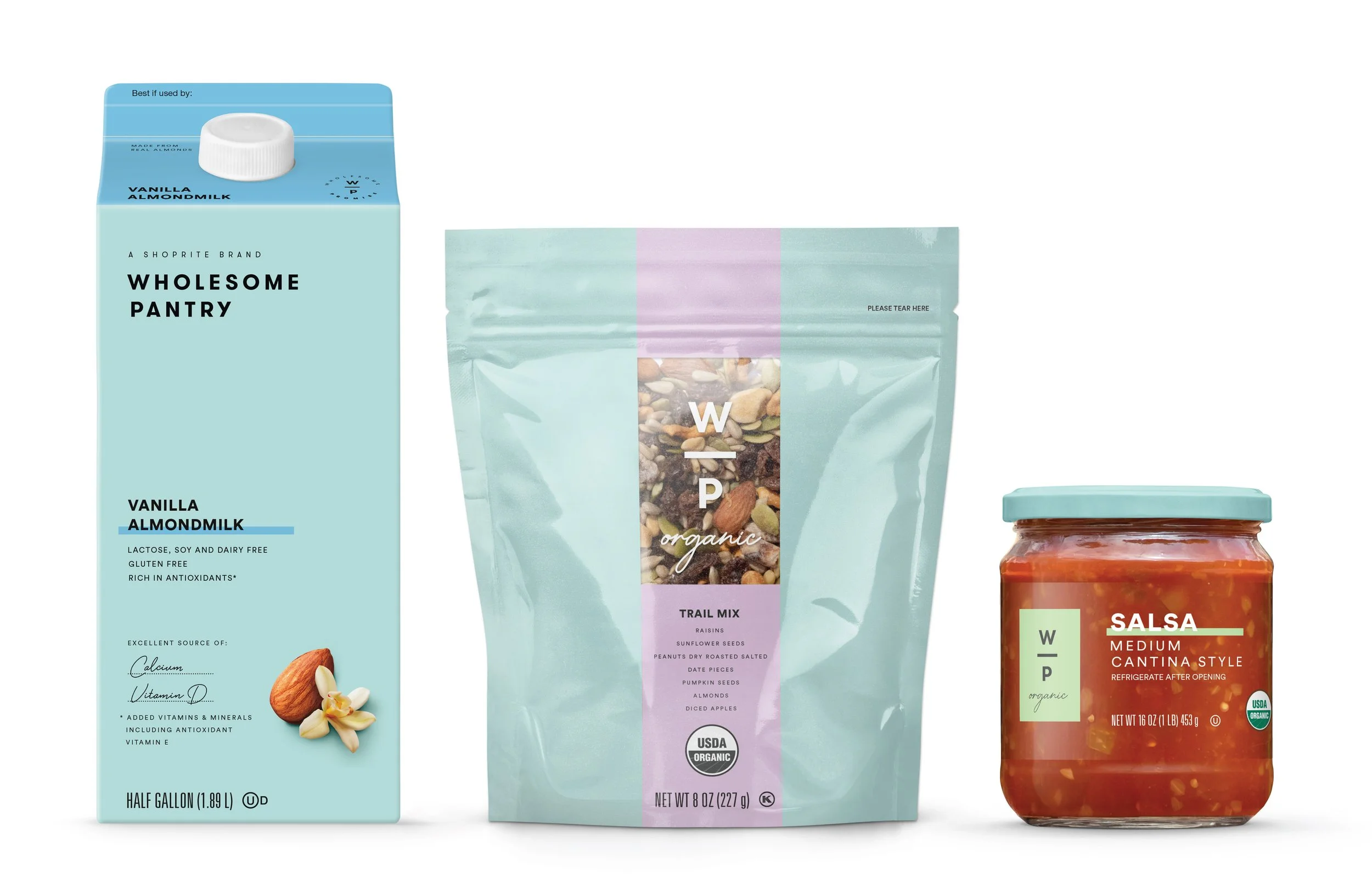
We created a design system that balances functionality with elevated aesthetics. Typography was used in a graphic, structural way, helping organize information across SKUs and product lines while giving the brand a confident, modern personality.
A neutral gray brand block provides consistency and immediate recognition on shelf, while subtle variations in typography and layout allow for clear differentiation between products. The result is a system that feels cohesive, easy to navigate, and sophisticated enough to showcase proudly in any pantry.
Outcome
Brand Strategy & Positioning
Visual Identity System
Packaging Design
Portfolio & SKU Architecture
Private Label Design System
In collaboration with Pearlfisher

CREATIVE EXPLORE
The visual explore for ShopRite’s Wholesome Pantry private label line focuses on a clean, modular architecture that balances modern simplicity with approachable wellness. The design creates a sophisticated identity that feels premium yet accessible within a grocery environment.

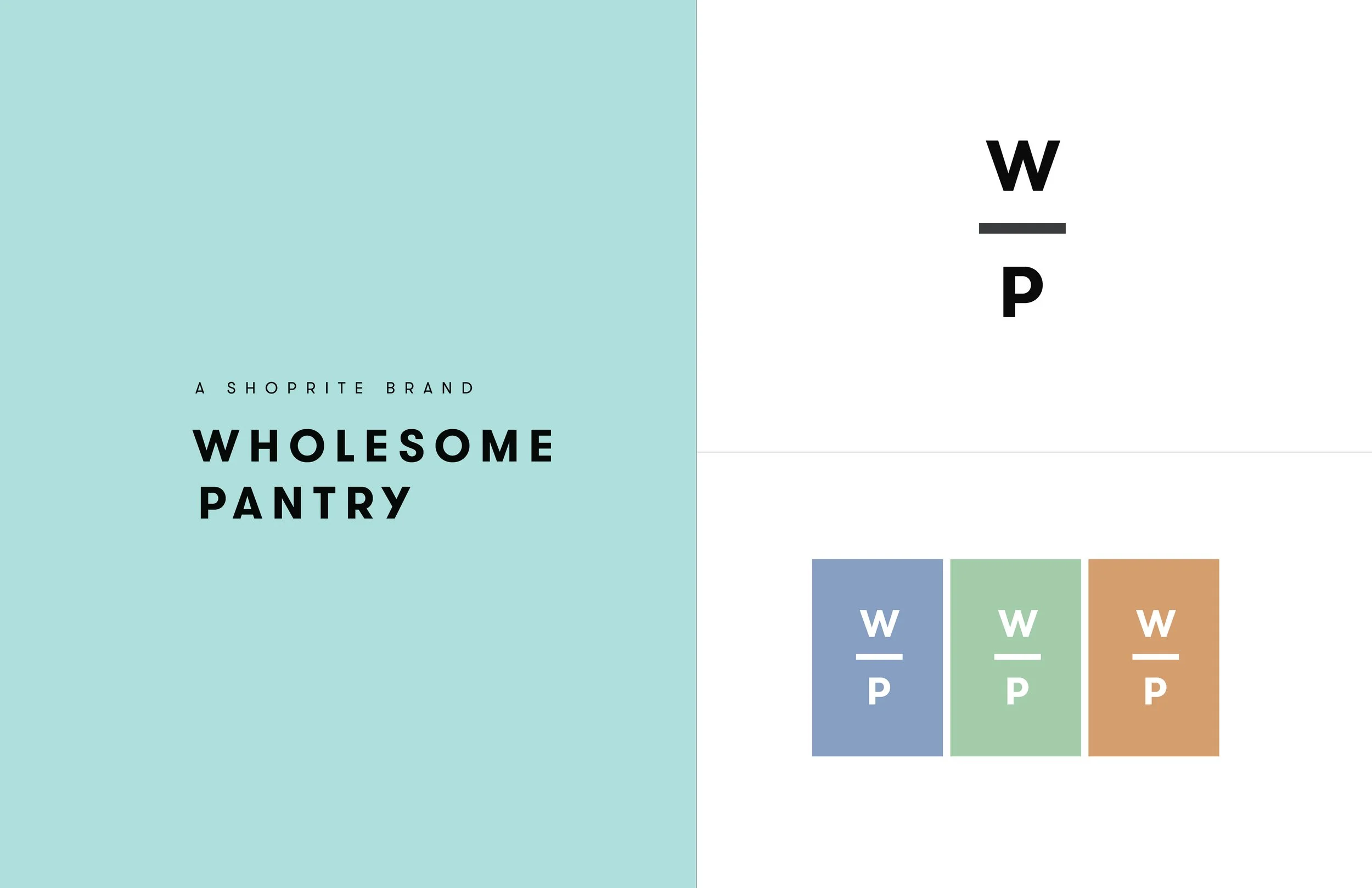
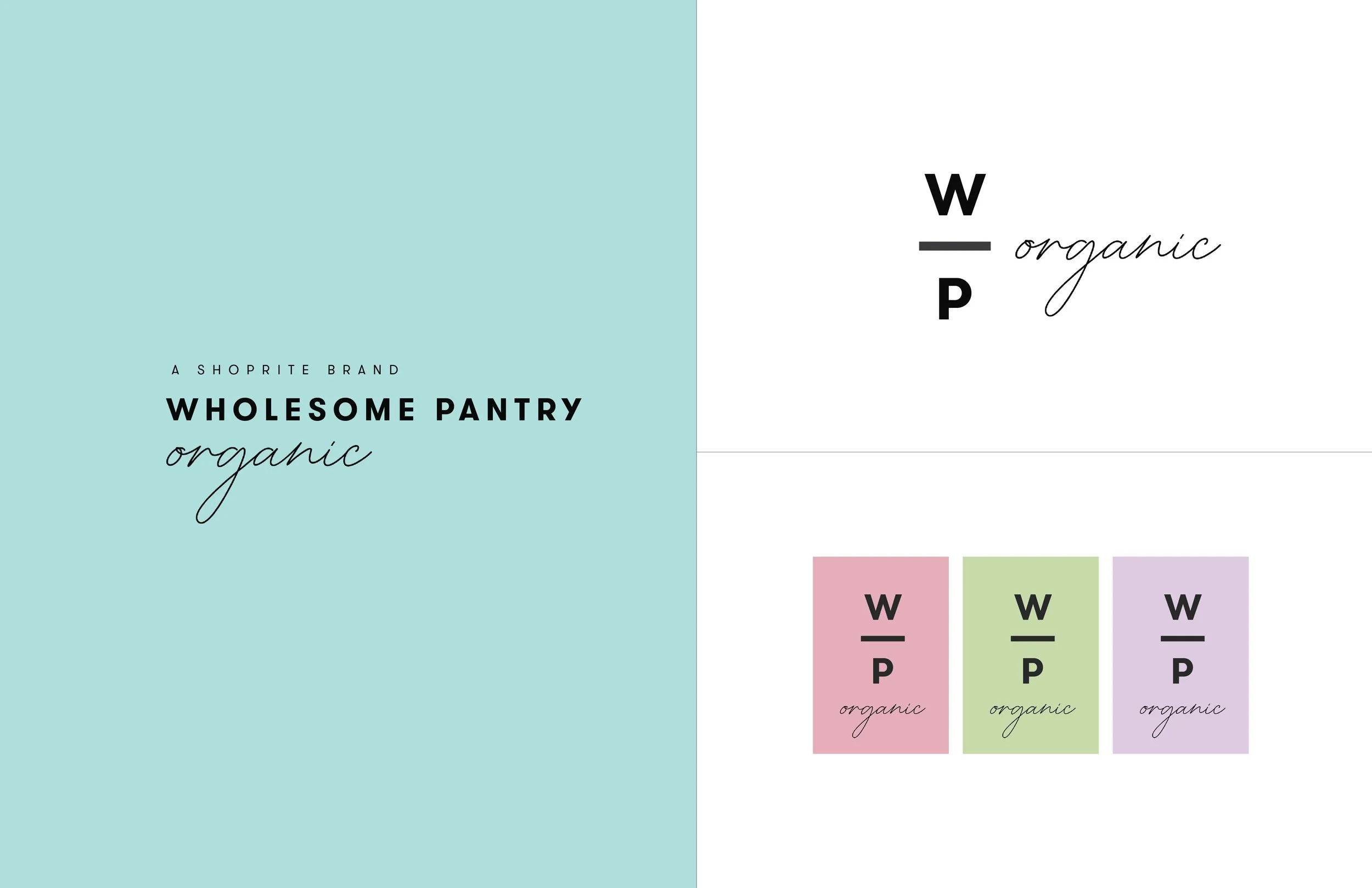
We also explored a stacked "W/P" monogram, which provides a flexible shorthand for smaller packaging footprints while maintaining high brand recognition. This design system option is elevated by a soft color palette that distinguishes between sub-brands like "Organic", ensuring that while the portfolio scales across hundreds of categories, the core promise of wholesome, uncomplicated ingredients remains the unifying visual thread.
Scaling Complex Brand Portfolios

