Nutro So Simple
NUTRO So Simple makes premium dog food with carefully sourced, high-quality ingredients, but the packaging needed to clearly communicate this to pet owners. The challenge was to create a design that conveyed ingredient transparency, quality, and simplicity, while helping shoppers quickly understand the benefits and differentiate between recipes on shelf.
The design needed to feel trustworthy, premium, and approachable, reflecting the brand’s philosophy that feeding your dog well should be uncomplicated.
Market Opportunity
Outcome
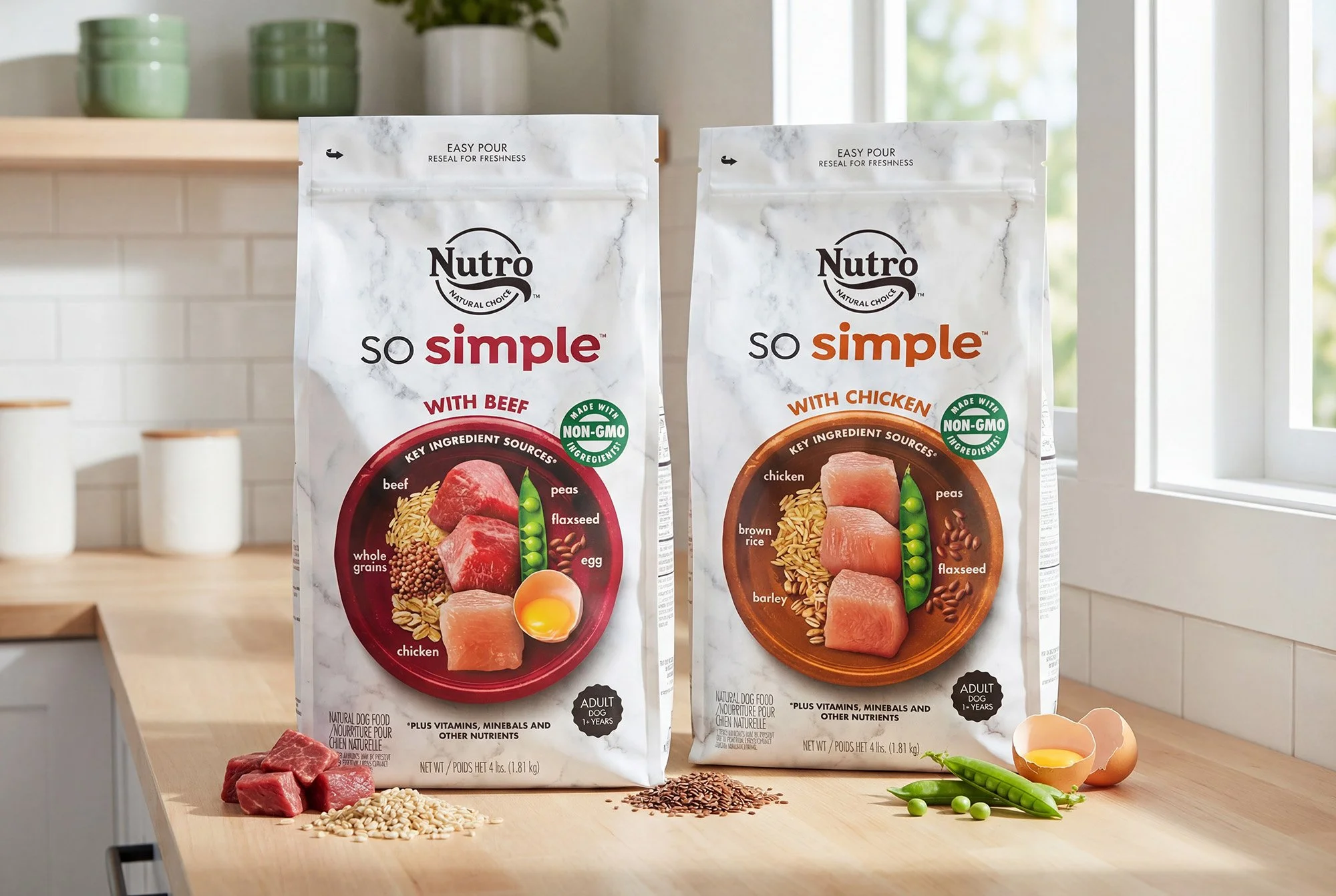
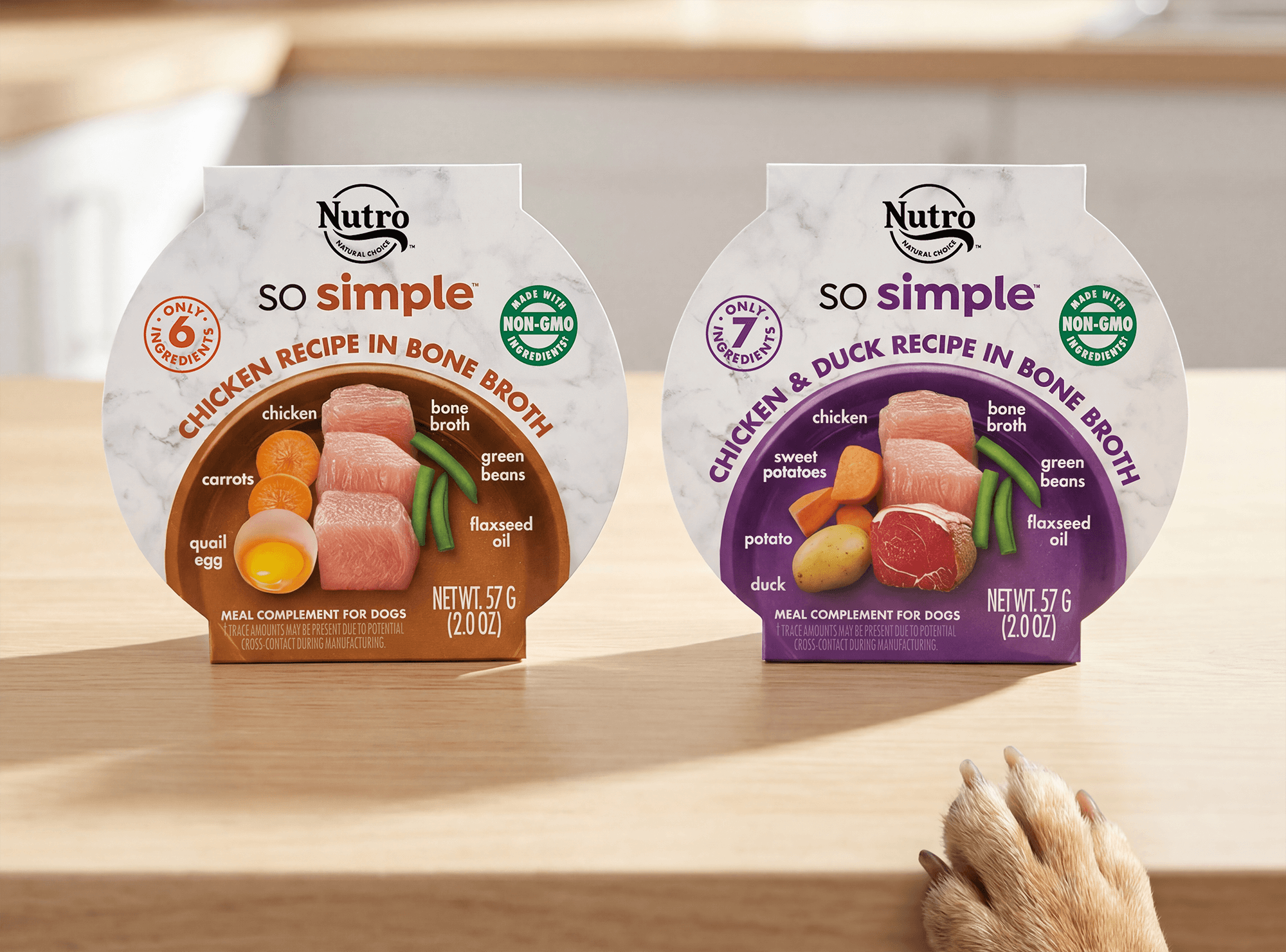
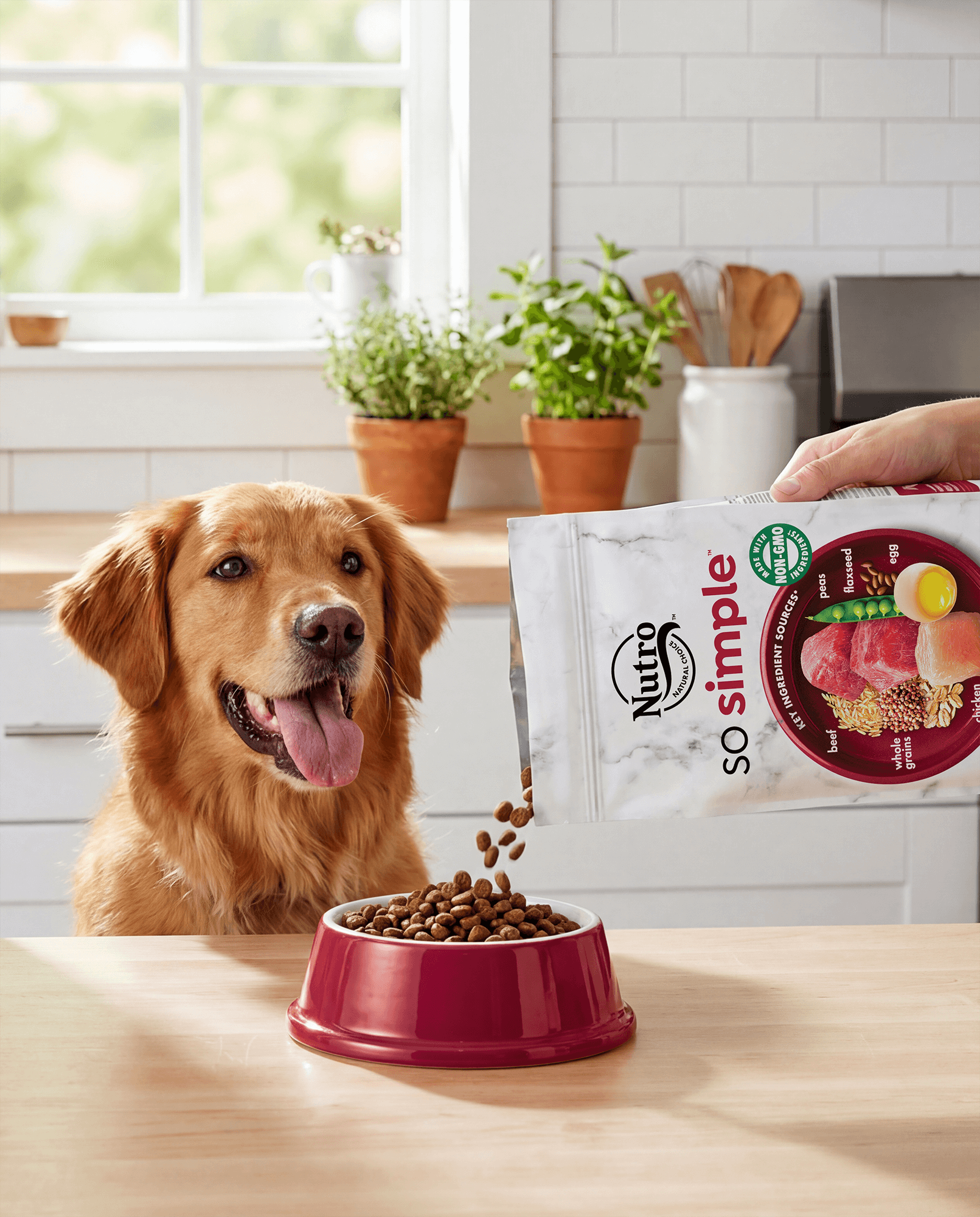
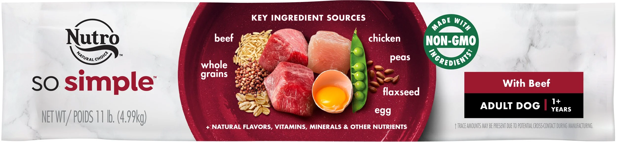
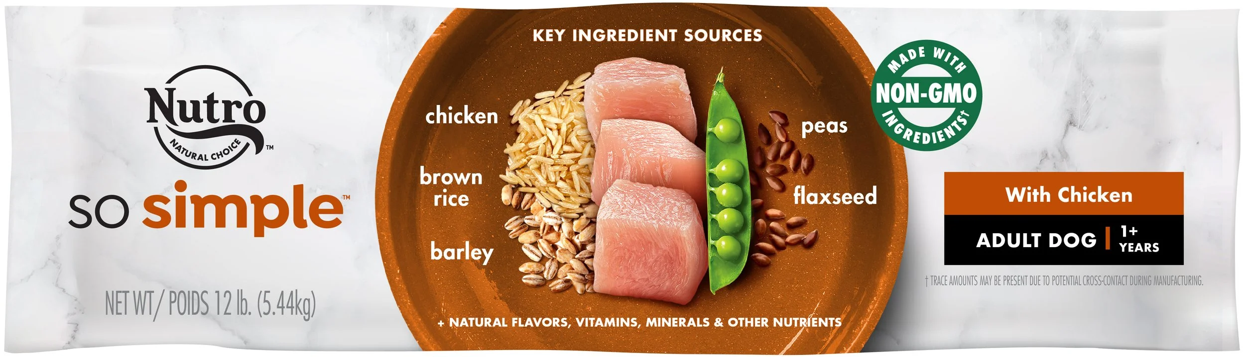
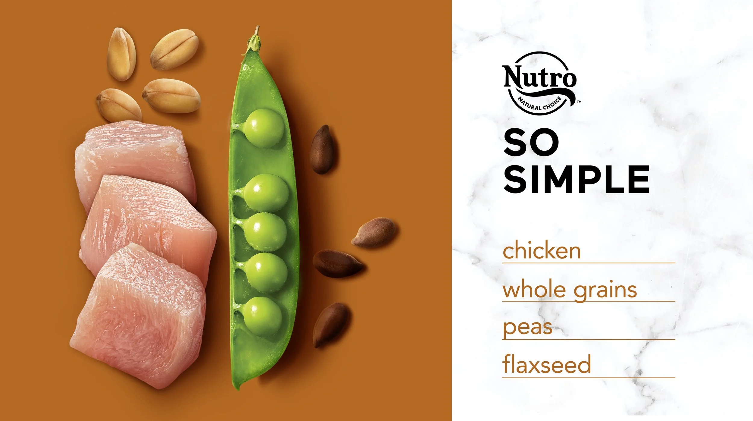
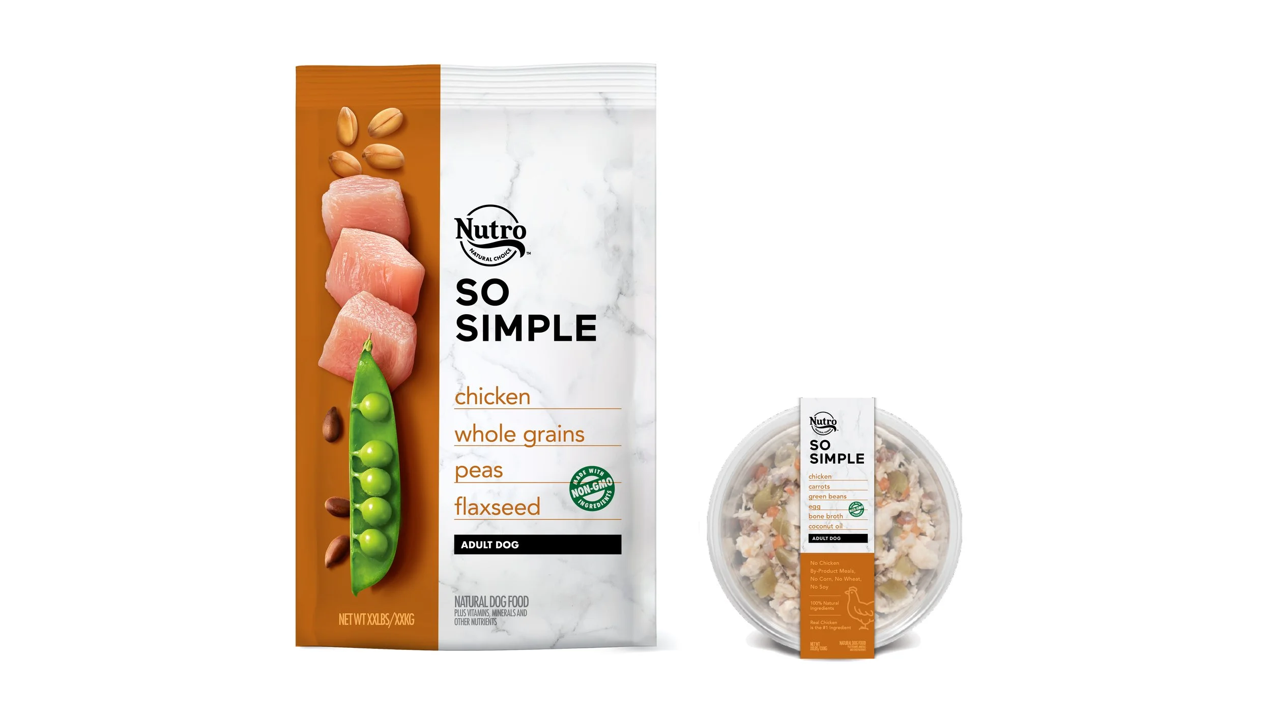
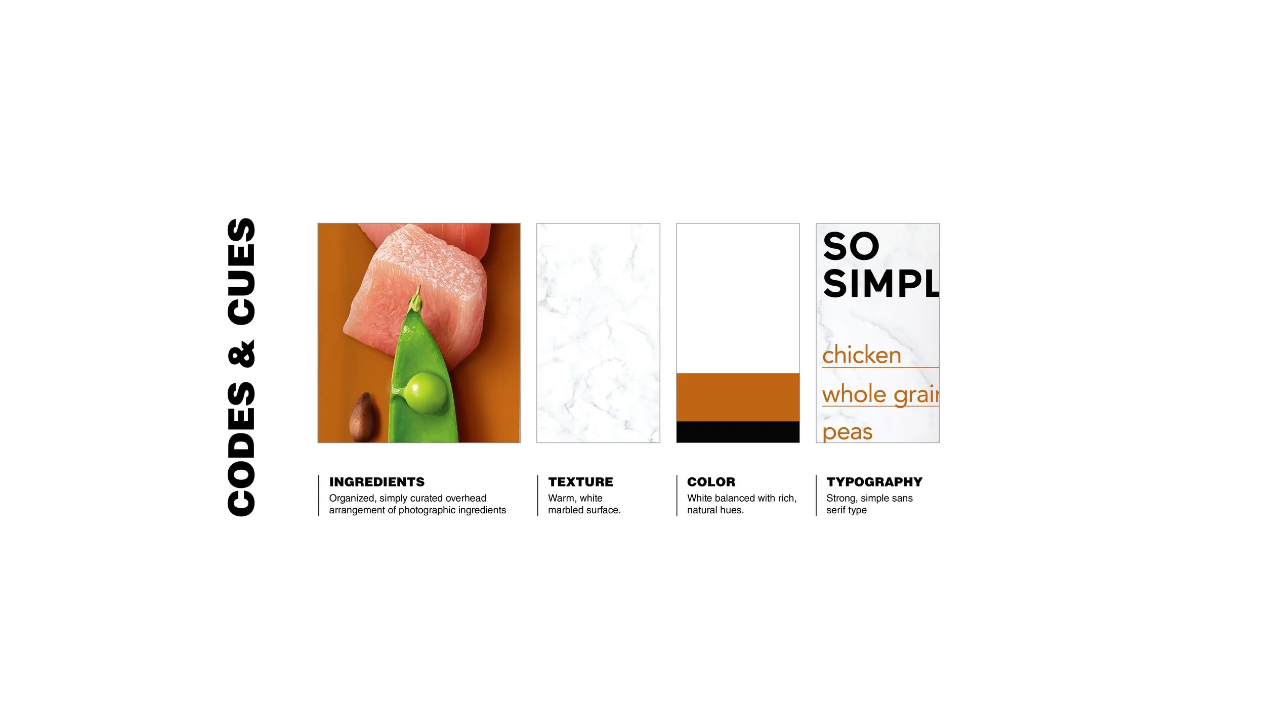
We built a packaging system that puts the ingredients front and center. A visual bullseye highlights the real food– chicken, brown rice, barley, peas, and flaxseed– in their whole, non-processed form, communicating transparency and care.
The marble background, a signature visual asset, conveys premium quality and natural authenticity, while the clean, simple logo creates a flexible structure for varianting by protein type through color coding.
This approach balances clarity, credibility, and shelf impact, reinforcing NUTRO So Simple’s positioning as a high-quality, trustworthy choice for pet owners.
Brand Identity & Logo Design
Visual Identity System
Packaging Design
Portfolio & Pack Architecture
In collaboration with Jones Knowles Ritchie
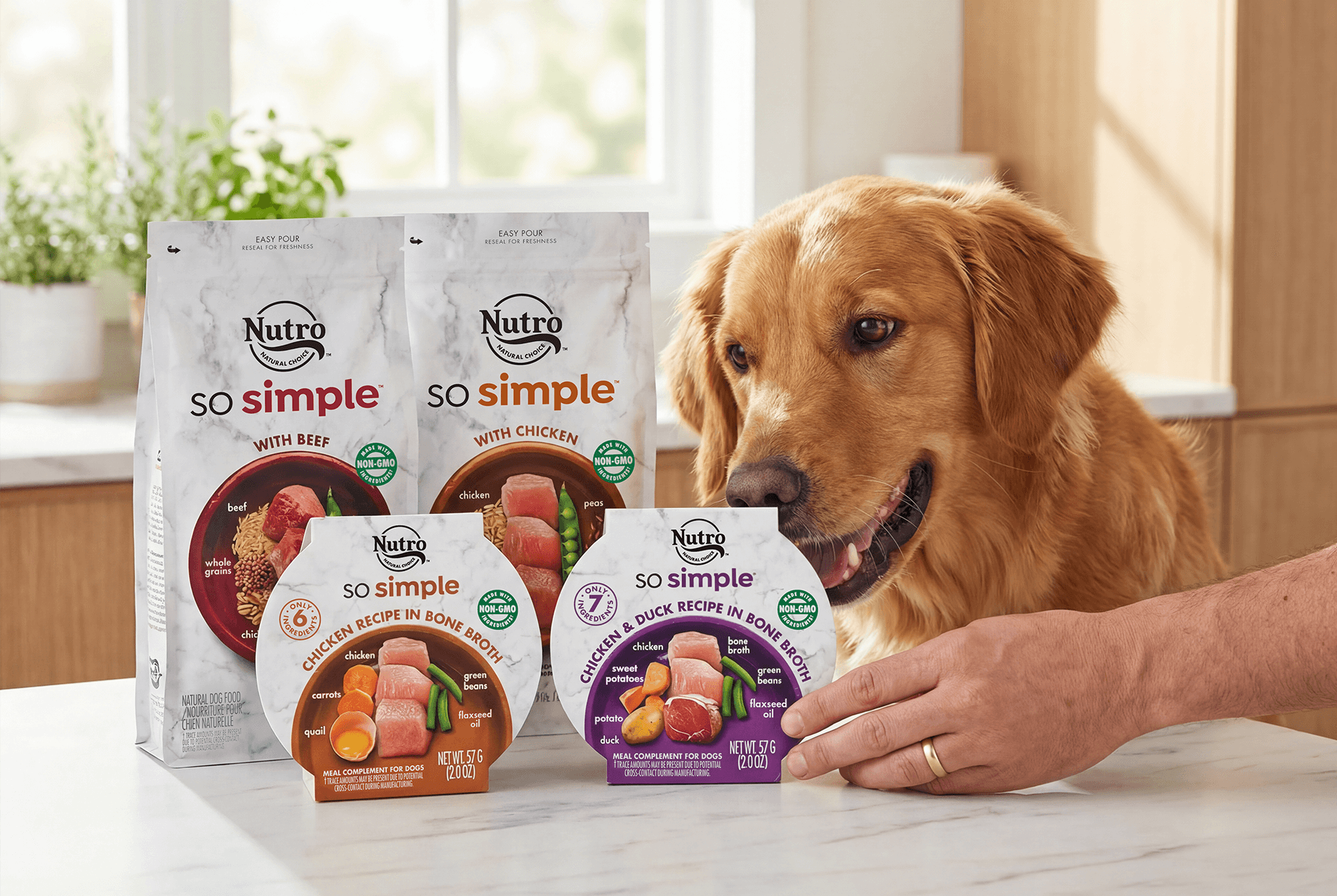
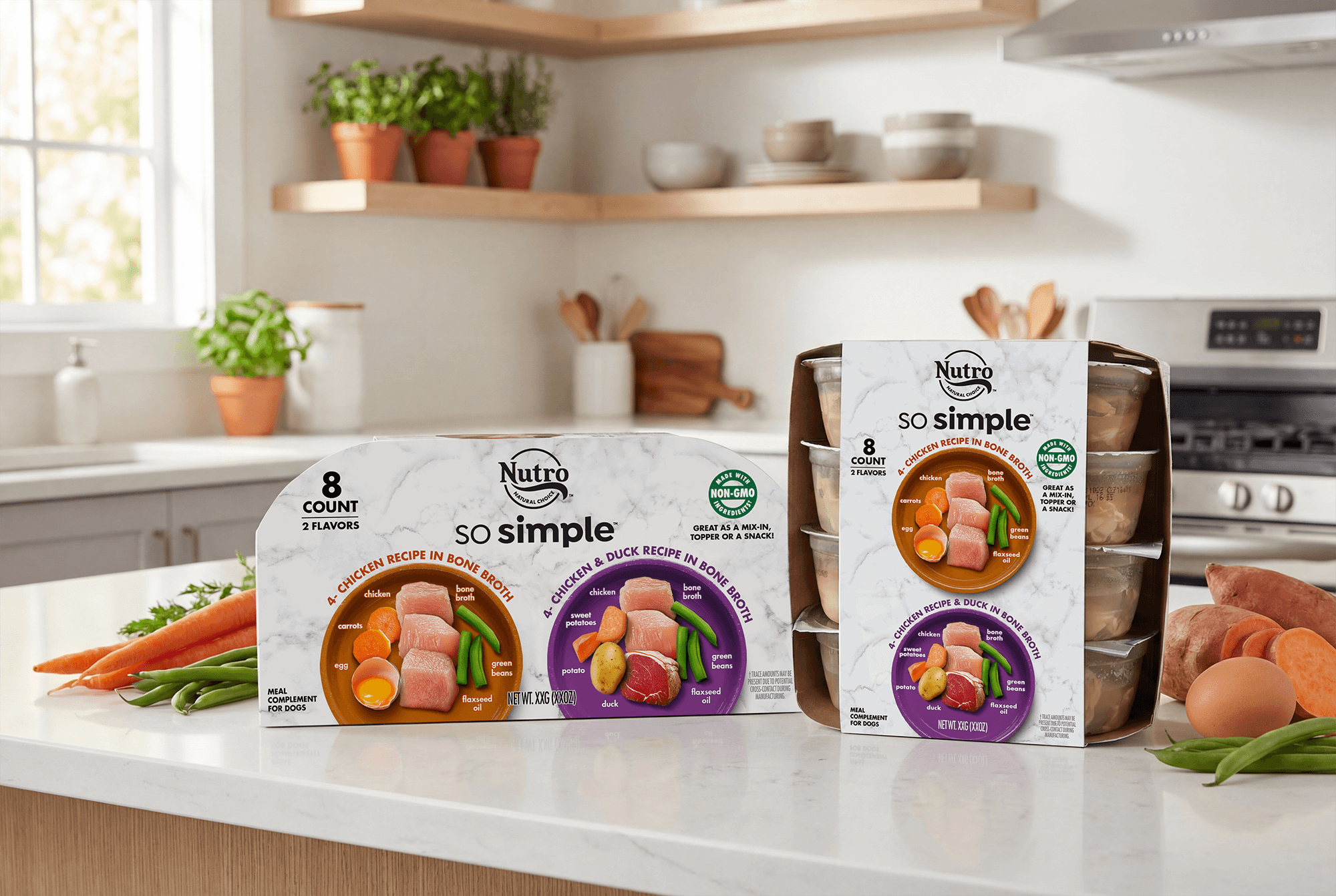
Since dog food is often stacked horizontally in the retail shelf, we designed the "butt panel" to act as a high-impact billboard for the shopper in the aisle. By placing the Nutro So Simple logo and flavor callouts in bold, high-contrast color blocks on this specific panel, we’ve made navigation effortless.
This allows pet parents to quickly identify the right protein. Whether it’s the deep red for beef or earthy orange for chicken, the consumer quickly understands without needing to lift a heavy bag to see the front face.
The design wraps seamlessly around the pack, ensuring that the brand’s premium marble texture and "key ingredient" story are visible from every angle. This consistent varianting system creates a clean, organized brand block on the shelf that emphasizes transparency and quality. By prioritizing the way consumers actually interact with the product at shelf, we’ve ensured that the most important information is always easy to find.
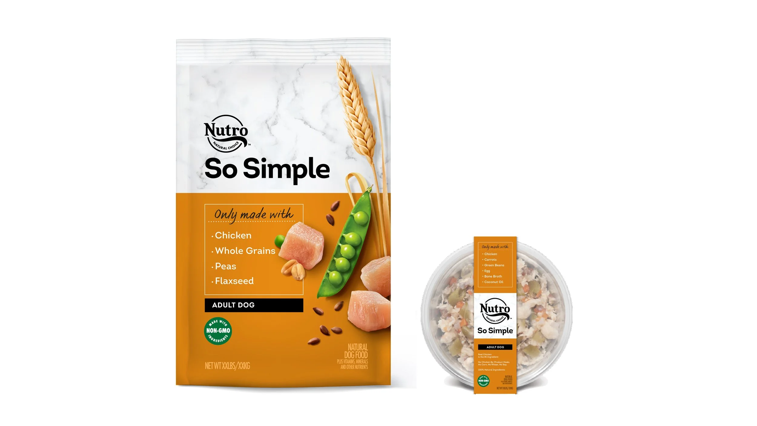
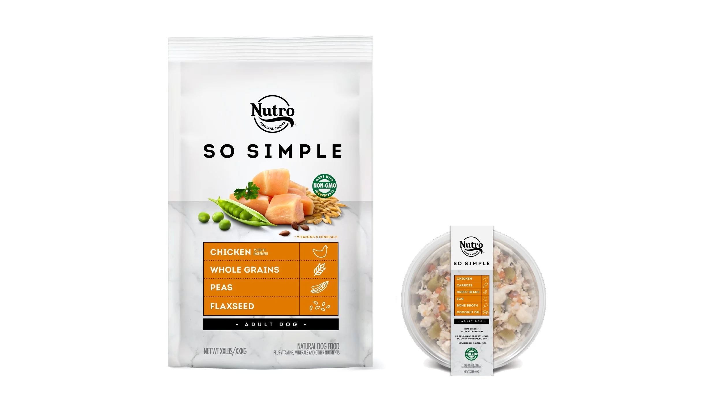
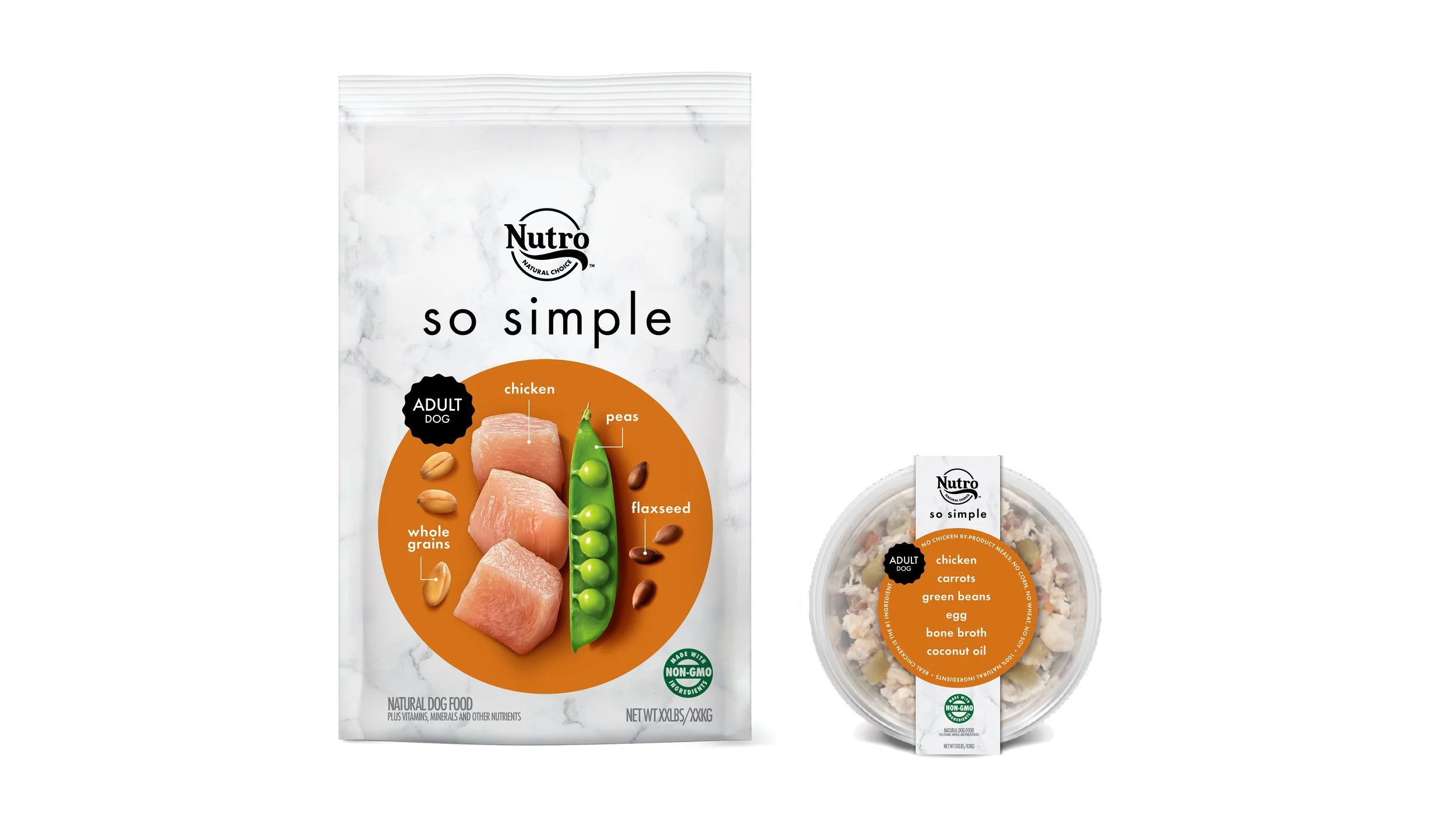
CREATIVE EXPLORE
While the final system for Nutro So Simple leaned into a marble-backed "visual bullseye," our creative exploration was an essential phase for pressure-testing exactly how much visual information a pet parent needs to feel confident in their choice.
We looked at radical, ingredient-first compositions where high-fidelity macro photography of chicken, peas, and flaxseed became the primary architecture of the bag. We played with typographic weight and white space, stripping away the category's typical clinical clutter to see if "So Simple" could be communicated through pure graphic restraint.
By iterating through these more minimalist directions, we were able to validate the importance of the marble texture as a premium anchor, ensuring the final design felt elevated and authentic rather than just another "natural" option on a crowded shelf.
Building Trust in Health & Wellness