Kraft x NotCo
Market Opportunity
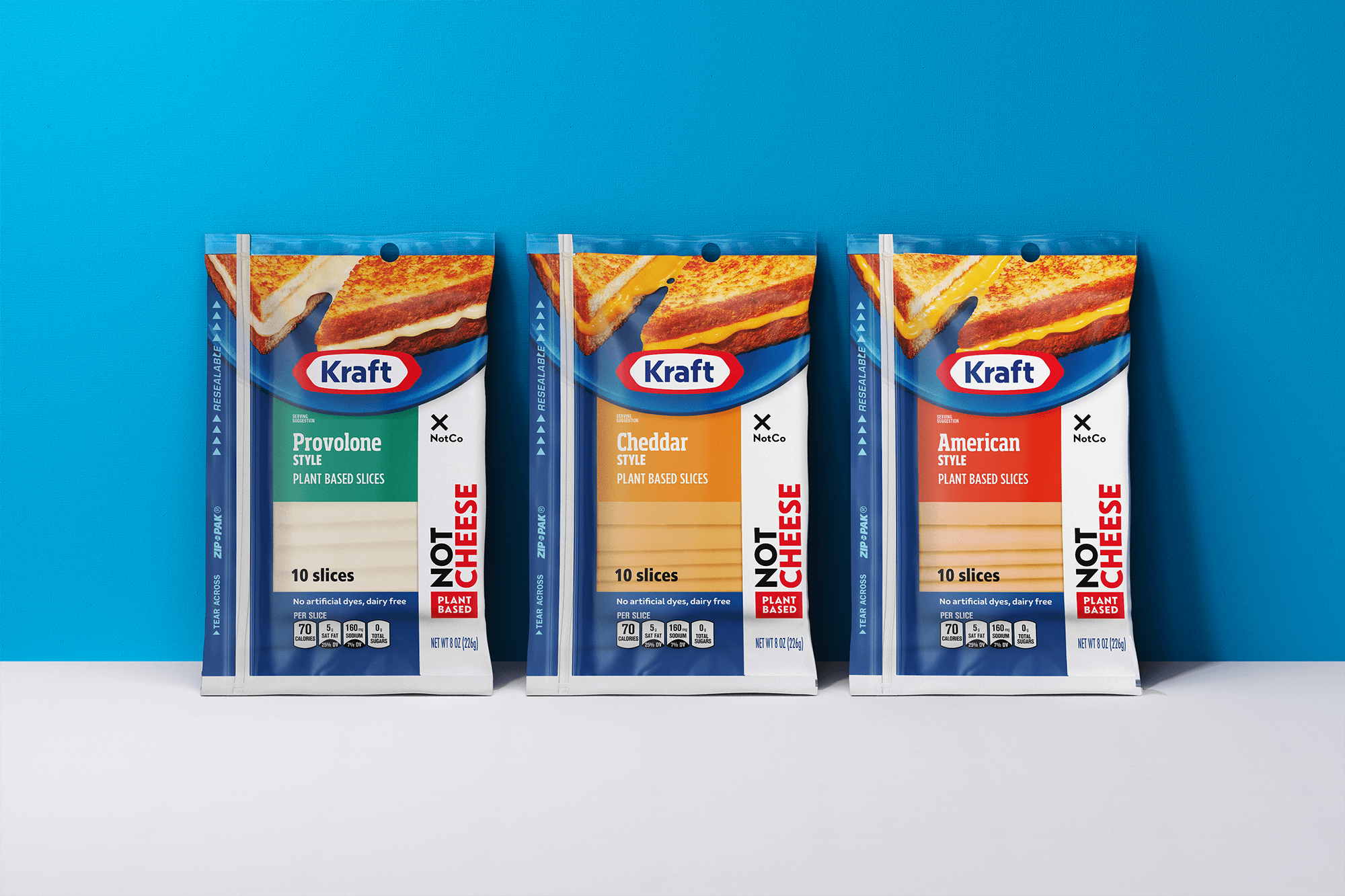
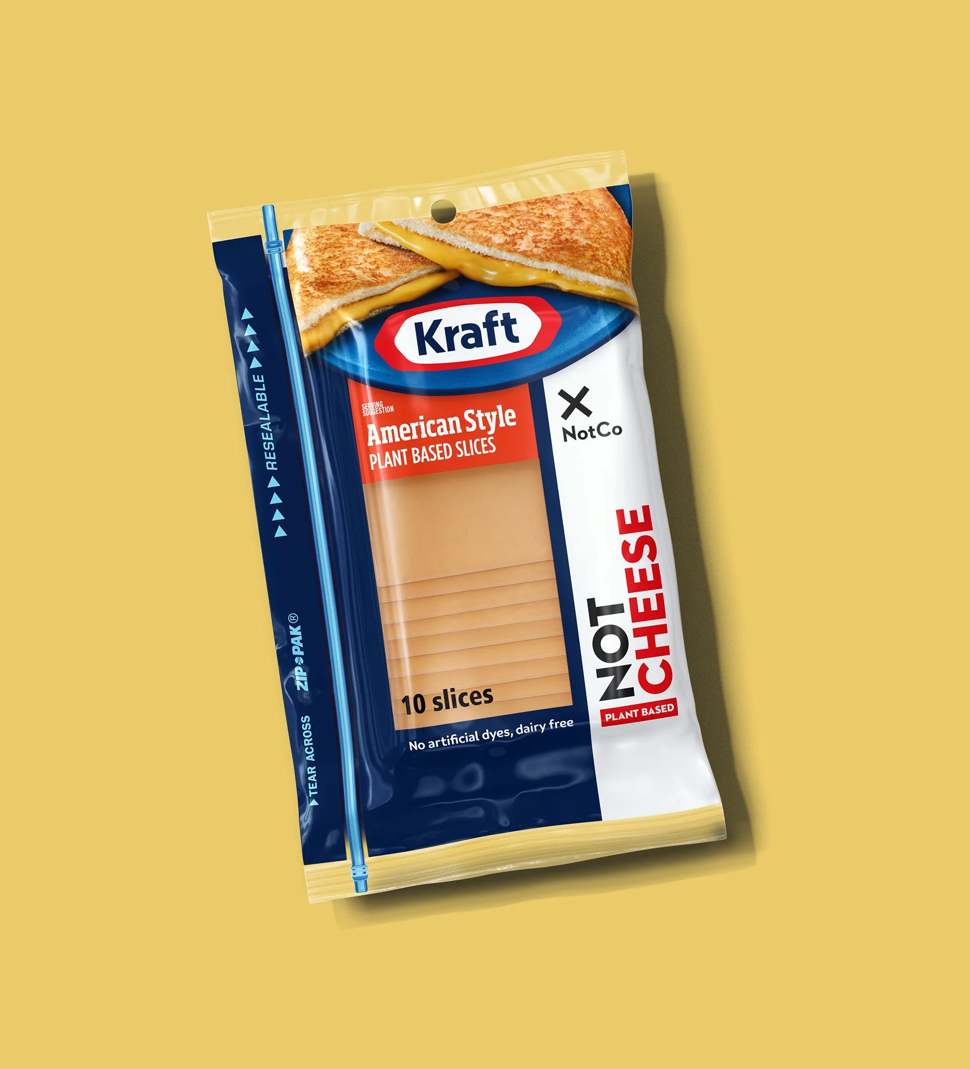
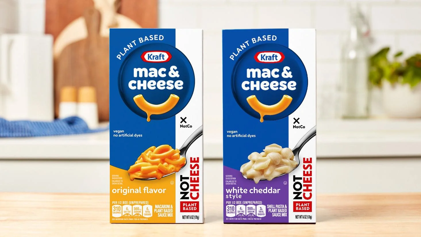
Kraft and NotCo came together to create a plant-based cheese that didn’t just imitate dairy. It elevated it. The brief was ambitious: build a packaging system that could signal innovation, sustainability, and taste all at once, while appealing to both curious plant-based shoppers and loyal Kraft fans.
The challenge was balancing two brand worlds: Kraft’s heritage and trust, and NotCo’s bold, tech-forward personality. The design had to communicate delicious plant-based cheese in a crowded aisle, differentiate from competitors, and feel unified across multiple SKUs. All without overwhelming shoppers or losing credibility.
Outcome
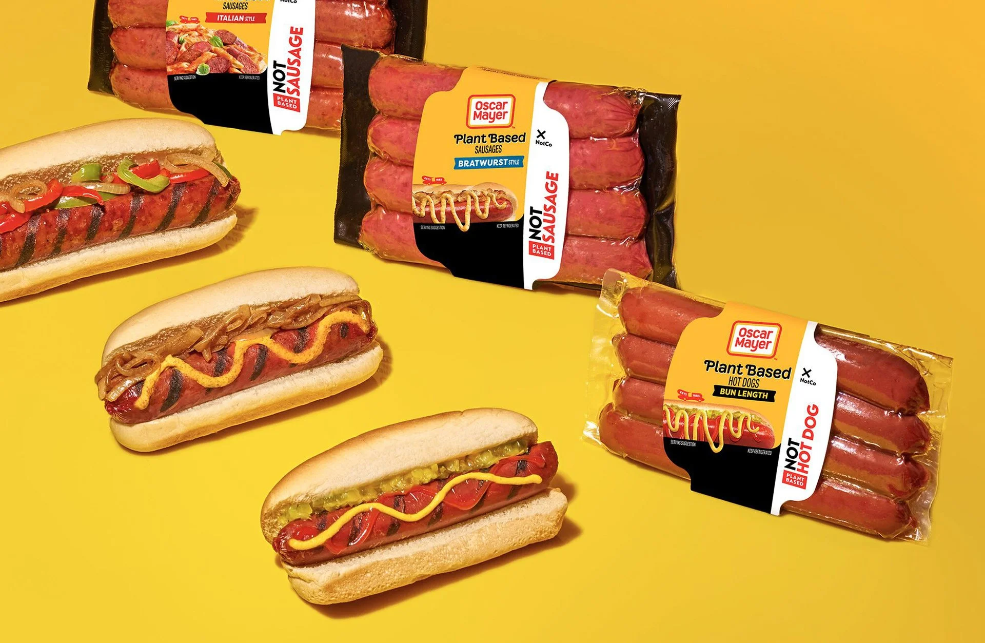
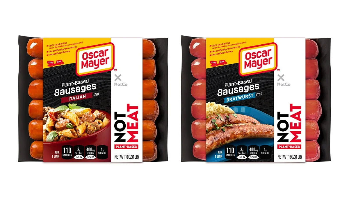
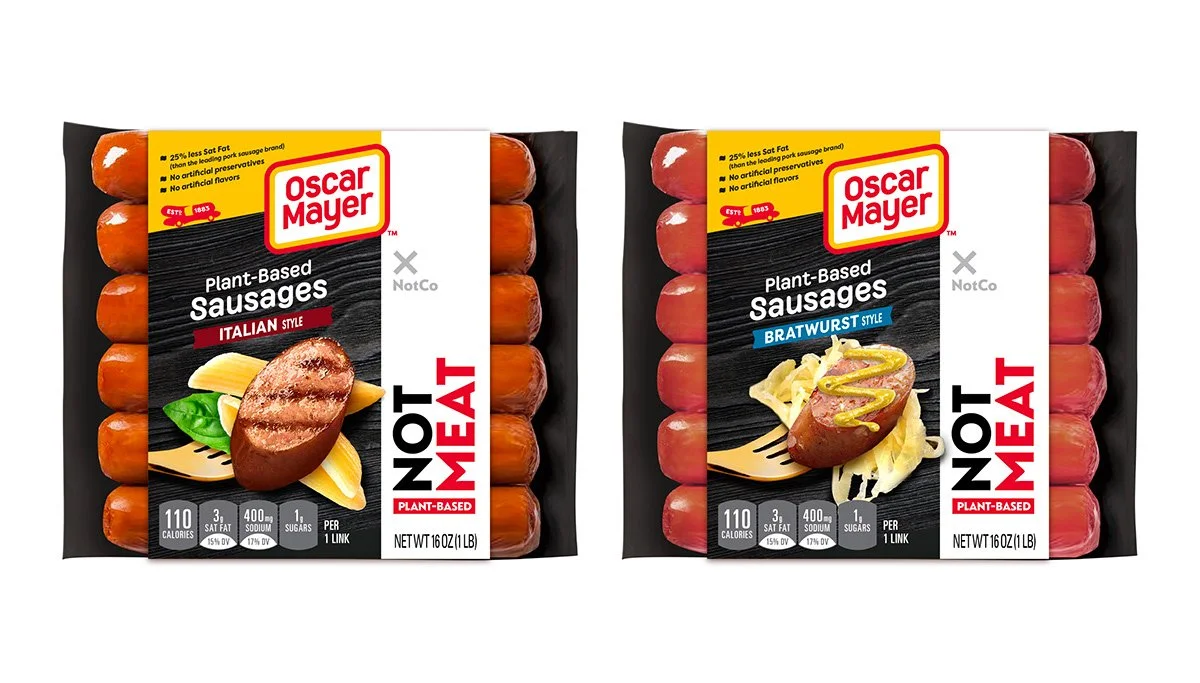
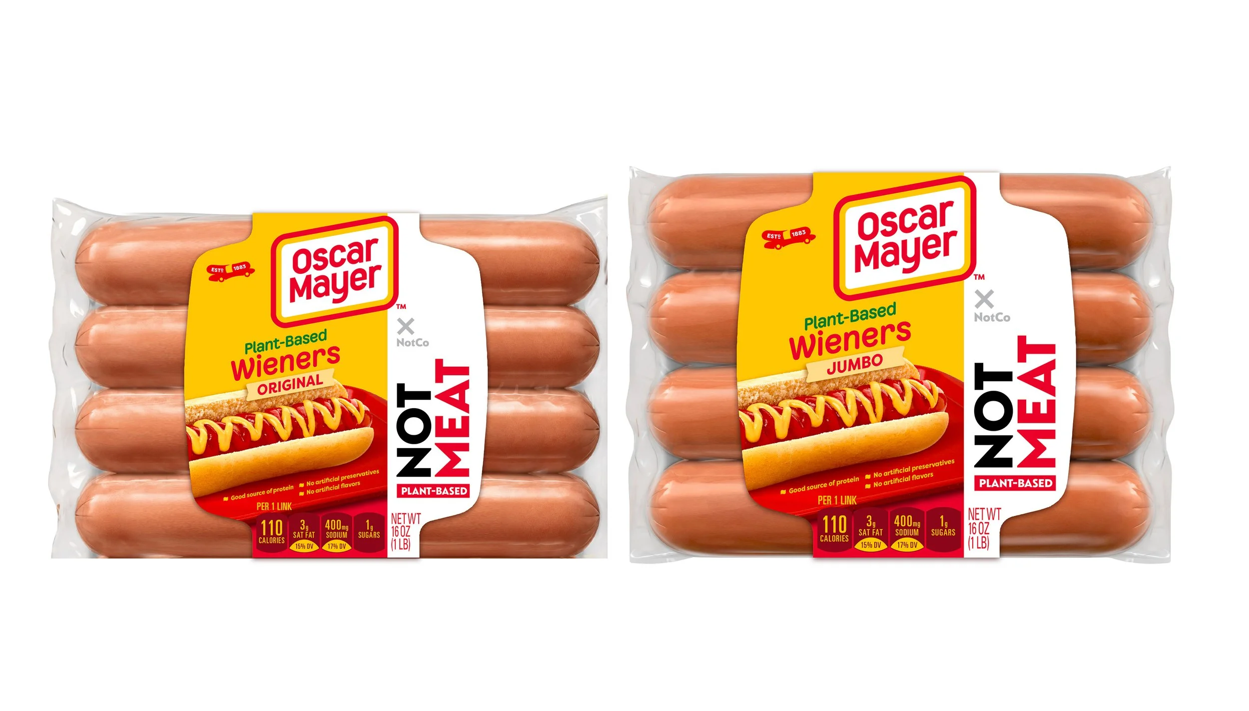
Packaging launch for the Kraft Heinz × NotCo joint venture– bringing AI-developed plant-based products to market under one of the world's largest food portfolios. We drew inspiration from NotCo’s science-driven, AI-powered approach to food, translating it into visual language that feels smart, playful, and approachable. Bold color blocking and clean typography highlight flavor and format.
Photography and textures were treated as appetite appeal, emphasizing creaminess, melt, and flavor. Plant-based doesn’t have to feel like compromise.
Brand World Development
Packaging Design
Concept Development & Iteration
In collaboration with Jones Knowles Ritchie
CREATIVE EXPLORE
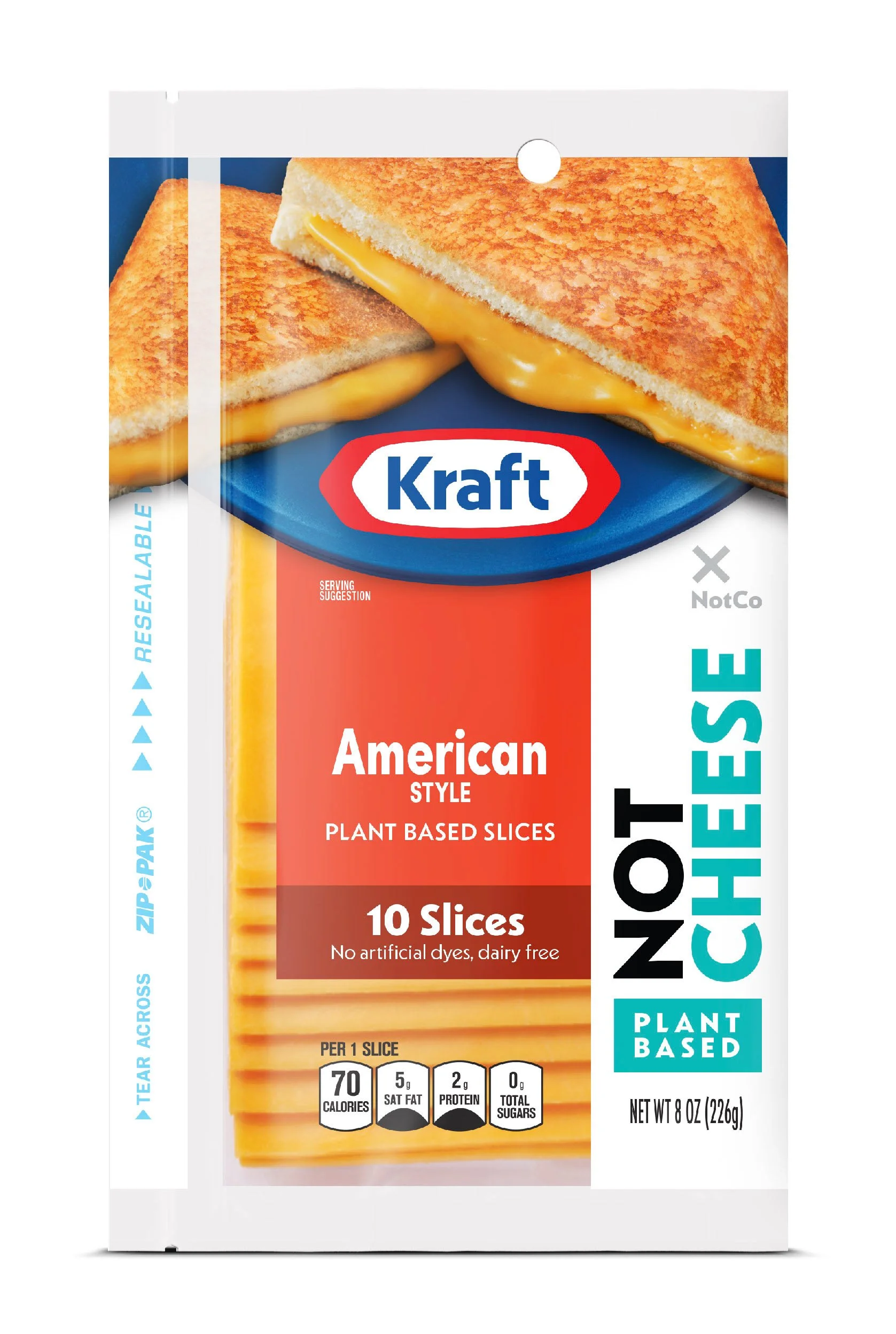
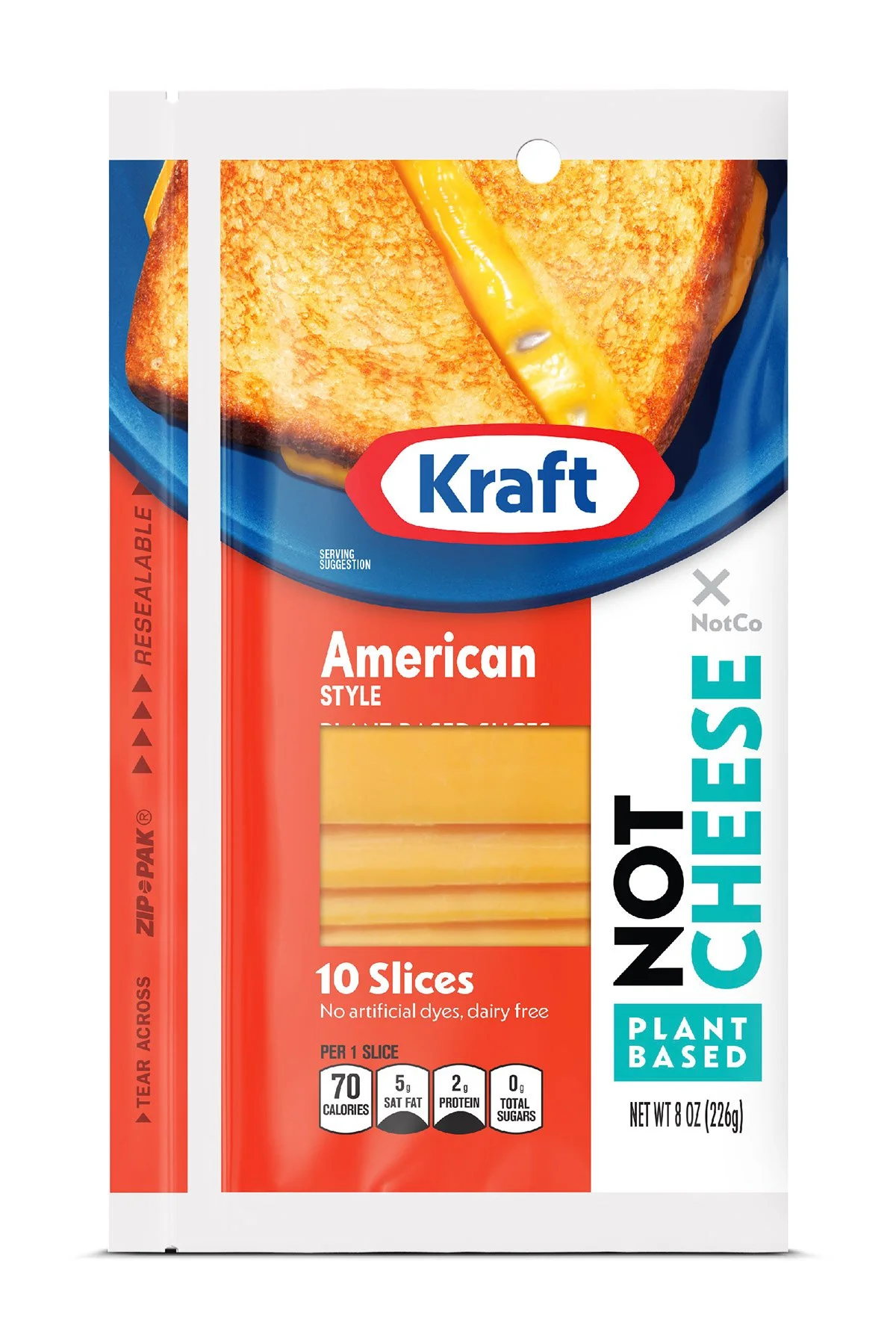
The design exploration for the Kraft x NotCo collaboration centers on the visual tension between legacy trust and disruptive innovation. By leveraging the iconic Kraft and Oscar Mayer equity alongside NotCo’s bold, vertical "NOT" typography, the system establishes an immediate and transparent dialogue with the plant-based consumer.
This exploration highlights the strategic intersection of two powerhouses: the reliable comfort of a household staple and the cutting-edge AI technology of a food-tech pioneer. The result is a packaging system that feels intentionally different – using a clean, clinical white to signal a new era of plant-based "NotCheese" and "NotMeat" that commands attention through its sheer honesty and graphic confidence.
Modernizing Category Leaders