EatPastry
EatPastry had built strong brand equity in the refrigerated cookie dough space, but the packaging was asking shoppers to work too hard.
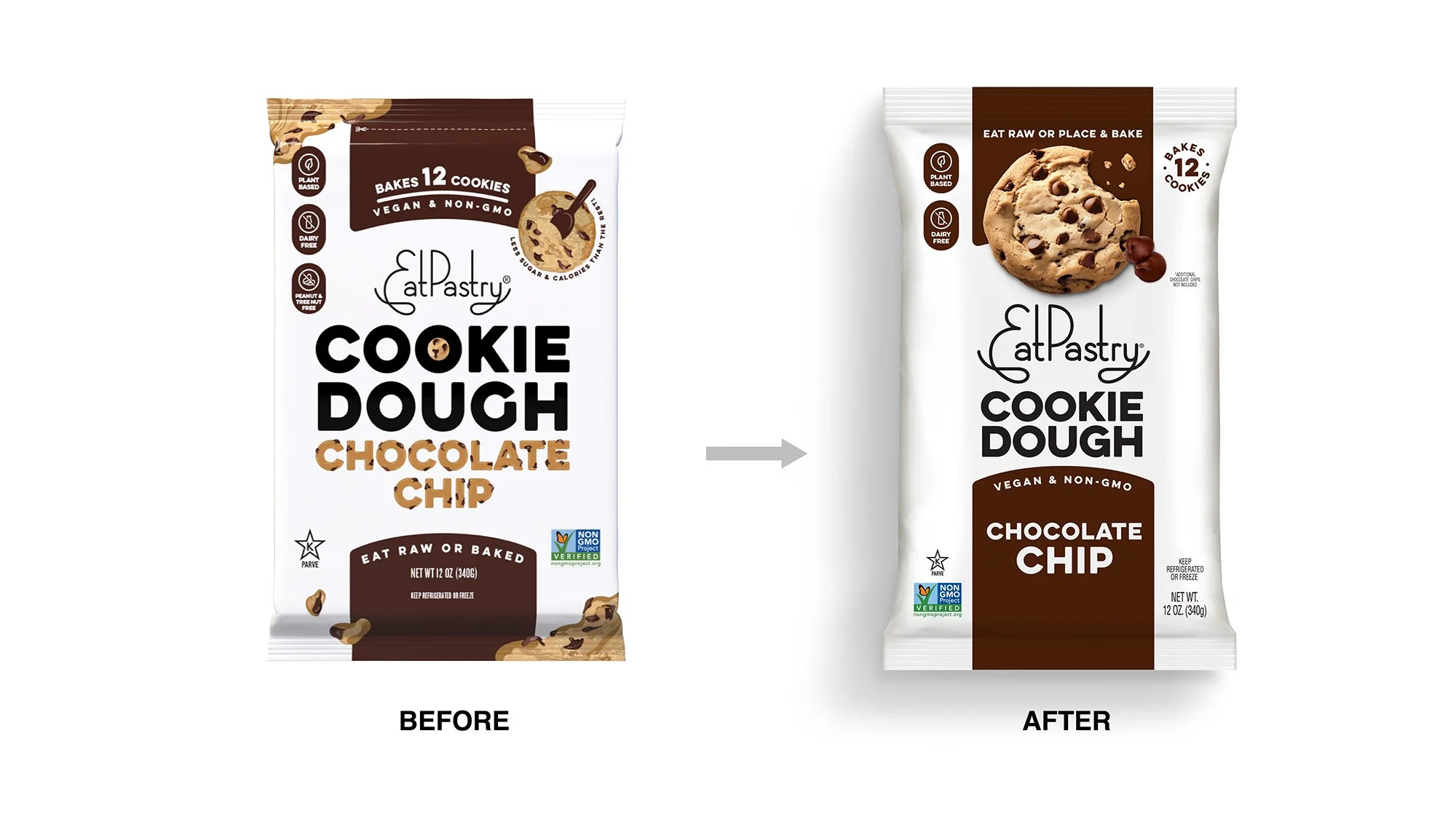
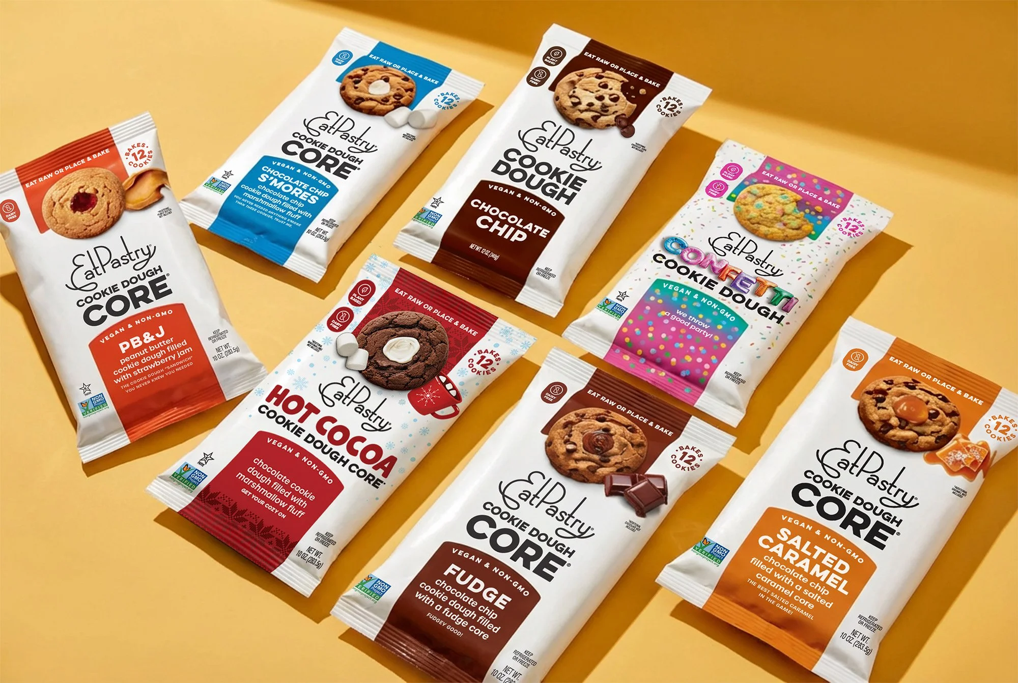
On shelf, the product relied heavily on text to explain what it was: shoppers had to read, interpret, and confirm before understanding the product. This was creating friction at the most critical moment of truth. In a crowded refrigerated set, that extra cognitive effort matters. When shoppers are scanning quickly, words lose to visuals.
The challenge was to increase appetite appeal and shopability– without breaking the existing pack architecture or changing the logo the brand already loved.
Market Opportunity
Outcome
In high-velocity retail environments, shoppers are short on time. The original EatPastry packaging relied heavily on words to explain the product, asking shoppers to pause, read, and process before understanding what was inside. The solution was to shift comprehension from reading to seeing.
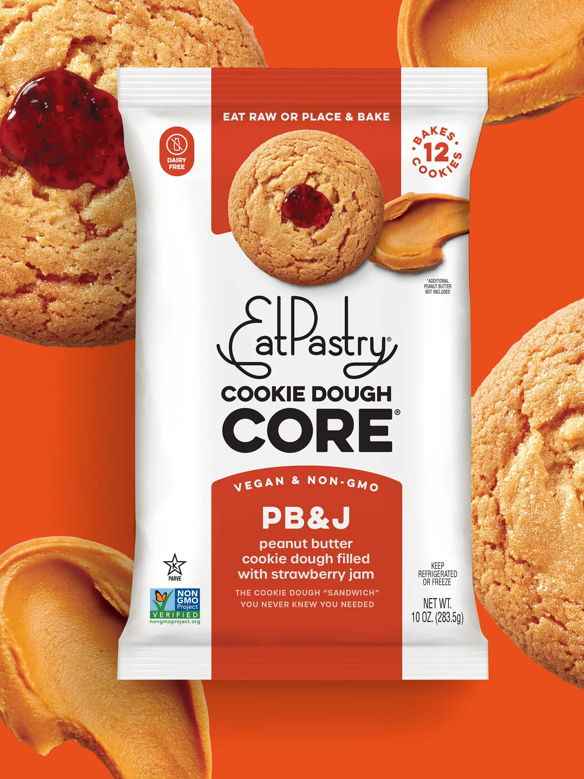
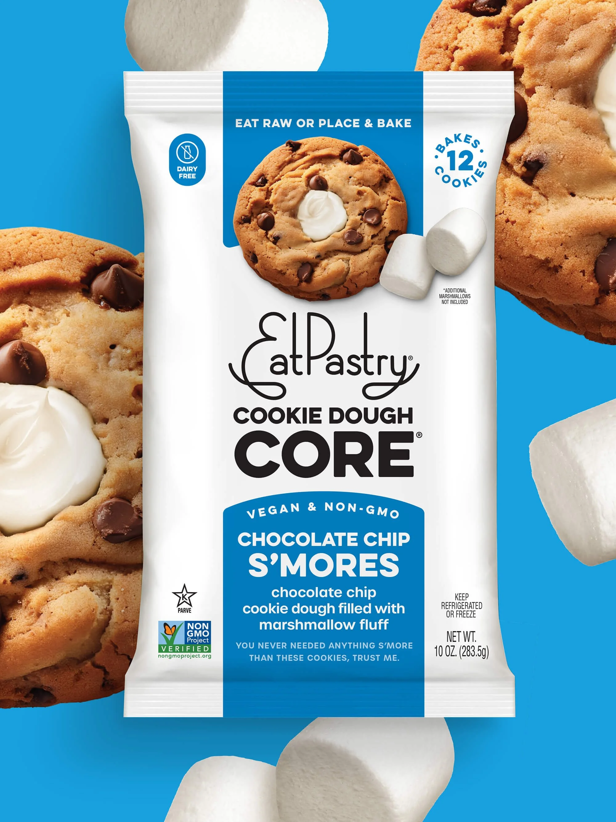
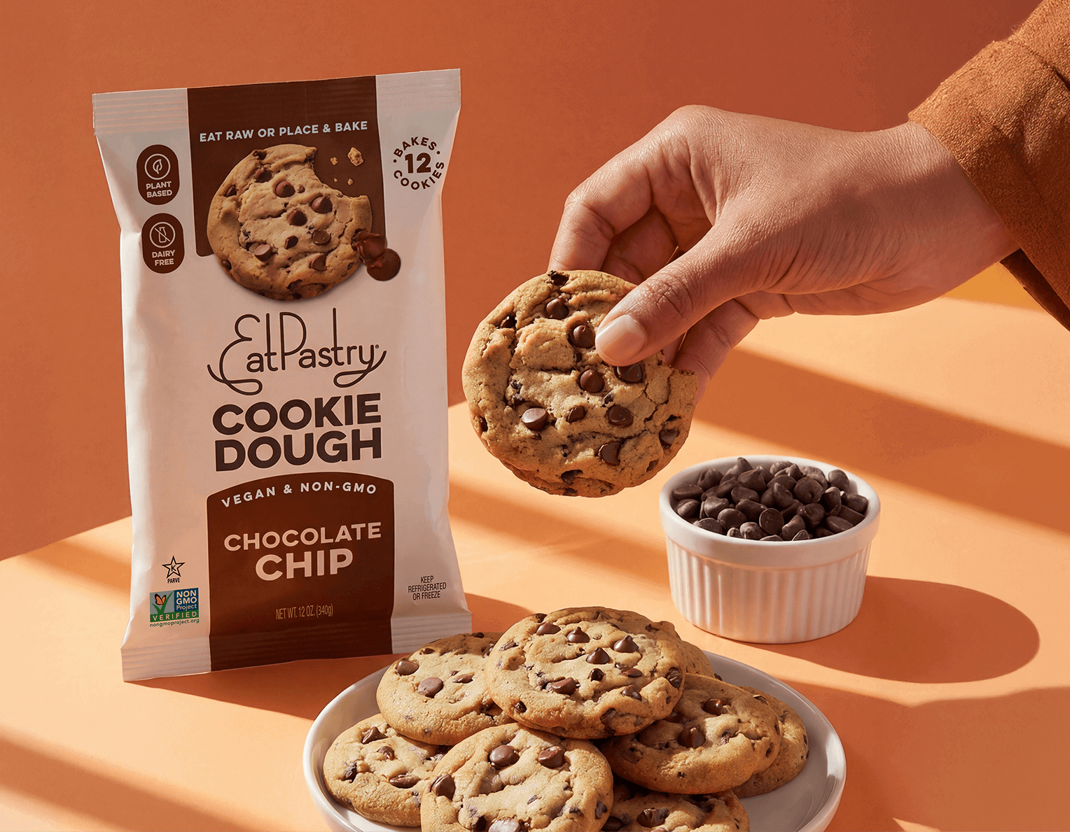
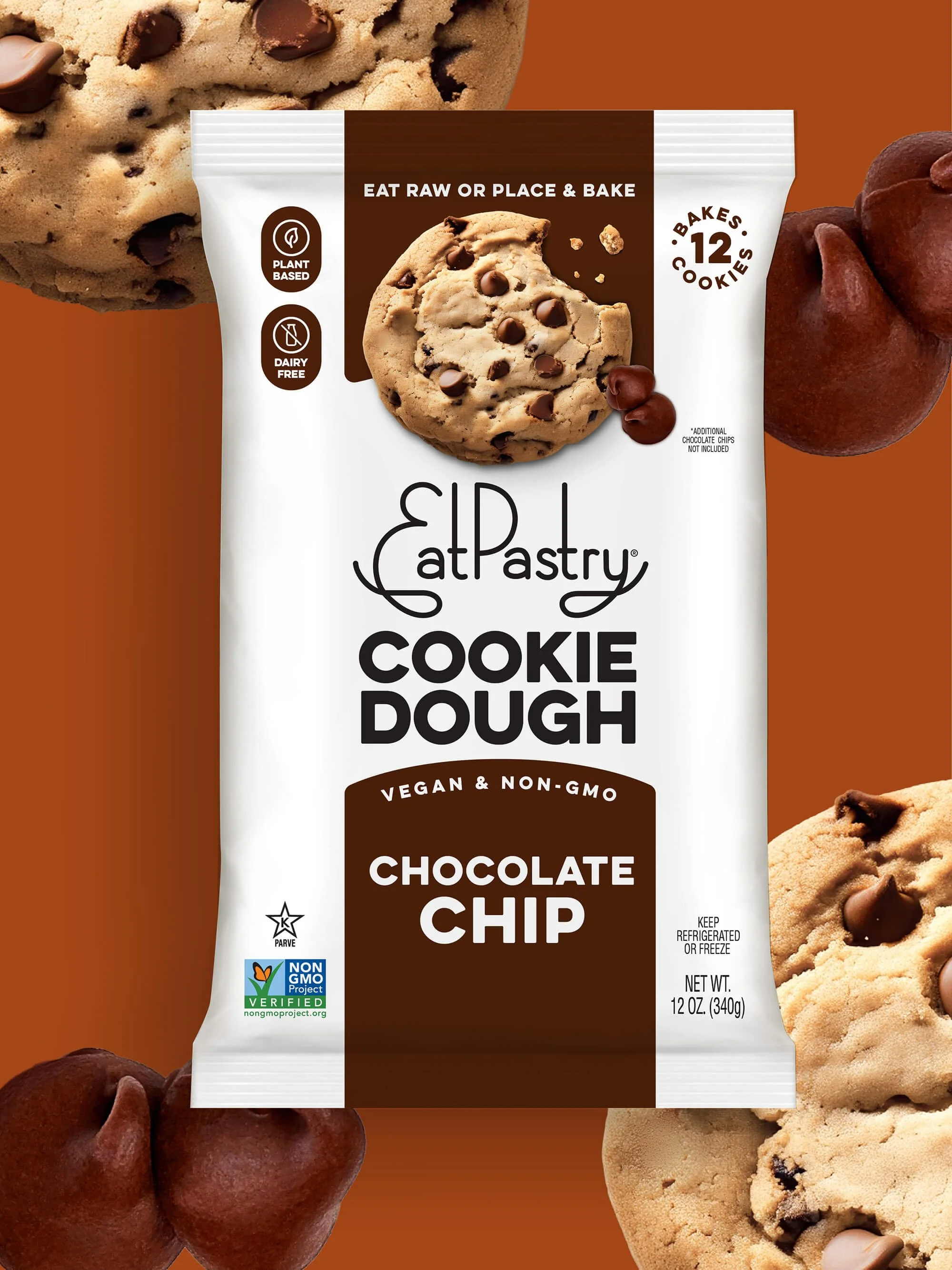
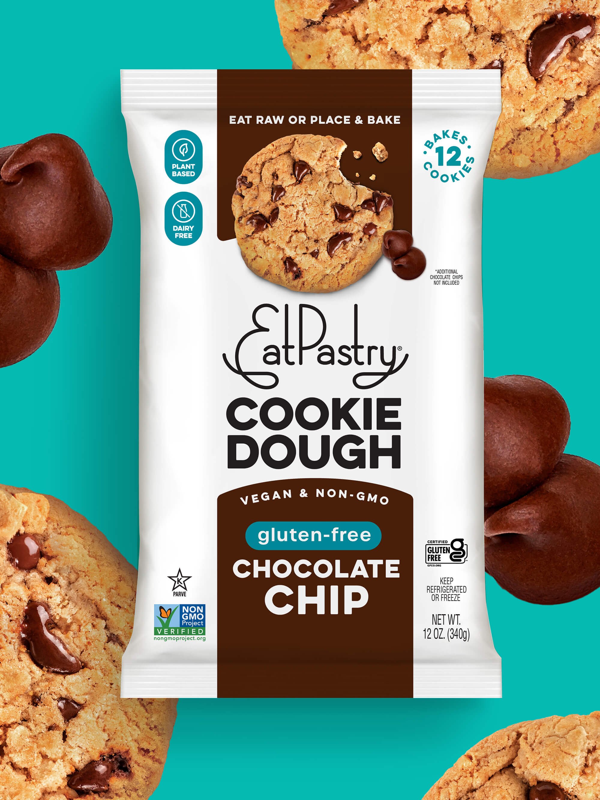
By leading with an appetizing, unmistakable visual of the cookie, the product becomes instantly understood. For unique SKUs, the image also highlights the CORE filled center of the cookie, making the product differentiator that much more clear. The cookie itself acts as a mental shortcut, communicating indulgence and flavor in a split second – reducing cognitive effort and increasing the likelihood of purchase.
Packaging Design Refresh
Pack Architecture
Portfolio & SKU Architecture
Brand Identity Alignment
SEASONAL & LTO ARCHITECTURE
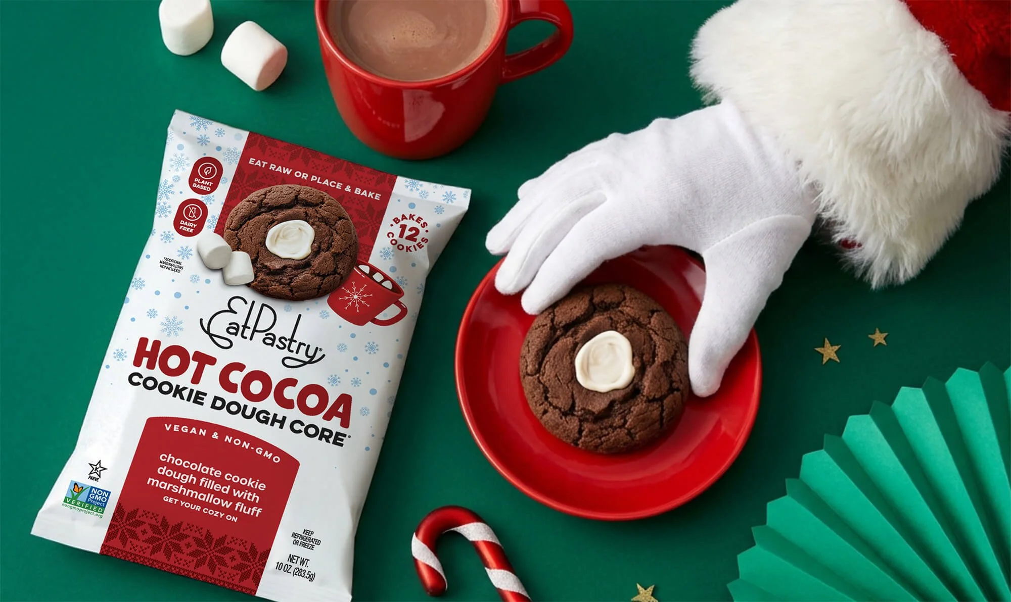
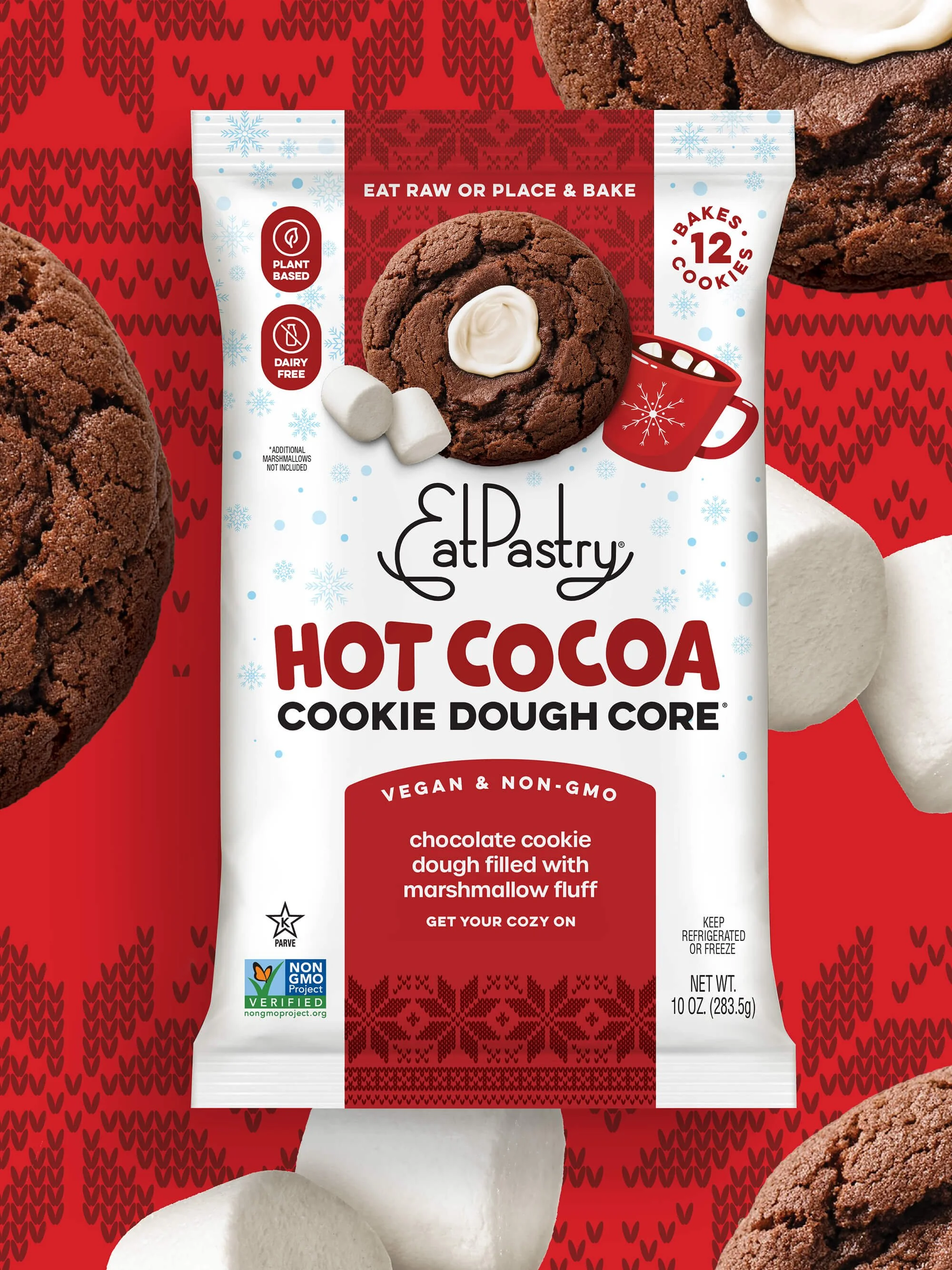
For seasonal and limited-time offerings, the system flexes. Instead of housing the flavor in the standard tab, the flavor name moves to the center of the pack to give it priority in the hierarchy. This shift allows the moment to be fully heroed, as seen with Hot Cocoa, where expressive seasonal patterns take over the background and tab. The result is a pack that feels celebratory while remaining unmistakably EatPastry – designed to stop shoppers, spark emotion, and clearly communicate this is special, and get it while you can!
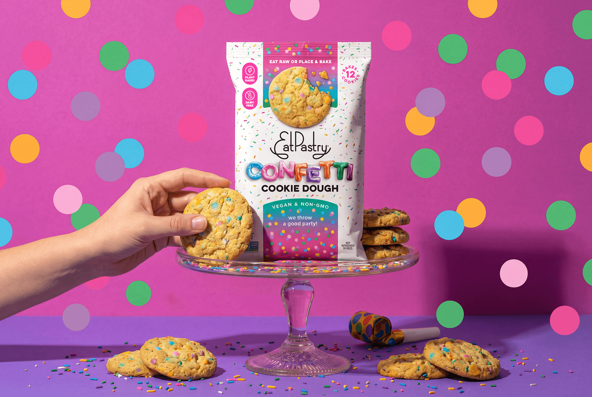
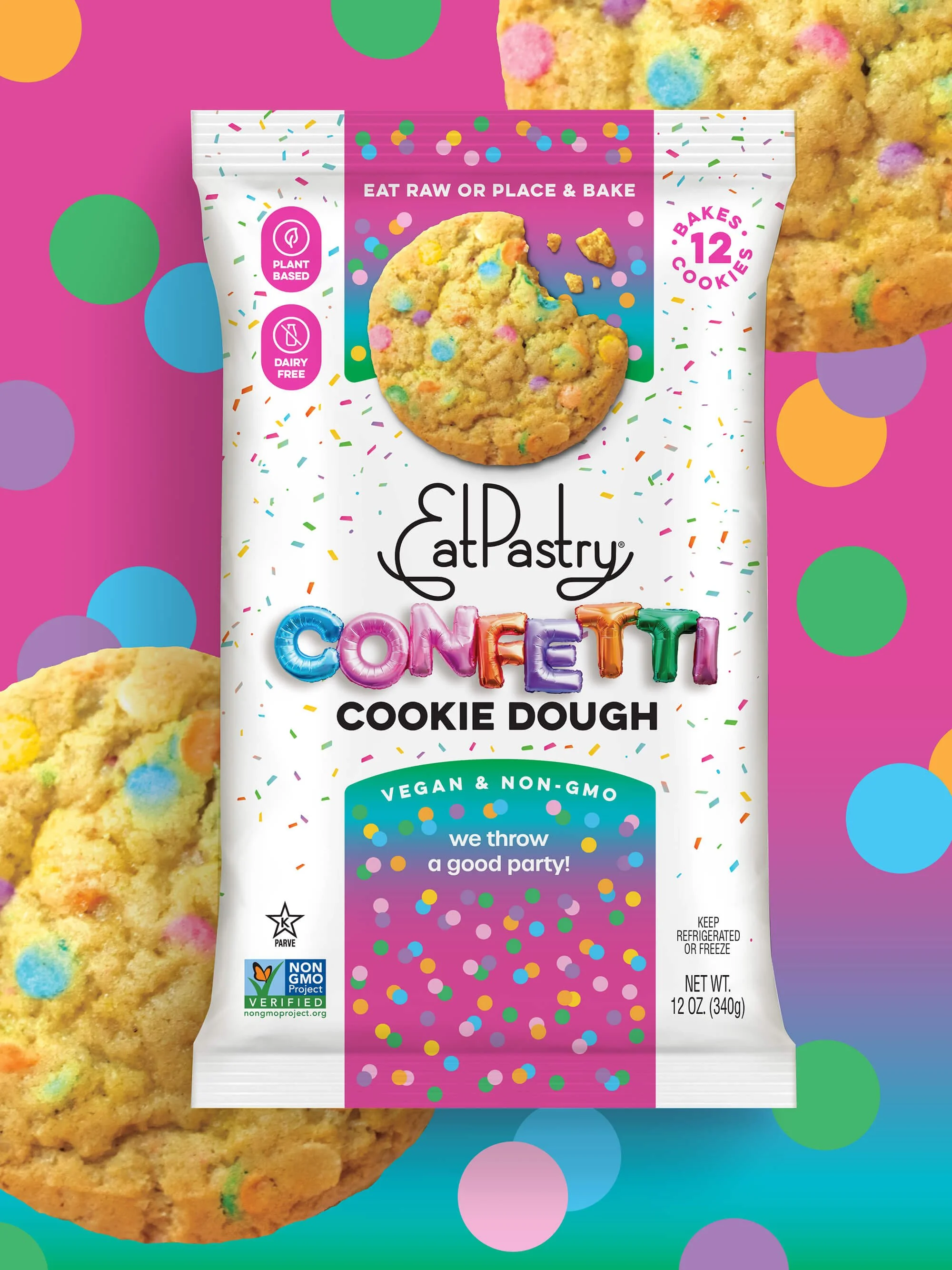
We optimized the existing brand system rather than reinvent it. The logo was scaled up and subtly thickened to create a more confident, anchored brand presence at shelf. Flavor navigation was clarified through consistent color-coded tabs with the flavor name sitting inside so that the brain mentally connects color to flavor. This allows shoppers to quickly identify and move across the line with ease.
The result is a refreshed pack architecture that feels familiar but performs harder: faster recognition, stronger appetite appeal, clearer navigation, and a more confident brand presence.
This work shows how strategic packaging design (rooted in shopper behavior, not aesthetics alone) can remove friction, improve shopability, and drive conversion without disrupting what already works.
This refined portfolio architecture provides EatPastry with a sustainable framework for long-term growth and SKU expansion. By anchoring the core lineup in a consistent color-tab system, we established a reliable visual shorthand that builds consumer trust and simplifies the shopping experience. This structure ensures that no matter how many flavors are added, the brand maintains a cohesive identity that is instantly recognizable on a crowded shelf.
The system truly shines through its built-in flexibility for seasonal and specialty releases. Transitioning the flavor name to a prominent, front-and-center position and introducing celebratory patterns allows these limited editions to feel like a genuine event. This approach creates a clear distinction between daily staples and special occasions, giving the brand a playful energy.
“ Working with Anna has been a dream come true for us. Anna takes the time to listen to what we are thinking conceptually, and brings her magic to create exactly what is needed for the brand.
Not only does she understand the creative component of package design, she understands the customer and puts effort into learning the product placement and real details needed to make the design work. Besides being amazing at what she does, Anna is a kind, smart, and a supportive partner.
She just gets me, and I couldn’t imagine working with anyone else!”
Jessie Elias
CEO & Co-Founder
More Bakery & Confections