Reprise
Traditional Chinese Medicine has credibility. Modern supplements have convenience. Most brands struggle to deliver both.
TCM ingredients often feel unfamiliar to mainstream shoppers. Names are harder to pronounce. Benefits require explanation. And the category itself tends to lean either clinical or “natural” in a way that limits mass appeal.
For Reprise, the ambition was bigger than launching another gummy.
The goal was to make ancient ingredients feel:
trustworthy
contemporary
and easy to shop in seconds
Across retail shelves, ecommerce grids, and growing sub-lines.
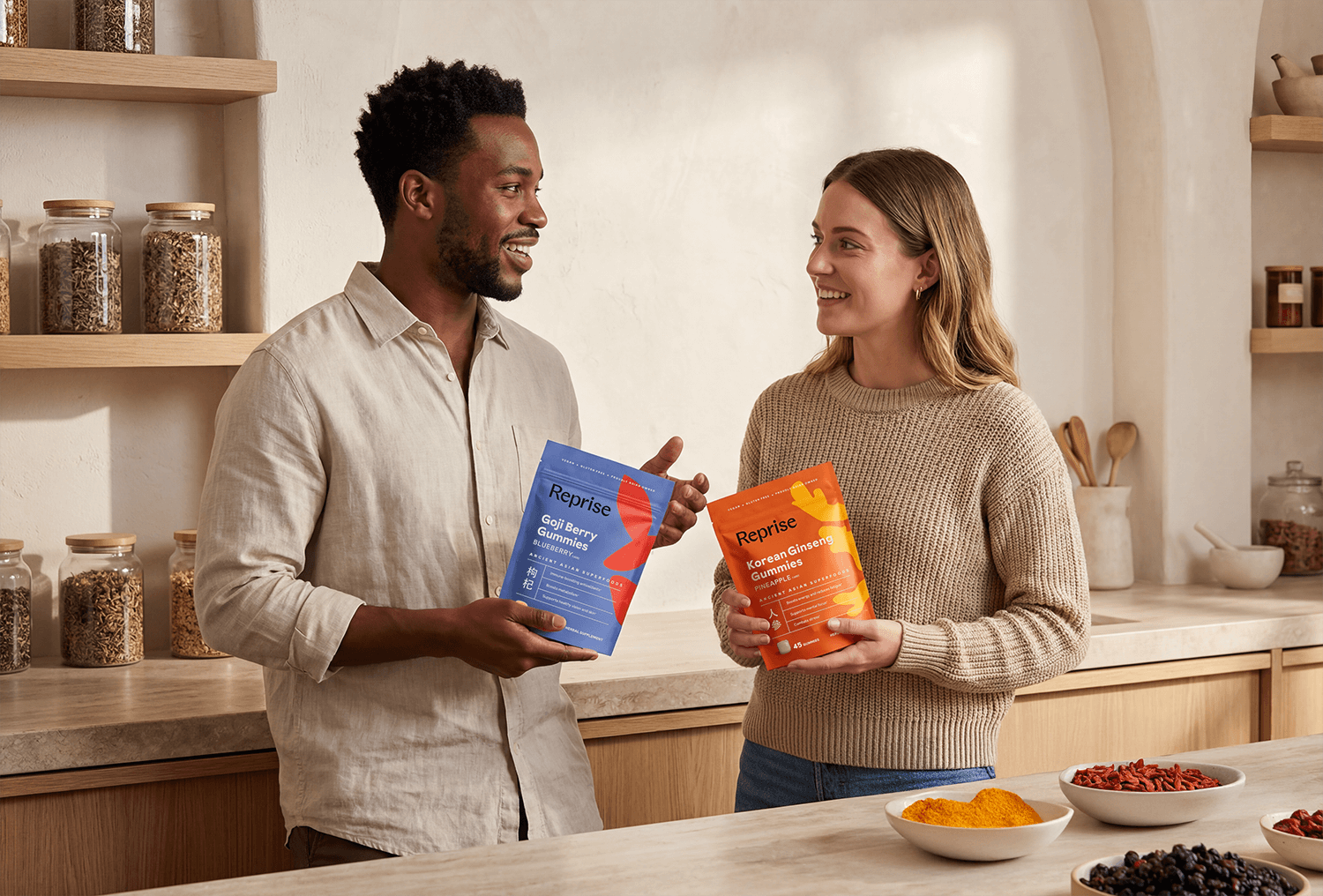
How do you build a system that organizes multiple benefits, ingredients, and price tiers without overwhelming the shopper? This was a portfolio architecture challenge, not just a packaging one.
Creative Challenge
Solution
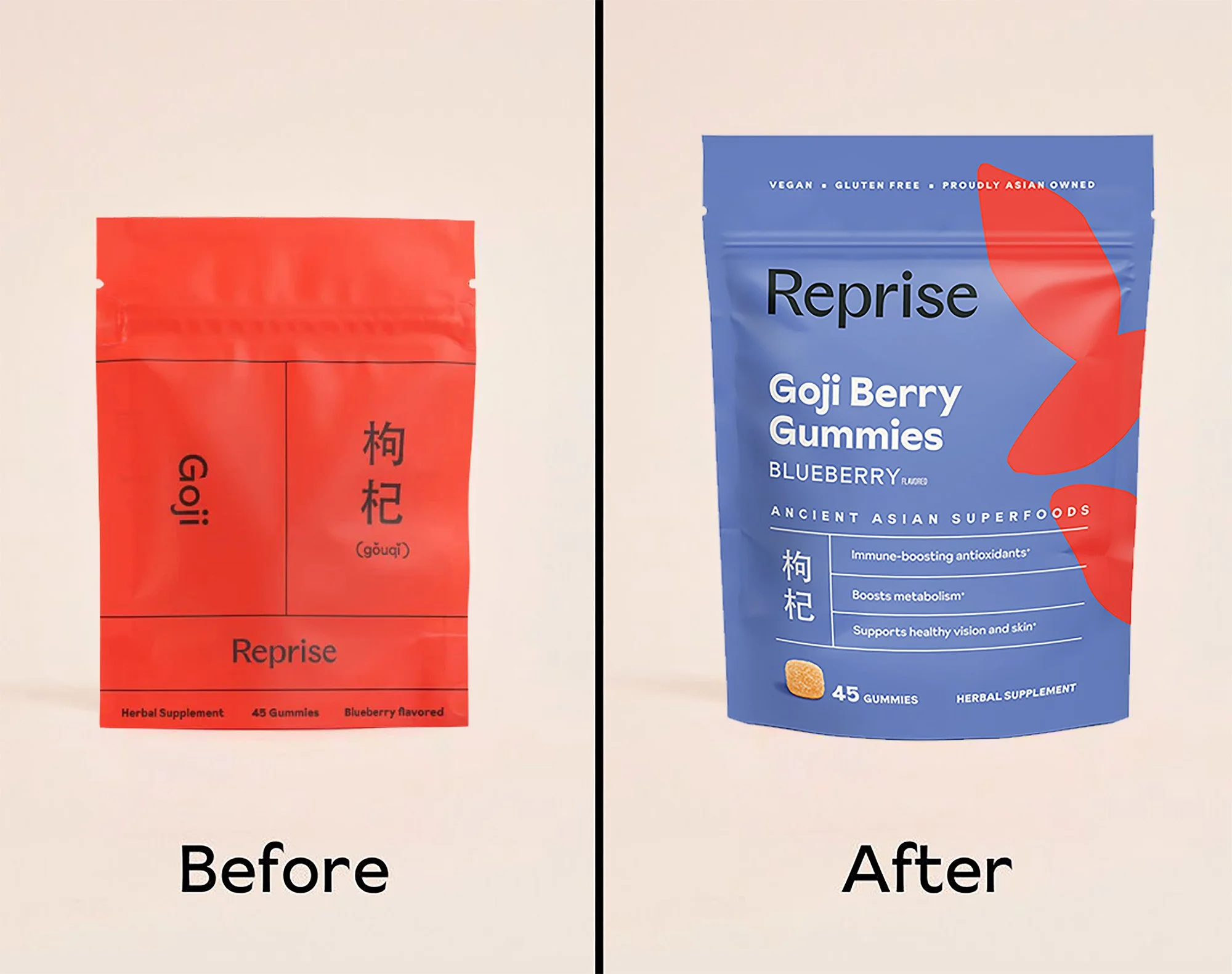
We approached the redesign as a clarity-driven refresh, keeping Reprise’s visual identity intact while optimizing the hierarchy of information to make the product’s purpose unmistakable.
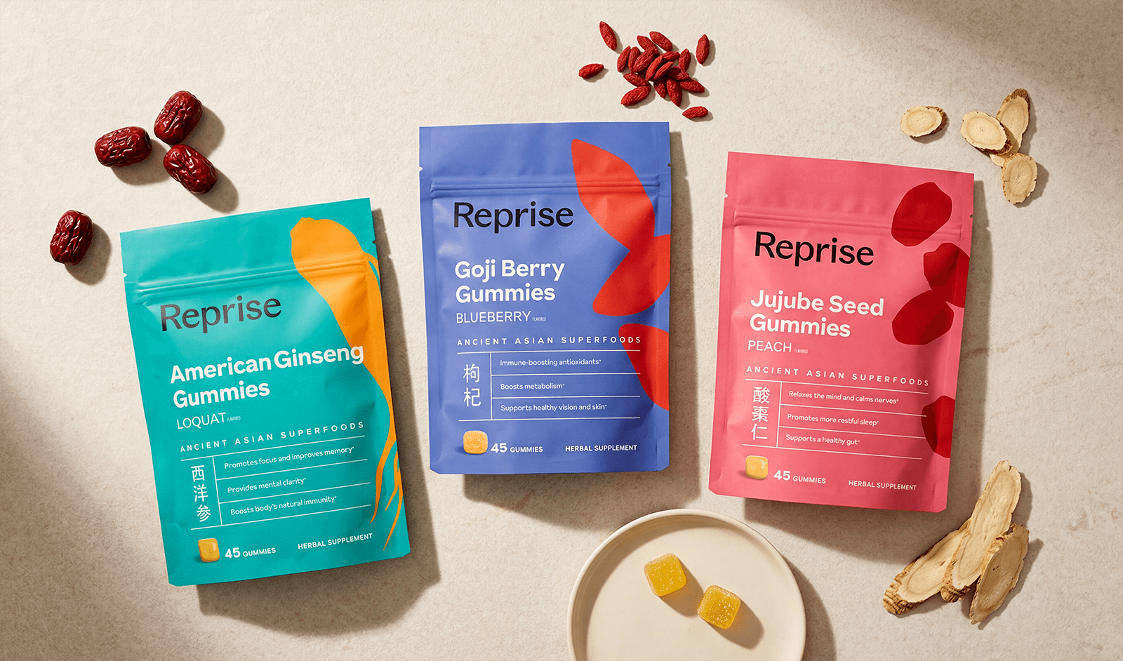
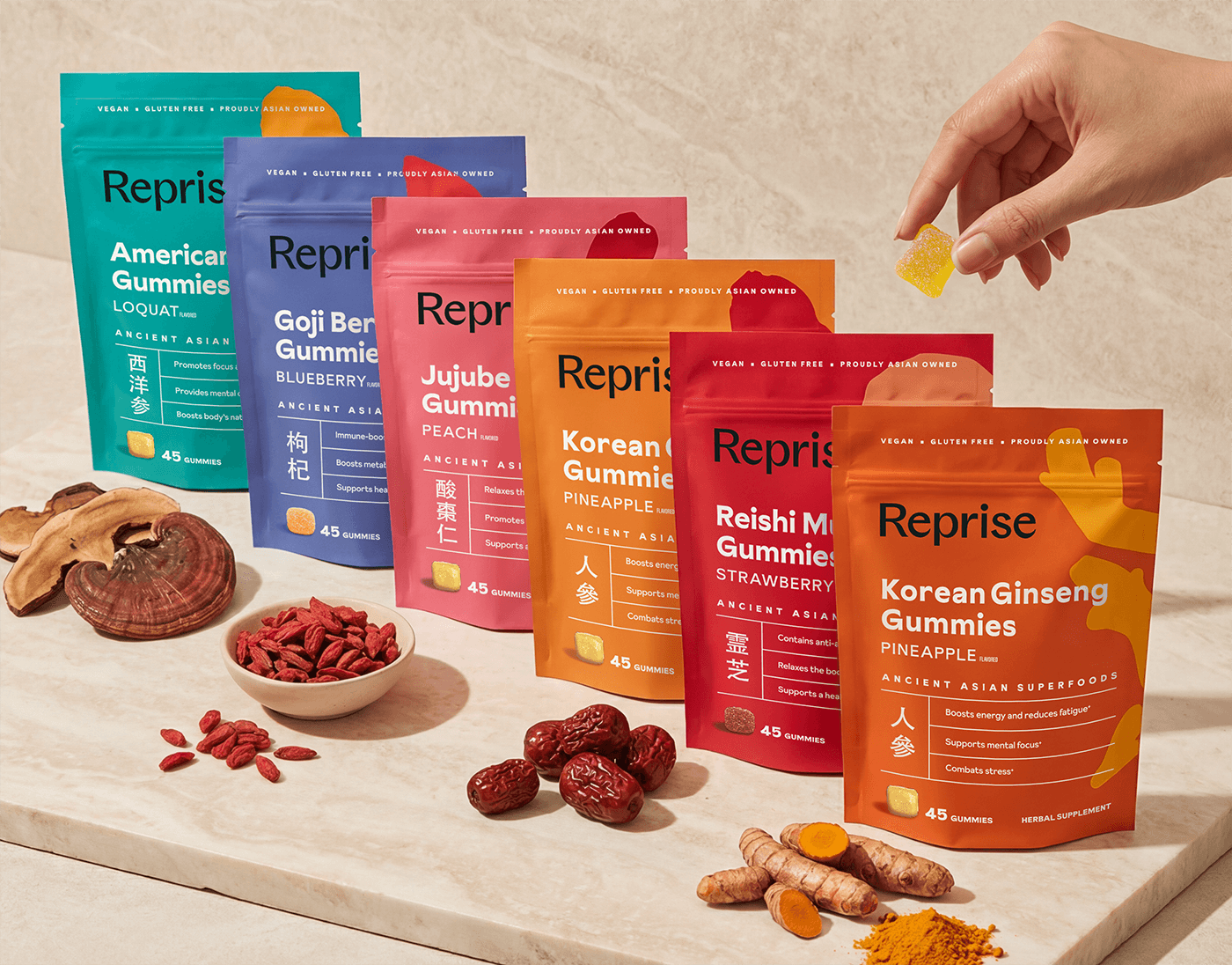
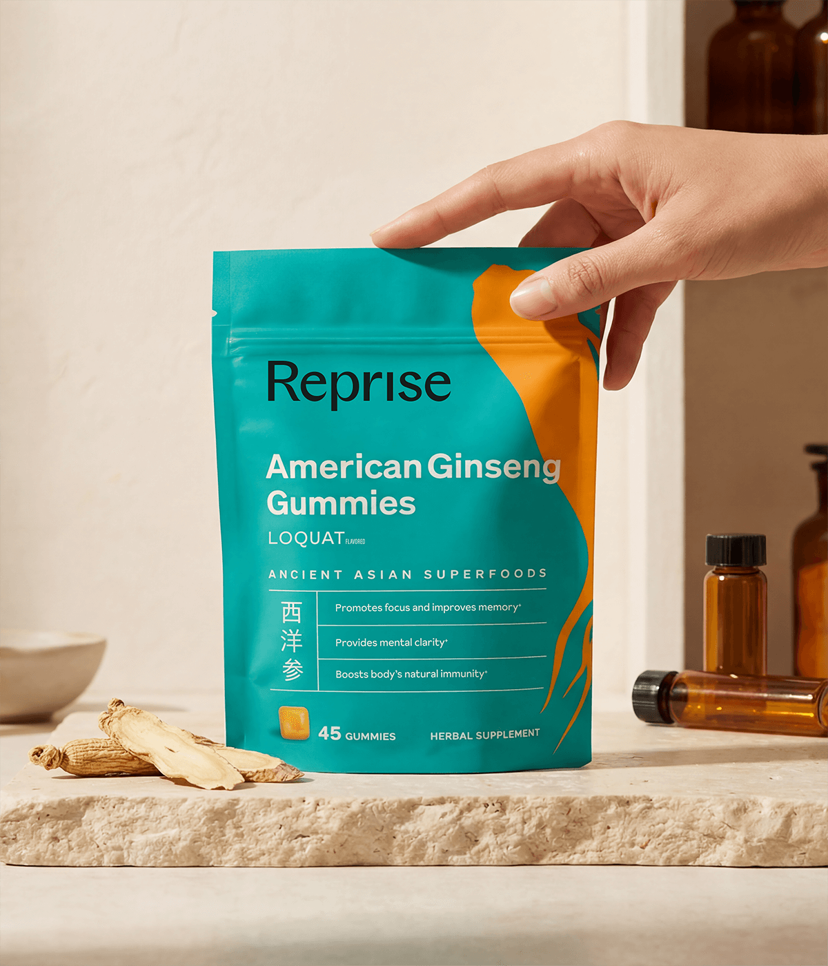
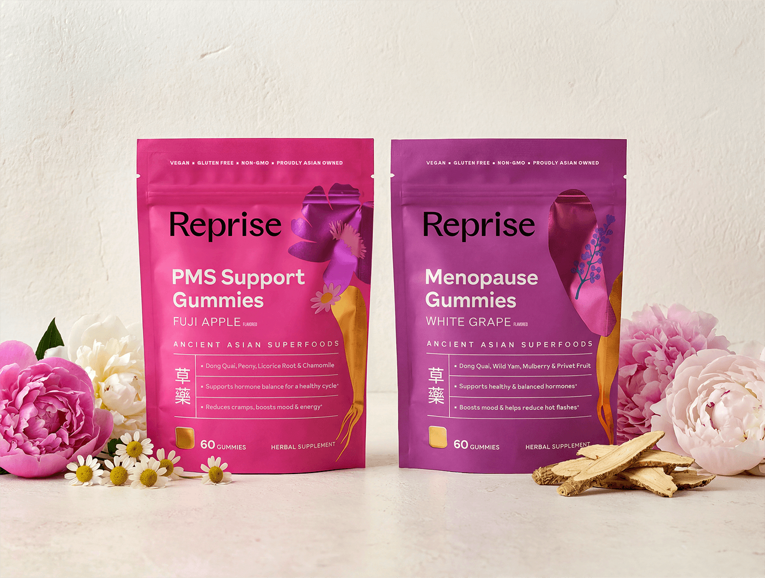
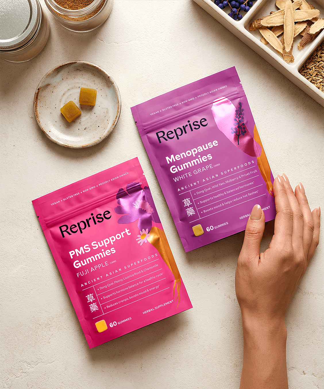
Bold, juicy background colors were used to reflect the Asian-inspired fruity flavors, creating visual differentiation and shelf impact. Custom illustrations, inspired by Chinese papercut art, visually communicate the herbal ingredients and their functional benefits, making the product story accessible at a glance.
From competitive audit to pouch size, substrate, and finish selection, every detail was considered to ensure the packaging works hard for the brand in retail, conveying both flavor and function while honoring Reprise’s heritage and loyal consumer base.
Brand Strategy & Positioning
Packaging Design
Custom Illustration
Portfolio & Pack Architecture
Color Strategy
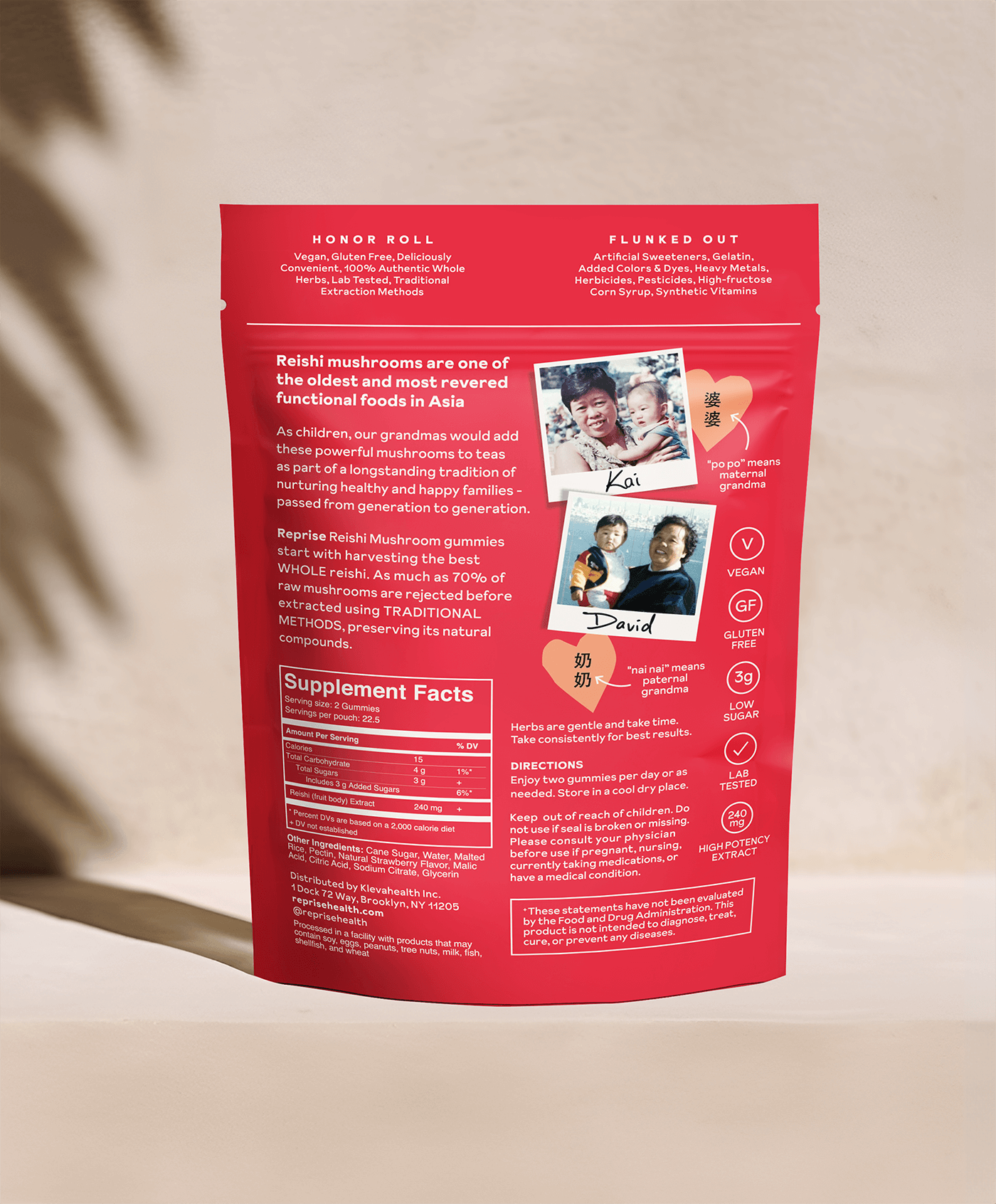
As an AAPI founded brand, this project offered a meaningful opportunity to center the founders’ heritage as the heartbeat of the brand’s authenticity. We integrated personal archival photos of the founders alongside their grandmothers, who served as the original inspiration for translating ancient Traditional Chinese Medicine into an accessible modern format. This storytelling bridge connects the ancestral roots of the formulas to the contemporary consumer, grounding the brand in genuine history. The revitalized identity and systematic packaging made its official debut at Expo West, marking a significant milestone in the brand's retail expansion.
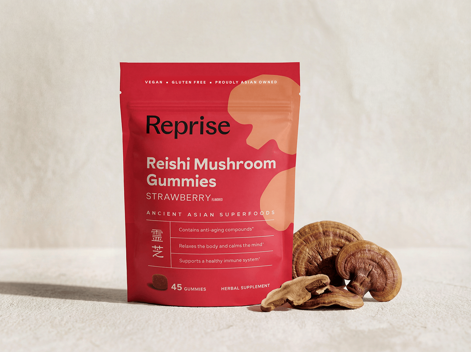
Traditional Chinese Medicine relies on the power of herbs. We felt these ingredients deserved to be the heroes of the visual narrative rather than secondary information. By elevating the botanical elements, we created a bridge between ancient wisdom and modern vitality.
We focused on making the benefits accessible to a broader audience without losing the premium feel that original customers loved. By weaving these ingredient stories into a contemporary, shelf ready aesthetic, we preserve the cultural roots of the brand. The final result is a packaging system that feels rooted in heritage yet maintains the punchy, vibrant energy required to thrive in a competitive retail landscape. SKUs are easily differentiated with clear navigation to help the consumer understand the product benefits as well as celebrating the unique herb and flavors of the gummies.
For the Women’s Health line, we elevated the brand’s visual language to signal a more premium, specialized tier of care. By introducing a sophisticated metallic finish to the pouches, we transformed the packaging into a high end wellness ritual. This shimmer does more than grab attention; it illuminates the custom papercut illustrations, adding a layer of depth that celebrates the botanical ingredients.
We also utilized strategic color coding to ensure the line feels intuitive within the retail landscape. We leaned into category cues by using a bright magenta for PMS support and a rich purple for menopause products. Pairing these familiar tones with the new metallic substrate allows the brand to be instantly recognizable on the shelf while maintaining its vibrant, cultural DNA. This system helps shoppers navigate complex health needs with ease, offering a sense of elegance and efficacy that resonates with a modern wellness audience.
“Anna was instrumental in making Reprise Health’s packaging retail-ready. She goes beyond just design— she studies competitive shelf sets to ensure products stand out in a crowded market. Her keen eye for detail and deep understanding of consumer behavior helped us create packaging that is both visually striking and highly functional.
From branding to structural considerations, Anna covered every aspect needed for retail success. She transformed our vision into a design that not only looks great but also communicates our brand story effectively. If you need a designer who blends creativity with strategic thinking, Anna is the one to work with.”
Kai Lim
Founder of Reprise Health