How do you modernize a logo without losing the heart of it?
When redesigning logos- especially those of legacy brands,
it’s important to look at the heart of what made it distinct in the first place
Start by squinting
👀 What are the key shapes you see?
🎨 What are the color impressions?
🔠 Then observe the letterforms
💡 Are there areas that can be simplified?
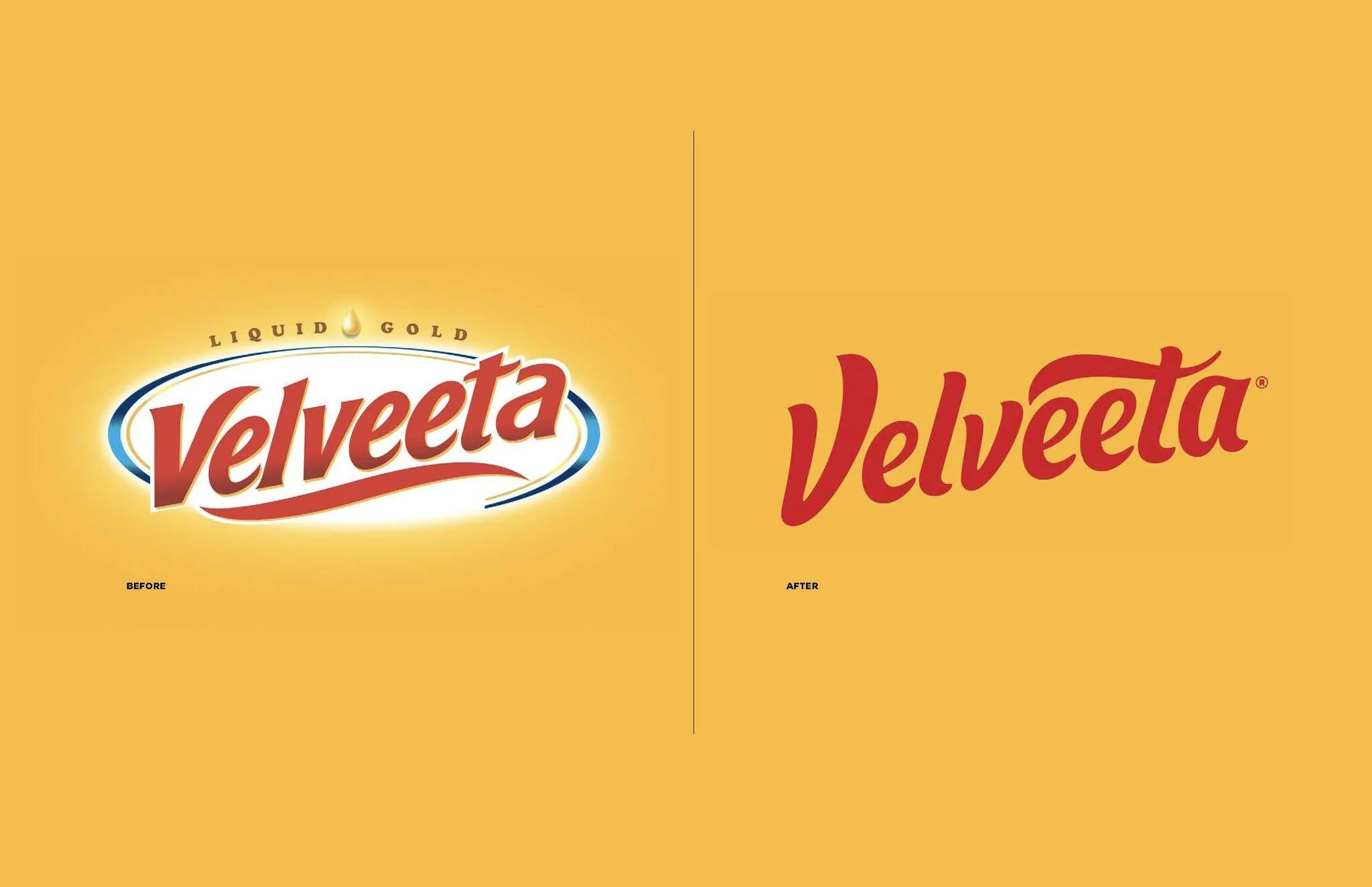
🧀 Here’s a redesign of the Velveeta logo I did while at JKR that shows a before and after:
Taking the essence of a classic American icon
and amping up the expressiveness of the letterforms
Stripping away the glows and all the extra details
Down to a logo that is bold, creamy and modern
Keeping the heart of where it was
And giving it a transformation
It feels modern yet familiar doesn’t it?
Keeping it fresh to bring new relevancy
yet not so different that it alienates loyal consumers
❤️ That’s the fine line when doing a redesign


