Magnolia Bakery
Magnolia Bakery, an iconic name in baked goods, was expanding into retail distribution for the first time. The challenge was to translate their refreshed brand identity– developed for bakery locations– into packaging that could stand out on store shelves. It needed communicate product variety while keeping the charm and authenticity that fans love.
The design needed to honor Magnolia’s heritage while creating a retail-ready system that felt approachable, appetizing, and true to the brand’s playful, classic personality.
Market Opportunity
Outcome
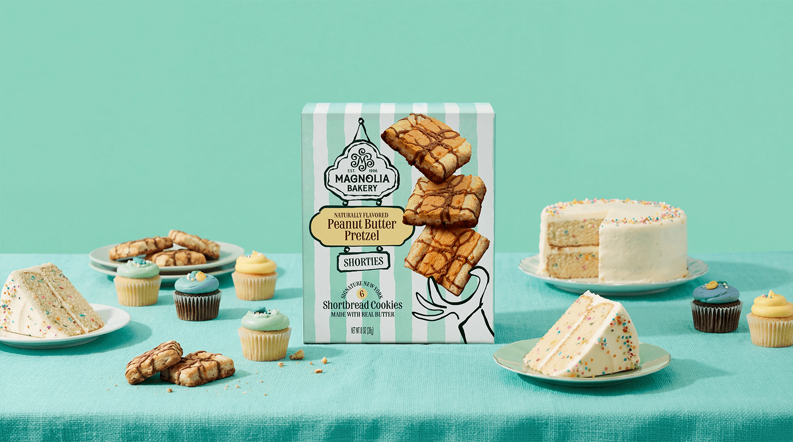
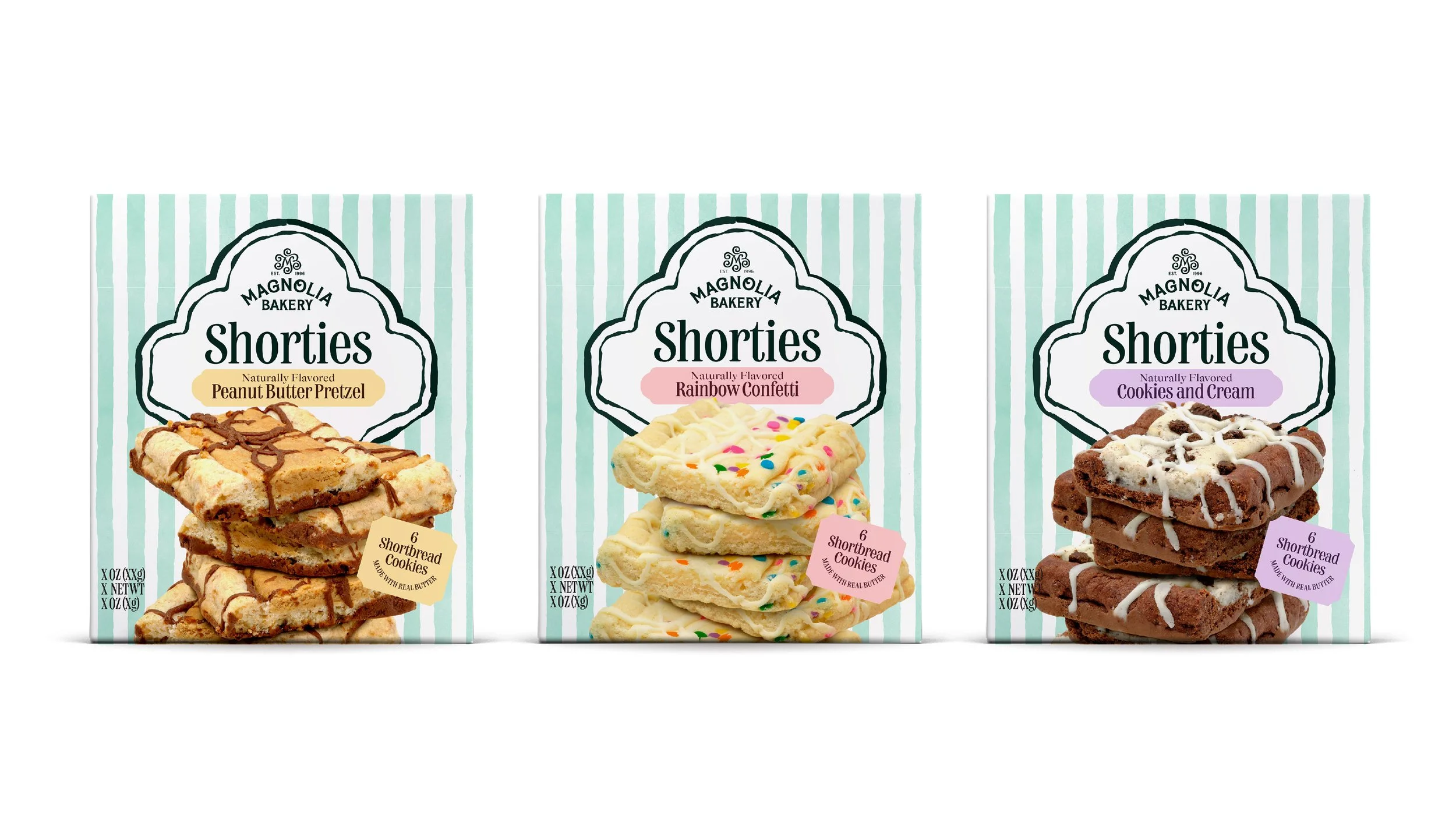
The packaging design keeps things classic and charming, reflecting Magnolia’s signature style.
A clean white background lets the iconic Magnolia Bakery logo take center stage, while bold, appetizing photography highlights the variety of cookie flavors. Illustrations drawn from the Magnolia brand world evoke a sense of playful tradition, connecting the retail products to the bakery experience and reinforcing brand recognition.
Every design element works to balance heritage with modern shelf appeal, making the cookies irresistible at a glance.
Brand Strategy & Retail Translation
Packaging Design
SKU Architecture
Concept Development & Iteration
In collaboration with Jones Knowles Ritchie
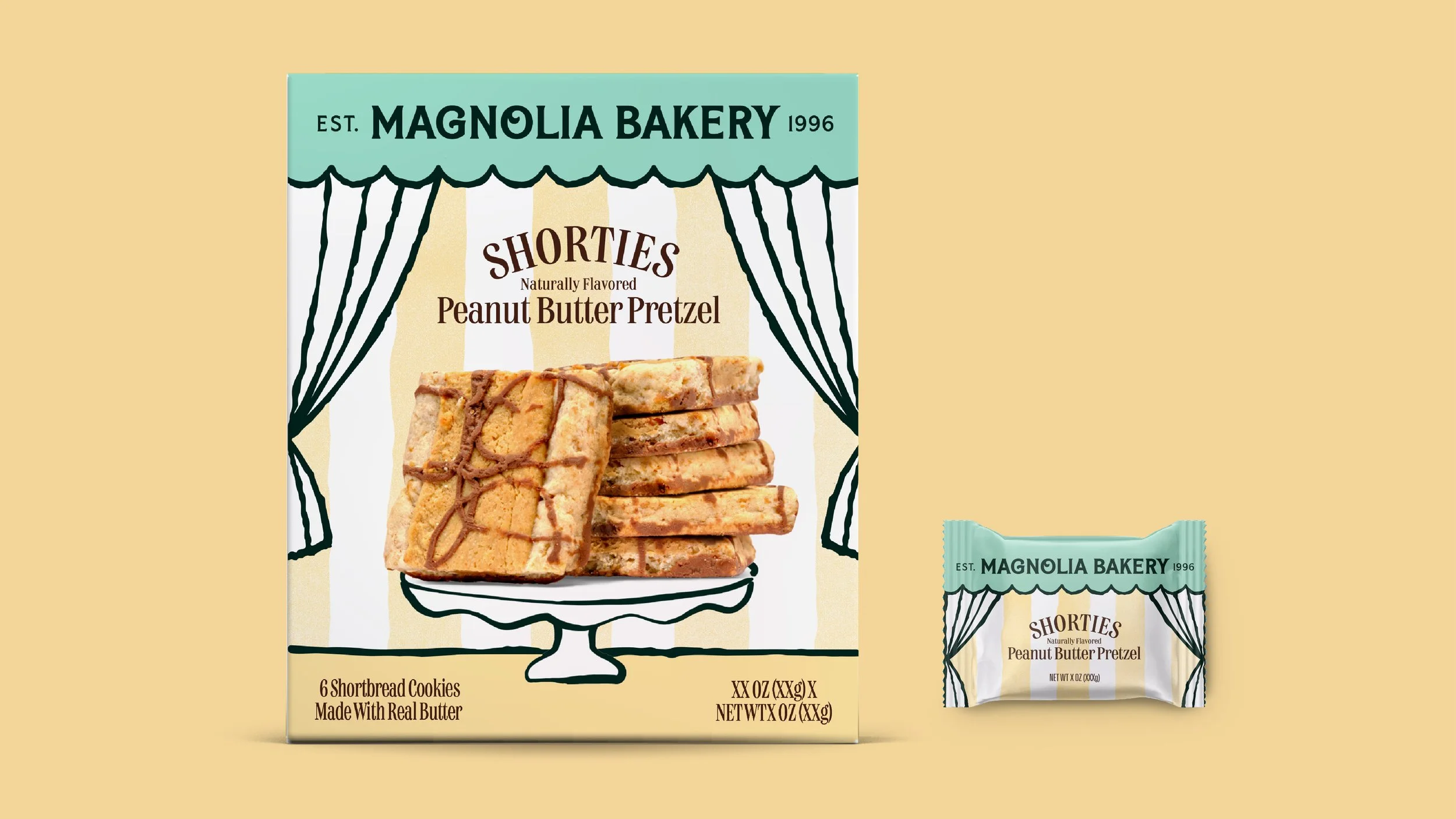
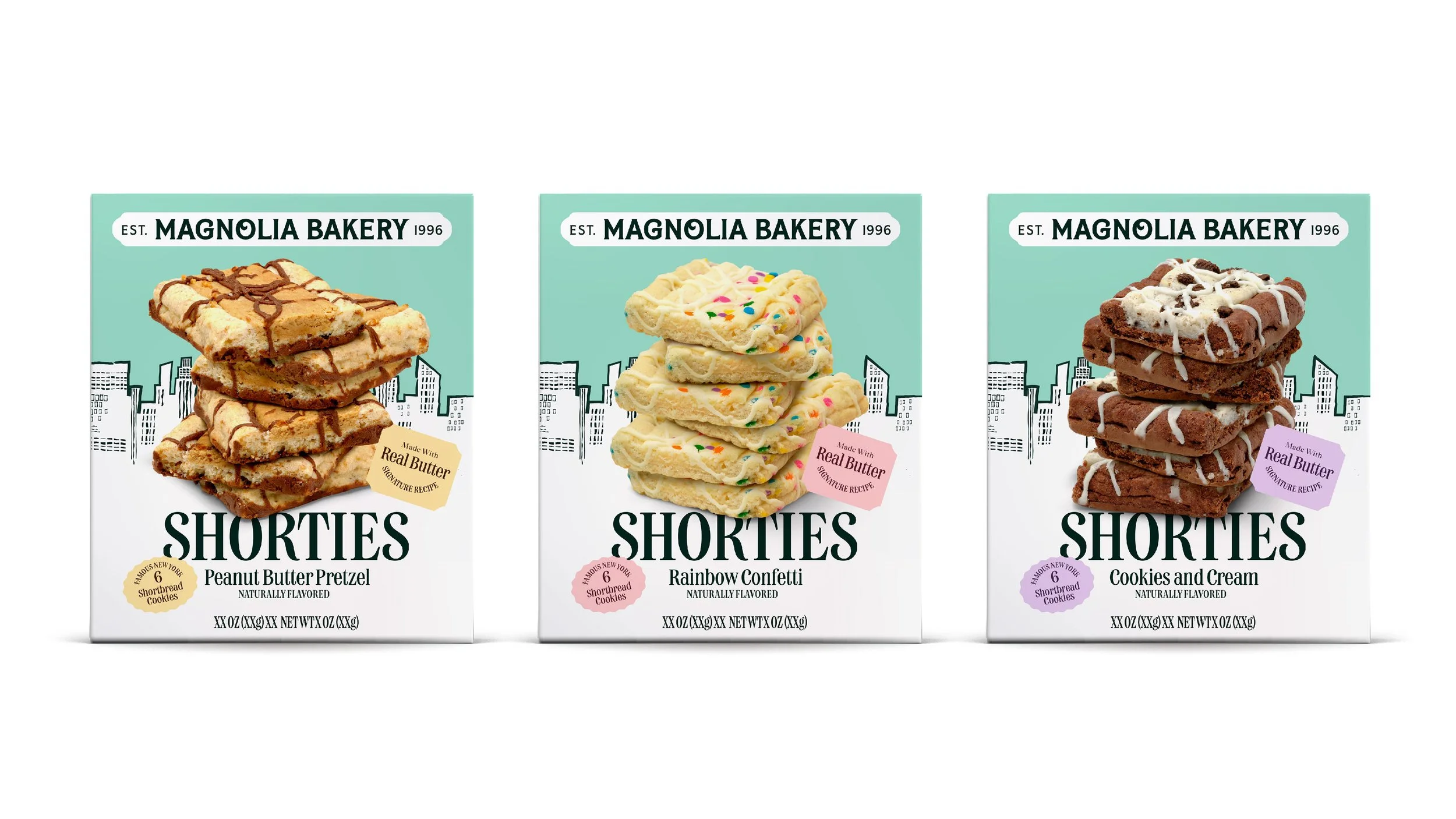
This design exploration captures the hand-crafted charm of the original neighborhood institution and scales it for the retail shelf. By leaning into the iconic mint stripes and introducing dynamic product photography, the system celebrates the decadent textures and buttery joy the brand is known for.
A key strategic element is the framing, which is designed to echo the classic hang signs found on bakery doors, anchoring the product in its New York heritage. This nostalgic touch, paired with playful hand-drawn illustrations and soft color blocking, ensures the packaging feels like a premium, "straight-from-the-kitchen" treat that is both approachable and shelf-ready.
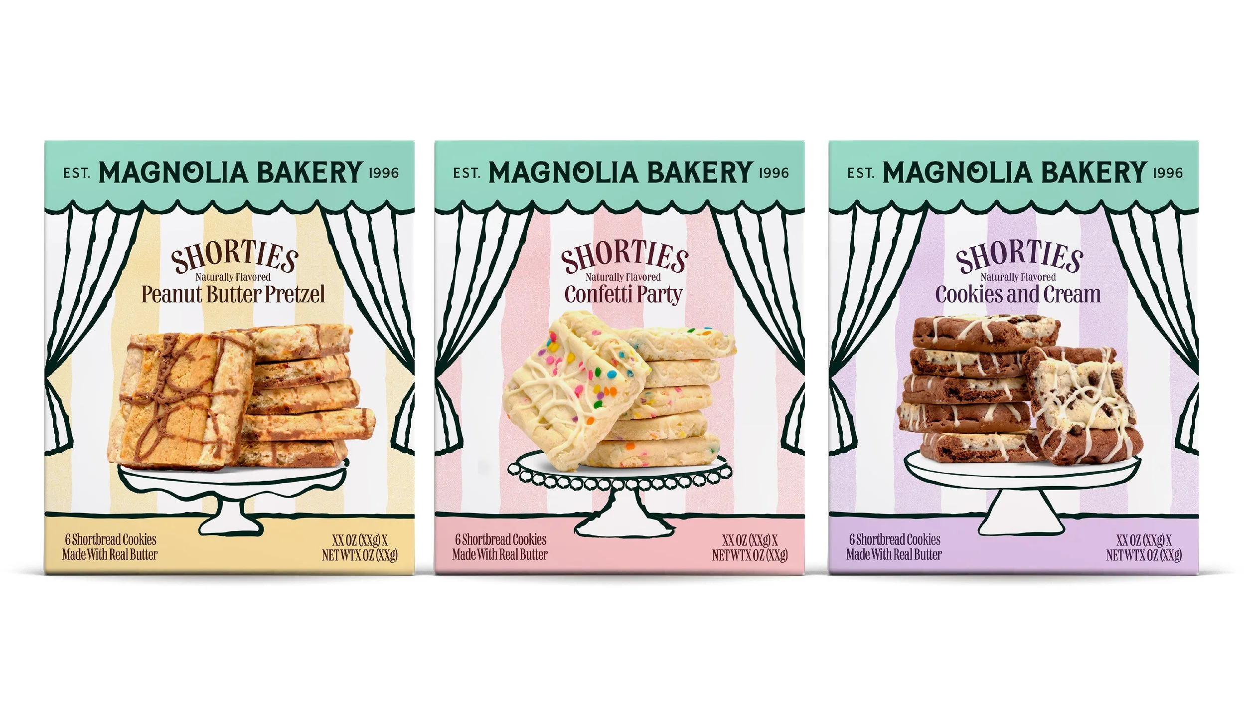
We moved between vintage-inspired checkerboard patterns that evoke a classic kitchen feel and illustrative New York City skylines that ground the product in its West Village roots.
These outtakes were vital for pressure-testing the "bakery-door" framing and hand-drawn elements, helping us understand which combinations felt truly personal and which felt too mass-produced.
By iterating through these varied typographic scales and color stories, we were able to define the exact threshold where nostalgia meets modern snack-aisle impact. It’s a glimpse into the rigorous process of refining a heritage identity until only the most essential and expressive brand truths remain.
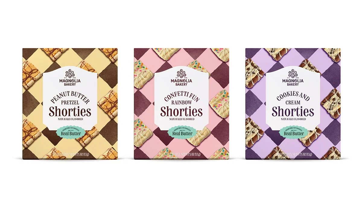
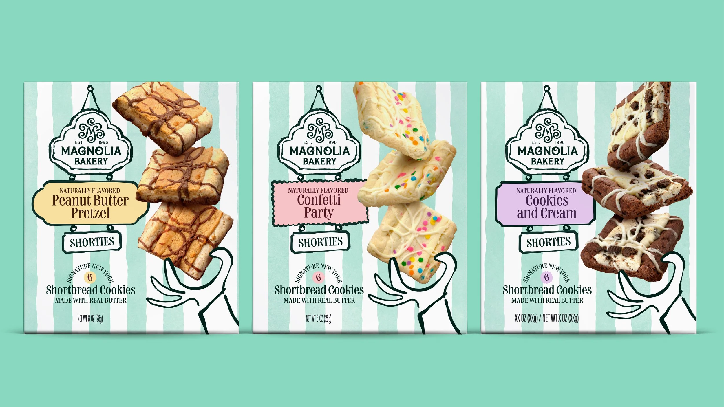
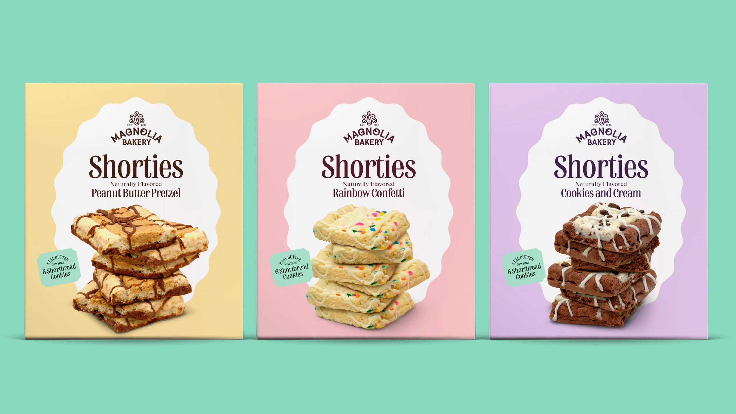
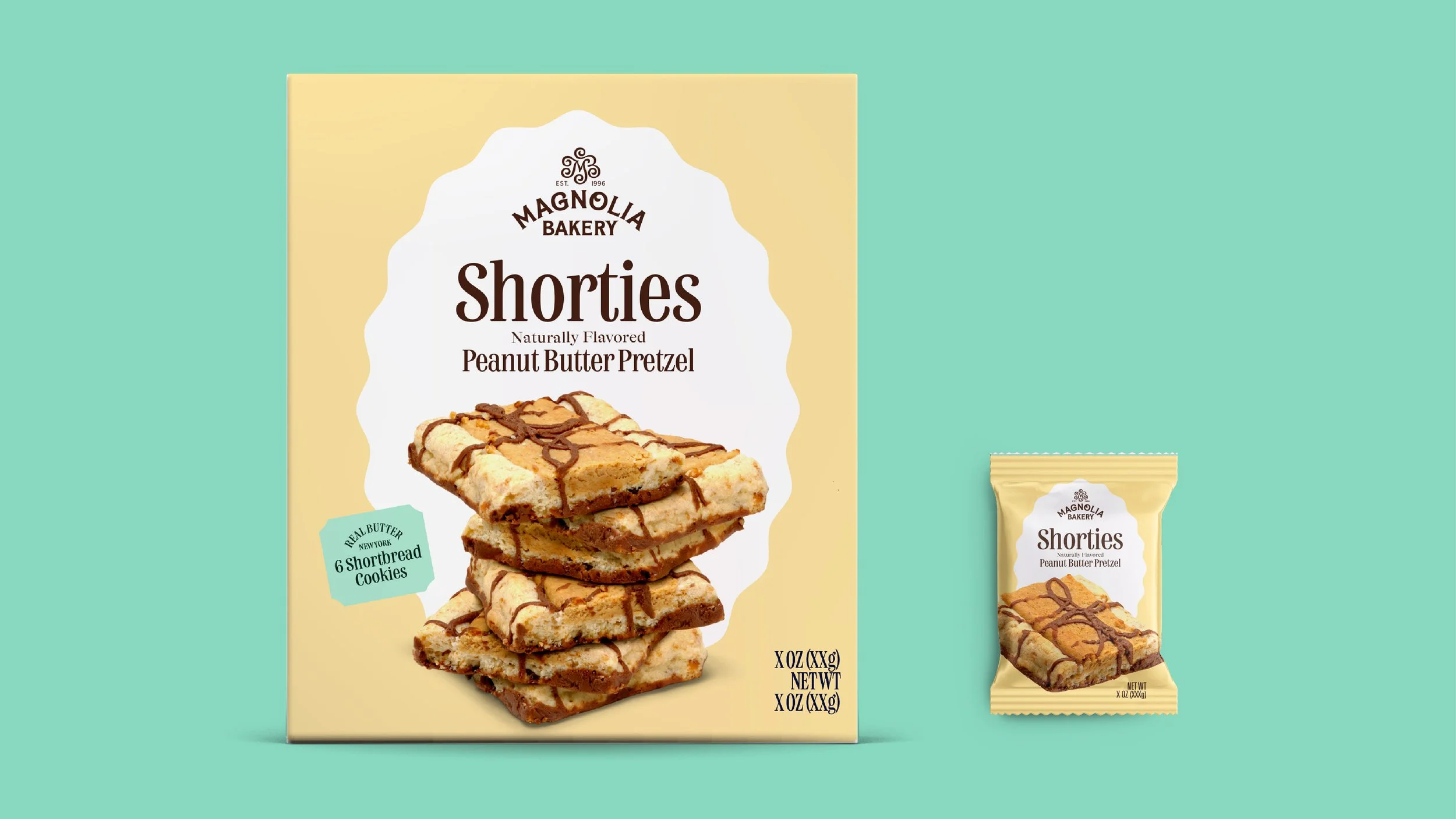
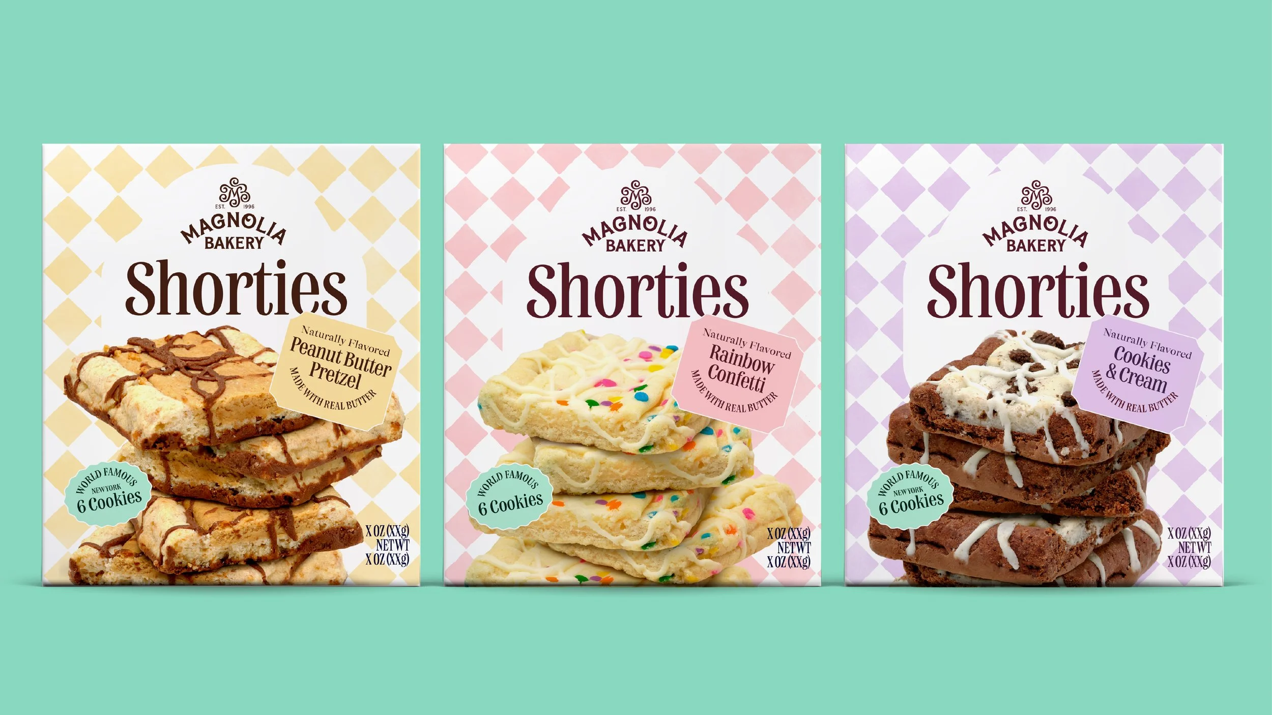
Brand patterns serve as distinctive assets that instantly anchor the product in the brand’s whimsical, boutique heritage. By rotating through patterns like diamonds, polka dots, and hand-painted stripes, the design gives each flavor – from Peanut Butter Pretzel to Rainbow Confetti – its own vibrant personality while the signature mint green keeps the portfolio unified.
These patterns do more than just add shelf appeal. They act as a secondary navigational tool that complements the indulgent food photography, creating a sophisticated yet playful visual rhythm. This strategic use of pattern transforms the packaging into a tactile brand story, ensuring the collection stands out as a premium, storied treat in a crowded aisle.

Preparing Brands for National Retail