MUD\WTR
Market Opportunity
MUD\WTR occupies an unique space in the market. It replaces coffee, but it’s not tea. It delivers functional benefits, but it doesn’t move like a supplement. And it needs to educate new consumers without slowing down the purchase decision.
In both retail and ecommerce, that tension creates friction.
Most functional beverages either lean too clinical and lose emotional appeal, or too lifestyle-driven and lose credibility. At the same time, the portfolio was expanding beyond a single hero SKU into matcha, coffee, flavored blends, and seasonal releases. Without a clear system, each new product risked adding complexity instead of clarity.
The mandate was not simply to refresh packaging. It was to create a design architecture that could clarify the offer, improve shopability, and scale as the business grows.
Outcome
A modular packaging system was developed to balance warmth, credibility, and speed of recognition.
A consistent structure creates familiarity across the lineup. Clear benefit communication establishes functional value. A disciplined color strategy organizes the range at a glance.
The result is a portfolio that reads as a cohesive family rather than a collection of individual SKUs. Shoppers can quickly understand the differences between products, and the brand can expand without rethinking the design each time.
As a result, the system reduces decision friction today while protecting equity long term.
Packaging Strategy & Design
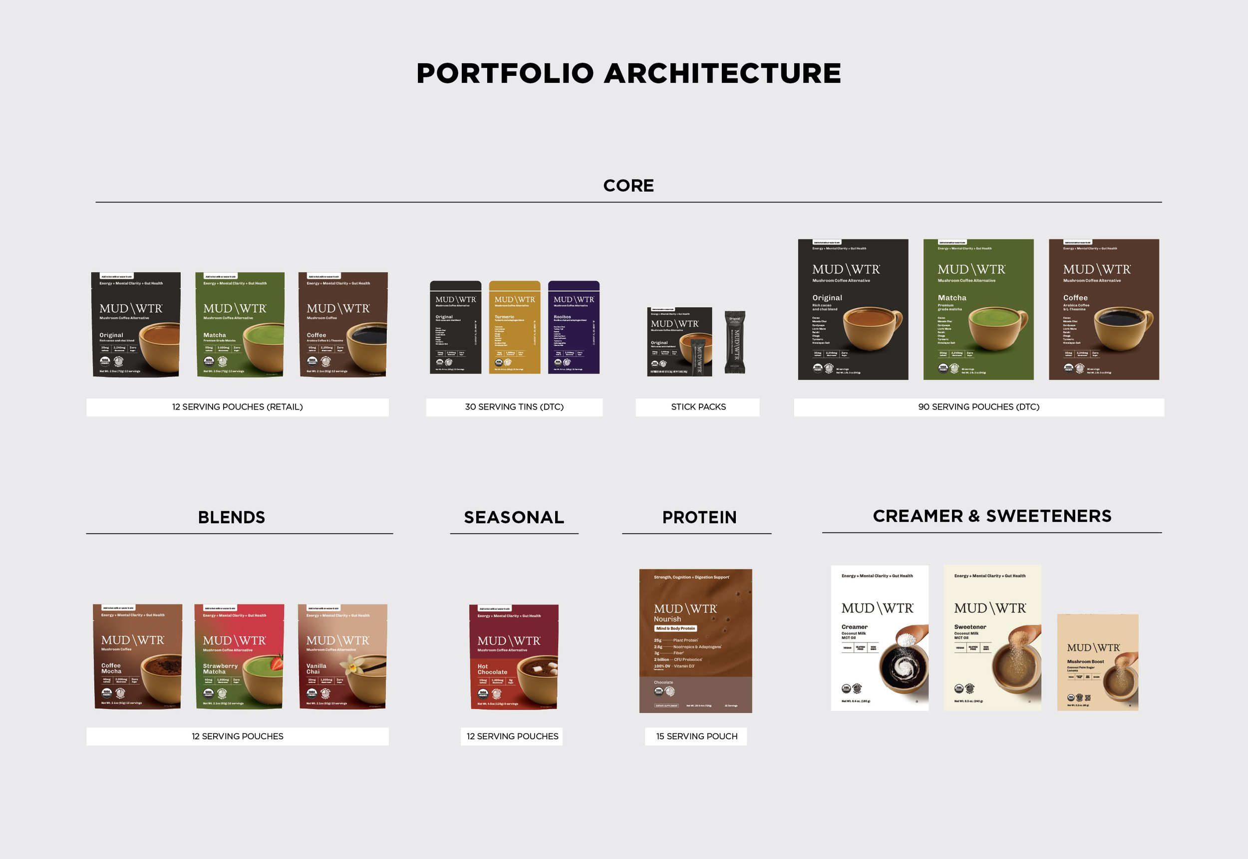
Portfolio Architecture
Design System Development
Color & Range Navigation Strategy
SKU Extension Framework
Cross-Format Implementation
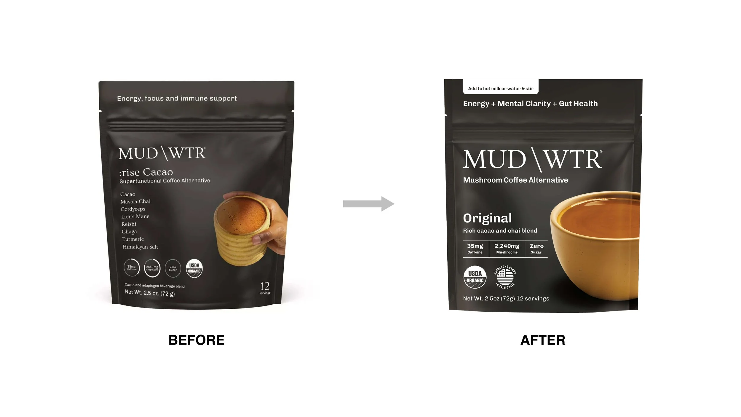
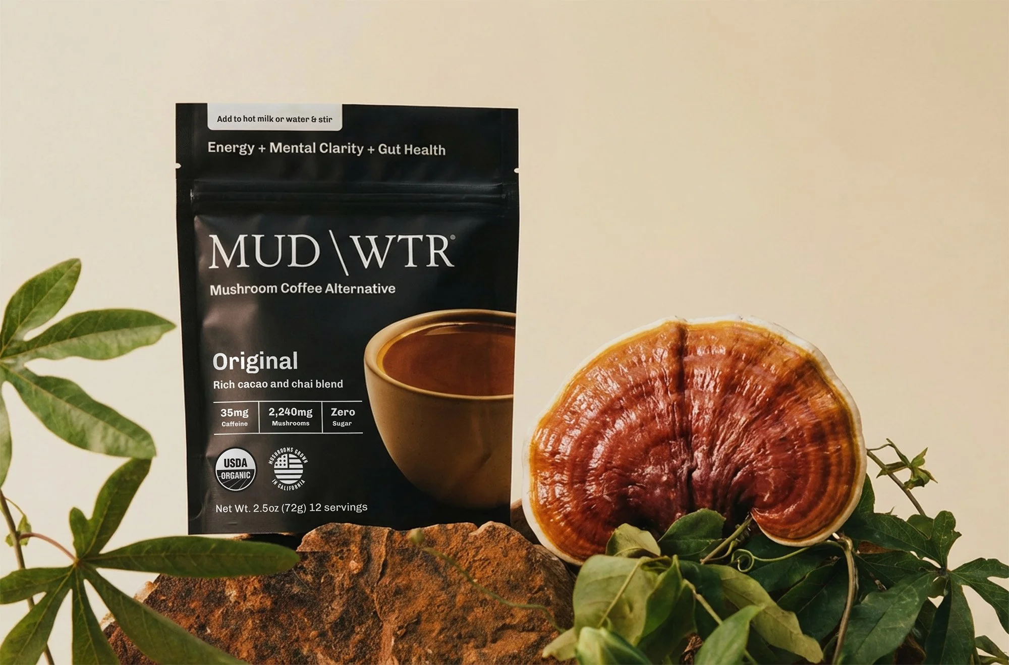
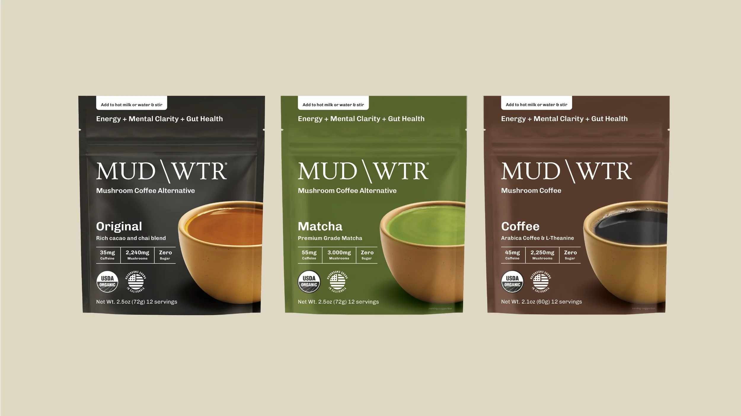
The evolution of MUD\WTR’s packaging marks a strategic shift toward radical clarity and benefit-driven design across the entire product line. By moving away from dense ingredient lists in favor of high-impact callouts for caffeine content, mushroom dosage, and specific health outcomes like gut health, we ensured that the functional value of every SKU is immediately accessible to the consumer.
This portfolio-wide refresh modernizes the brand’s premium aesthetic through larger, more immersive product photography and a simplified typographic hierarchy. The result is a cohesive visual system that prioritizes the consumer's need for quick information while reinforcing MUD\WTR's position as a leader in the functional beverage space.
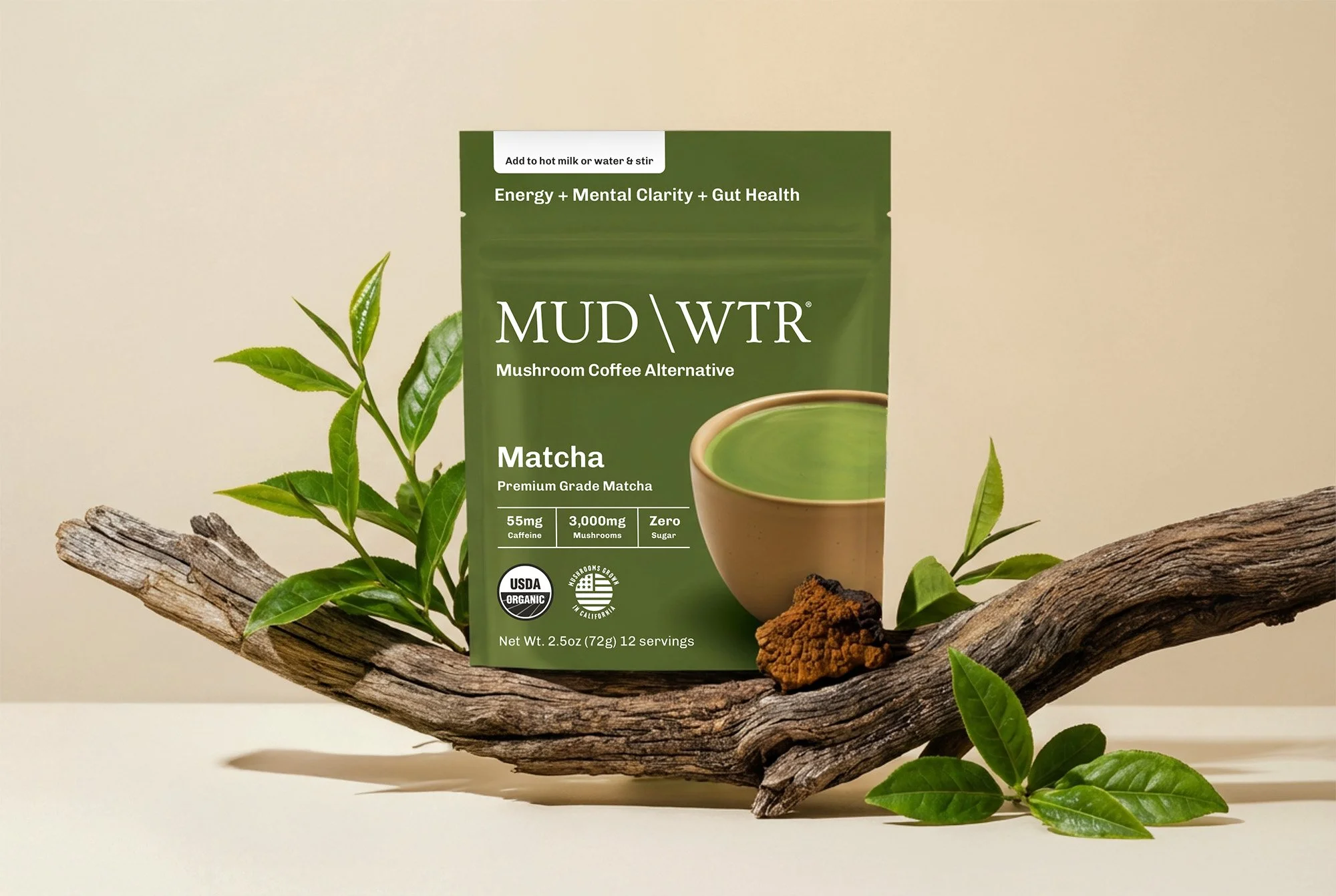
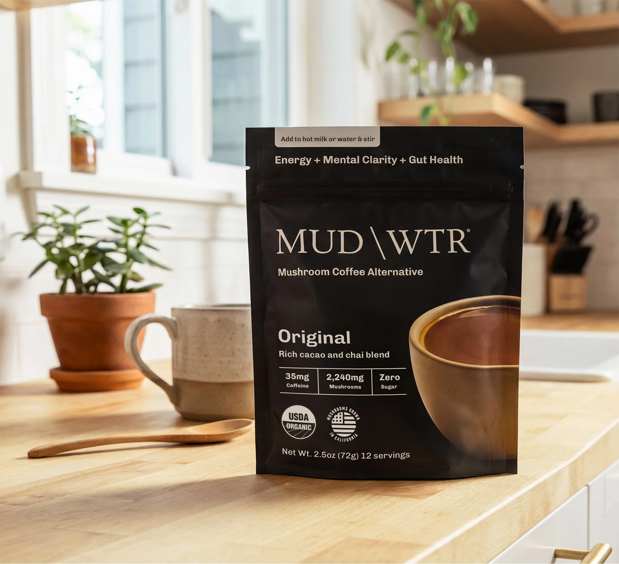
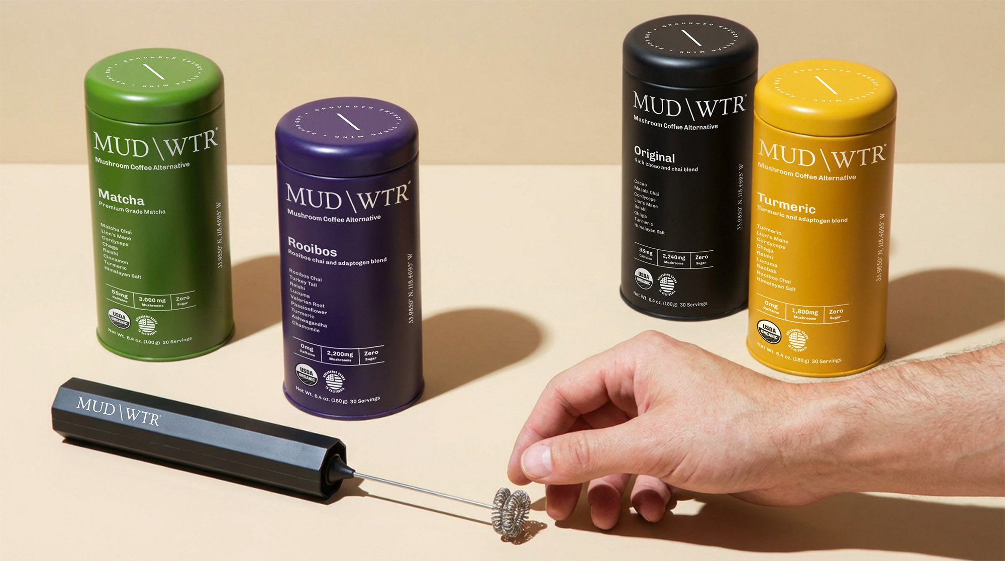
The MUD\WTR portfolio started off with core SKUs: Original and Matcha.
Solid, grounded color fields create stability and trust, positioning the products as daily rituals. The restrained palette differentiates variants while maintaining a unified shelf presence.
This base gives the portfolio a clear center of gravity before introducing variety. Strong color blocking and a consistent layout ensure every SKU remains legible across environments, from physical retail to ecommerce thumbnails and paid media. The packs function as navigation tools, helping consumers identify and select products in seconds.
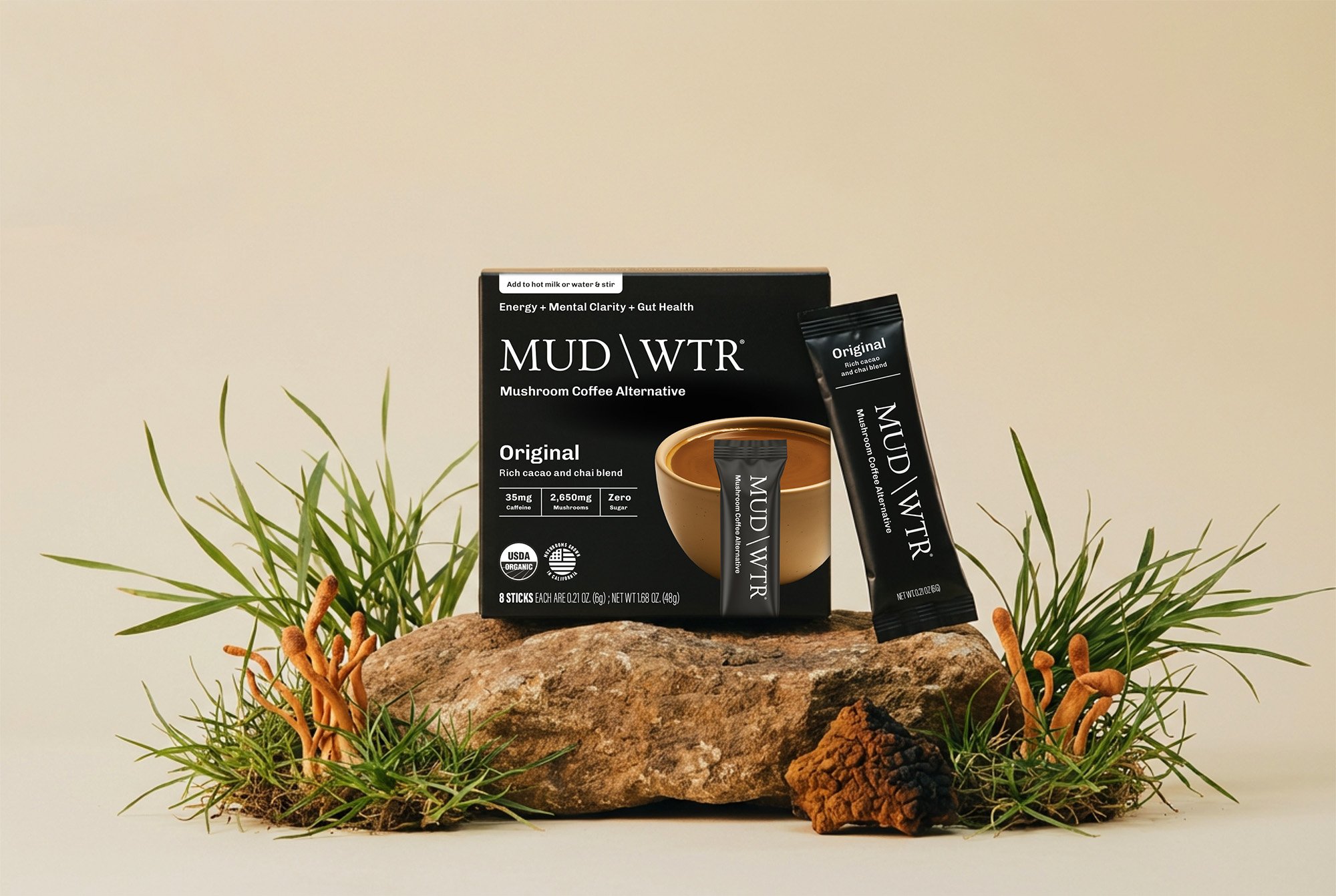
The brand originated with a reusable tin format that is distinctly theirs.
Here, color blocking does the heavy lifting. Each SKU is defined by a dominant color, making differentiation immediate even at small sizes. The simplified layout preserves the same hierarchy as the pouches, ensuring the format feels like part of the same family rather than a separate line.
Different format. Same system. Zero re-learning for the shopper.
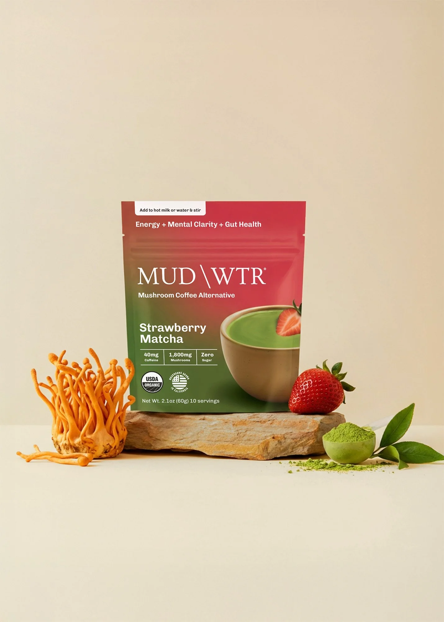
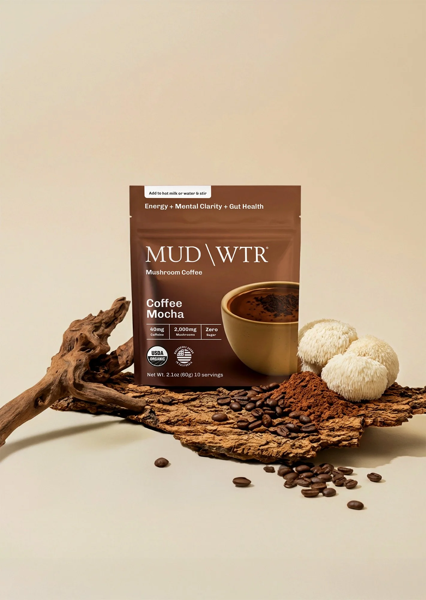
As the portfolio grew into flavored and functional blends, the priority was to signal variety without fragmenting the brand.
We introduced gradients as a simple visual shorthand for blended or enhanced formulas. While the structure remains consistent, the gradient immediately communicates added flavor or complexity.
Solid fields denote core products. Gradients denote blends. It’s an intuitive rule that shoppers understand instantly, without needing to read copy.
The system was built with growth in mind. Rather than treating each launch as a standalone design exercise, we established a clear set of rules that allow the portfolio to expand without adding complexity. New core SKUs inherit the base structure, new flavors integrate seamlessly through the gradient language, and limited editions introduce expression while maintaining the same foundational framework.
The outcome is a cohesive, scalable portfolio that’s easier to shop and easier to grow. Clear differentiation improves navigation across retail and ecommerce, stronger visual consistency builds recall in a crowded category, and a flexible system supports faster, lower-friction SKU expansion.
What began as a packaging engagement ultimately became a brand platform, positioning MUD\WTR as a credible, everyday alternative to coffee and giving the business a foundation built for long-term growth.
“We worked with Anna to do a revamp of our packaging. Anna did a great job combining technical expertise, the net weight needs to be this size, with visionary exploration.
She always brought us several ways in that challenged us and was super open to feedback and changes in direction. It was a great experience working with her.”
Megan Scott
VP of Marketing at MUD\WTR
More Disruptive Brand Systems