Silk Plant-Based Milk
Market Opportunity
Silk’s packaging system was breaking down in real retail environments.
In bunker fridges and standard shelving setups used by Kroger and Walmart (two of Danone’s largest customers), structural elements of the fixture were actively blocking key information.
Shelf bars and fridge rails obscured the upper and mid sections of the pack
The plant base (Almond, Soy, Coconut) was partially or fully hidden
Variant navigation became inconsistent across SKUs
Shoppers were forced to rely on incomplete signals
At the same time, the product proposition wasn’t landing clearly.
The “5 Essential Nutrients” benefit was present, but not immediately understood or prioritized.
The redesign started with a simple shift in thinking.
Not how the packaging looks in isolation, but how it performs when it is partially blocked, quickly scanned, and competing for attention.
Key information was repositioned into the areas of the pack that remain visible across most shelf conditions. The plant base, which is the first decision most shoppers make, was brought into a more reliable field of view and reinforced through scale, color, and typography so it could still be recognized at a glance.
At the same time, the system was simplified to reduce friction. Instead of multiple elements competing for attention, the hierarchy was tightened to guide a clear reading path. Brand, product type, and core benefit work together instead of against each other.
The “5 Essential Nutrients” message was clarified and given a more intentional role. Rather than sitting as a supporting claim, it becomes a clear reason to choose, something shoppers can understand instantly without needing to search for it.
Every decision was made to ensure that even in imperfect conditions, the packaging still communicates what it is, what it offers, and why it matters.
Outcome
Packaging Architecture
Shelf Visibility Optimization
Information Hierarchy Design
SKU System Development
In collaboration with Jones Knowles Ritchie and Danone
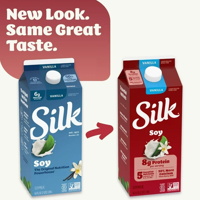
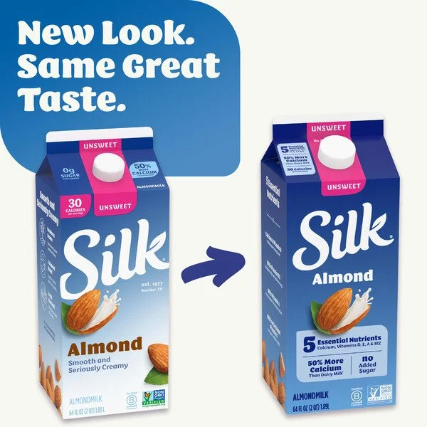
BEFORE
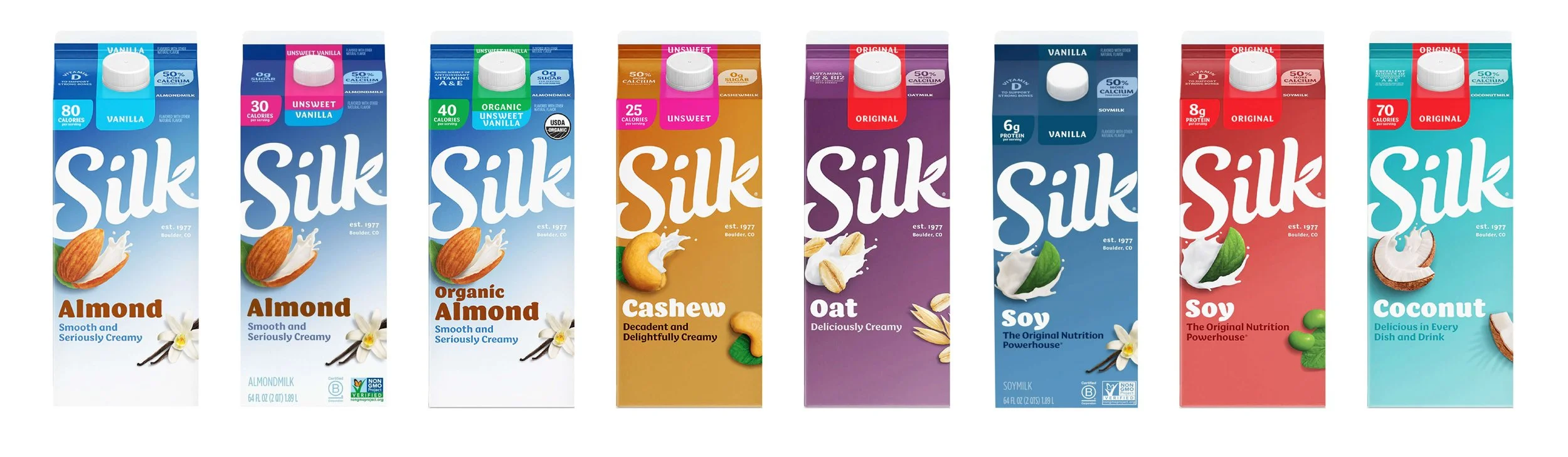
The previous system struggled to hold together on shelf.
Key information shifted from SKU to SKU, and critical details were often pushed into areas that became obscured in real retail environments.
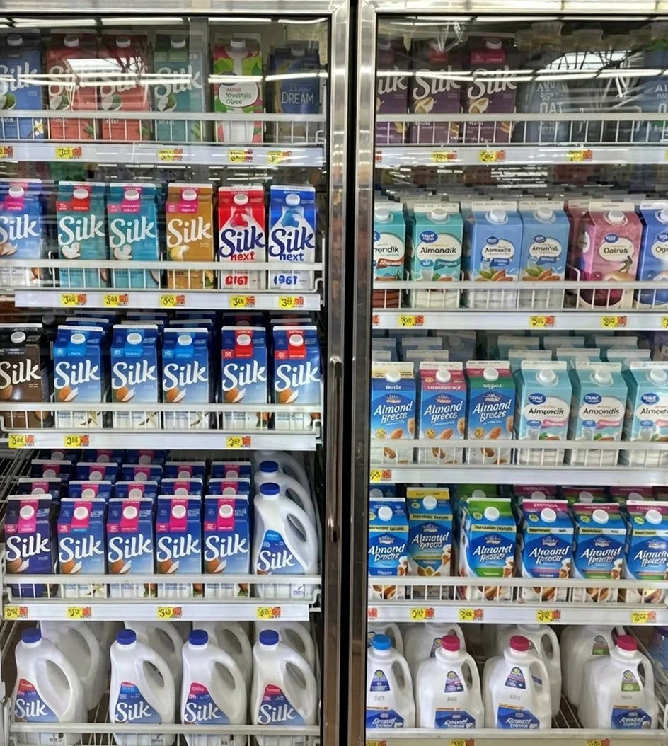
Key messaging was being obscured by door bars at Kroger and Walmart. Important information such as milk base type needed to clear the 3” bar in order to ensure shoppability and navigation.
Additionally, when these milk cartons would be merchandised in bunkers, all visibility of carton would be lost. The only area of communication seen from the top would be the gable of the carton.
We had to rethink how to highlight messaging to ensure visibility and navigation even in the most sub-optimal conditions.
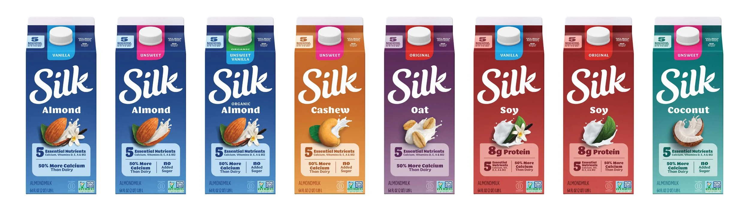
AFTER
The refreshed system is built for clarity under real conditions.
Key information is consistently placed within visible zones, creating a more reliable and intuitive reading path across every SKU. The lineup works as a unified system, making it easier to navigate, quicker to understand, and stronger at the moment of decision.
The updated system holds up where it matters most, on shelf, in motion, and under real retail constraints.
Even when partially obscured, the packaging remains easy to navigate. Shoppers can quickly identify the product type, understand the core benefit, and move through the lineup without hesitation. What was previously hidden or unclear becomes immediate and legible.
This shift reduces confusion across SKUs and creates a more consistent experience from one variant to the next. It also strengthens the role of packaging as a decision tool, not just a container for information.
The result is a system that does not rely on perfect visibility to work. It is built to perform in the environments where most decisions are actually made, helping the product get chosen faster and more confidently.
More Brand Architecture & Portfolio Systems